We may earn revenue from the products available on this page and participate in affiliate programs.
I’ve always been a staunch fan of white walls. I like the blank canvas and clean possibilities of empty, expansive walls. But then I moved into a new apartment and was presented with the daunting question from building management: “What color do you want the walls?” When given the choice of practically any color option in the world, white seemed a tad safe.

I had a lightbulb moment when getting ready one morning: What if my walls and furniture mimicked the color of my most beloved products? After all, if I like a shade of blush, I’d surely also love it replicated as a paint color. As a beauty editor, my bedroom is more like a mini Sephora, if you will. I love my skincare, hair products, and makeup like they’re my own inanimate children, so inspired by my kids, I designed my bedroom so my products are on display.

Ready to turn my white bedroom into a true color-infused beauty shrine, I looked to Farrow & Ball’s newest paint collection for inspiration. That’s when I laid eyes upon the hue that made me fall in love with color: Rangwali by Farrow & Ball. Described by the brand as an “exotic and adventurous pink,” Rangwali was the joyful boost of color I never knew I wanted.
Rangwali is named after the vibrant powders thrown during the Holi festival of colors in India. It’s a relatively low-risk pink too: The shade isn’t that poppy, bubblegum tone so often associated with pink. Instead, it has a deeper complexity, thanks to black pigment added for a depth of color.
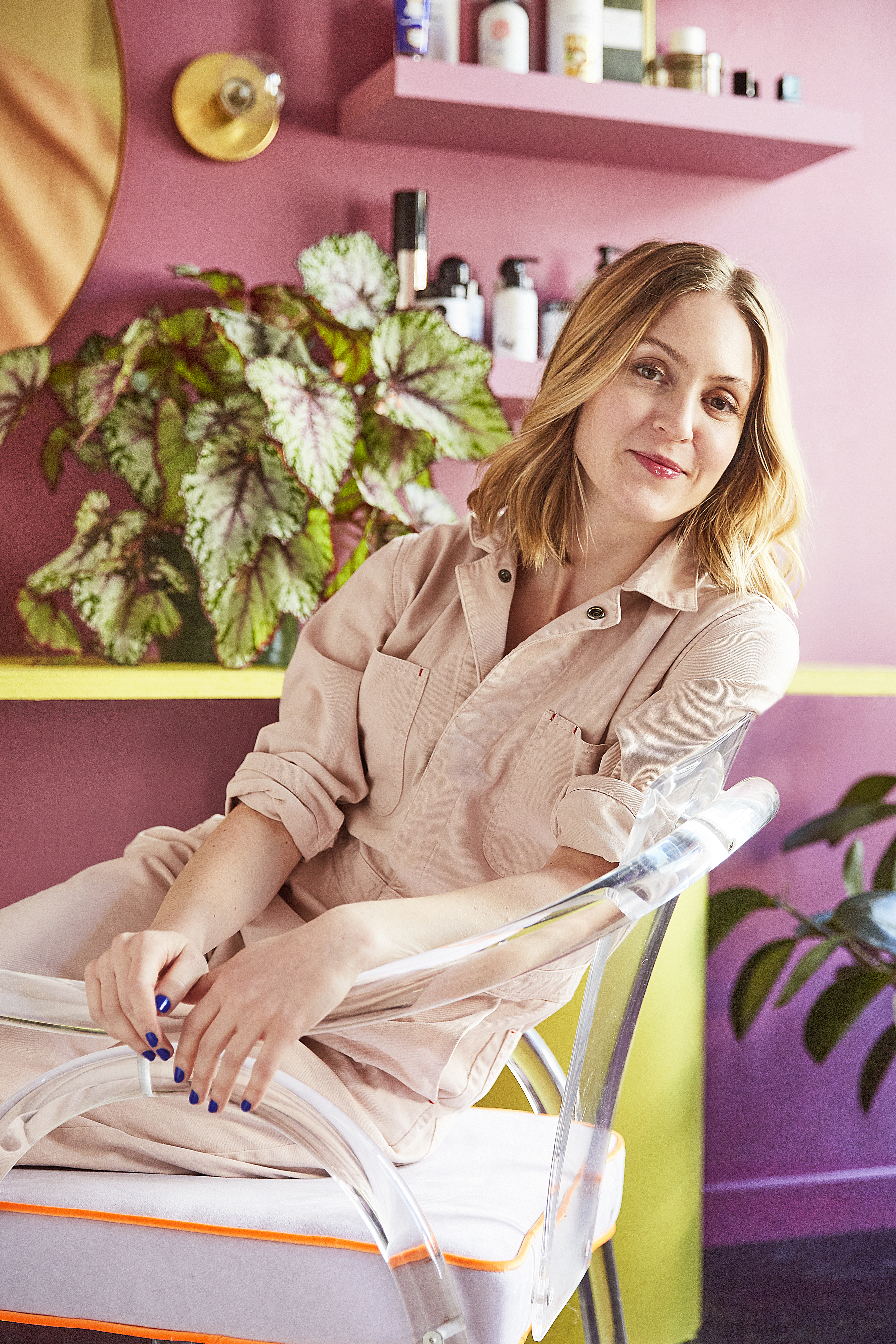
That same shade played beautifully with my simple, floating shelves from CB2. They come in bright white, but I painted them Rangwali as well to make the shelving less noticeable so the products and paint color could be the focal points.

When painting with a darker shade, I discovered it’s nice to brighten things up with pops of different colors. I painted my IKEA beauty closet a delicate, subtle blush—Calamine by Farrow & Ball. The closet is the perfect place to store away products that aren’t used on a daily basis, like face masks and special occasion fragrances and makeup.

It’s also worth considering color-blocking, a signature trick of our style editor, Elaina Sullivan. It was Sullivan who convinced me to branch out with a Pop-bright Yellowcake shade, a sunny, vibrant, can’t-miss hue. A Domino favorite, the classic bright yellow is admittedly a bold choice. It was conceived to mimic the frequently used shade in iconic Americana 1960s kitchens. While I love that background story, my color-adverse brain was pretty sure it wouldn’t work well with my newly loved Rangwali walls. I was wrong. The bright yellow takes the darker colors into a whole new color scheme. It’s like a yellow eye shadow—unconventional yet met with great fanfare from every person who lays eyes upon it.
My bedroom now feels like a celebration. The three prominent shades taught me to give color a chance and take some creative risks when decorating my home. And it turns out that life really is much more fun in color.