The Stone Slab in This Lisbon Apartment’s Dining Room Arrived Via Sailboat From France
A monochromatic makeover where Portugal and Paris collide.
Published May 8, 2022 1:00 AM
We may earn revenue from the products available on this page and participate in affiliate programs.
For months, the dining room of designer Gracinha Viterbo’s clients, a Portuguese couple with two teens, remained empty. No one could agree on a table large or grand enough to fit in the massive space (a whopping 300 square feet of the nearly 3,300-square-foot home), and all the bespoke designs Viterbo’s team presented just…didn’t feel right. Then the couple’s friend in France reached out. As the owner of a stone quarry, he had more than a few extra-large slabs on hand, and the group unanimously fell in love with a dark, swirly marble called Black Crocodile.

But with one problem solved, another quickly arose: figuring out how to get it from western to southern Europe. Luckily, the husband is a sailor. “And naturally, there’s a regatta in Lisbon, so they brought it in via boat. It was a huge collaboration, a big trip, and a whole ‘romancing the stone,’” Viterbo recalls with a laugh. “I always love when the clients feel connected to a project, that they feel like they participated in the design.”


When it came to the remaining furnishings, however, her clients were much more hands off, entrusting Viterbo to bring her vision of a black and white interior to life. It was a stillness, shares the designer, that she felt was lacking from the homeowners’ lives. Prior to purchasing the historic apartment on one of Lisbon’s main streets, the couple were living a maximalist style—and not by choice. They were seeking refuge from their busy work schedules, and Viterbo was determined to deliver that. “They were entering a new chapter of their life. The idea was not to clutter,” she explains. “It was a process of stripping down.”

This practice of paring back wasn’t just new to her clients, but to Viterbo as well. If you’ve seen her and partner Miguel Vieira’s work with their studio Viterbo ID before, you’ll recognize splashy color palettes and eclectic patterns. “I think designing is very psychological. It’s important to me that I elevate their lives through my choices,” she says.
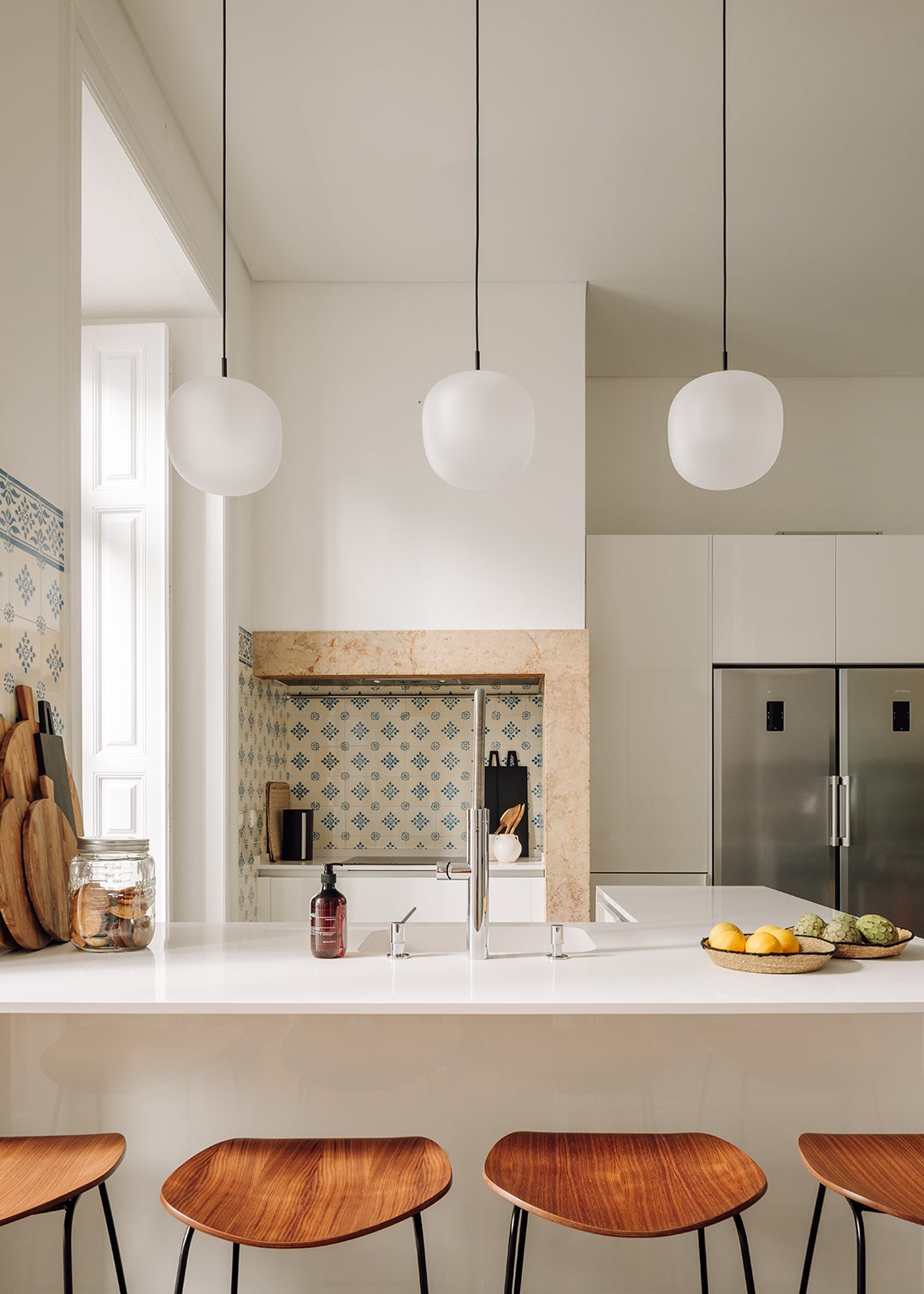
Sticking to clean lines; cozy, natural fabrics like linen; and a neutral palette was what the couple needed. Deciding to paint everything white, however, isn’t as simple as it sounds. “Lisbon is called the Pink City,” explains Viterbo. “We have our pink sky and our terracotta roofs. This changes the color inside homes drastically.”


While a wall may look pure white in the morning, by sunset—especially in the spring and summer—everything will look peachy. When working in Portugal’s capital, Viterbo makes sure to select paint colors with cooler undertones to counteract all the warmth from outside, especially in spaces where the light doesn’t touch much, such as connecting corridors. So while the walls and ceilings look as if they’re the same paint color, they’re all actually a shade or two darker from the next (Farrow & Ball’s Wimborne White, School House White, and Lamp Room Gray).

The building, too, influenced Viterbo’s approach. Rather than tear down and rebuild, Viterbo kept every wall intact and restored all of its Portuguese signatures—a ceramic blue tile backsplash, Lioz limestone, stucco walls, and intricate ceiling cornices and molding—which had been neglected by its former owners. “There was so much natural light coming in from the big windows, almost like a Paris apartment. Lisbon was very influenced by Paris, around the 18th and 19th centuries. So we had these cool high ceilings to work with,” she explains, including tall windows that didn’t call for drapes. “I love curtains; they dress up a room. But this space just didn’t need it,” she adds. “It was also an exercise for me to stay away from the things that I was used to doing.”

That doesn’t mean there isn’t any color in the home (the cornflower tile, for one, could not be removed). Viterbo had a wall shelf installed in the living room, a metal square cabinet, but couldn’t decide how to style it. A visit to her favorite gallery led to a discovery of a new ceramist known for using hand-building techniques. “I just bought it,” she shares. “Of course, we were following this neutral philosophy, but something did feel like it was missing. And I didn’t want to bring color in through paint or fabric. It had to be very special.”

In fact, the entire home is about balance, whether it’s the use of curved furniture and sconces in a square room with strong lines, mixing old and new, or pairing textured fabrics and supersmooth surfaces. Even the starting point of it all, the contrasting application of black and white, stays true to this ethos.

“There’s this very well known Fado song, from the ’30s or ’40s, that goes: ‘Don’t be so French, don’t forget your Portuguese,’ because there was so much influence from France at the time,” says Viterbo. “Where the Parisian touch comes in this project is the black. There’s an accent in the living room, corridor, dining room, and bedroom. I think it has this chicness that comes in to balance all the white.”