How a Designer Figured Out Different Purposes for the Redundant Rooms in This ’90s Home
One nook is meant for game night, another just for reading.
Published May 15, 2022 5:22 AM
We may earn revenue from the products available on this page and participate in affiliate programs.
Space: We think having more of it will solve everything, but often an abundance of it can create problems of its own. Take this house in Surrey, in the south of England, which was built in the 1990s. It came with a generous entrance and beautiful bay windows, but when its new owner got the keys last year, she realized she needed help zoning its long rooms more effectively.
Holly Vaughan of Vaughan Design & Development was tasked with animating the otherwise redundant spaces. She created a desirable everyday dining area with squishy bench seating and a more formal space for entertaining. But the designer still had square footage to play with, so with the remainder, she had fun carving out a game room and a sweet banquette book nook. Here, Vaughan explains how she breathed character into the home while also giving each of the vast areas a specific purpose.
Magic Carpet
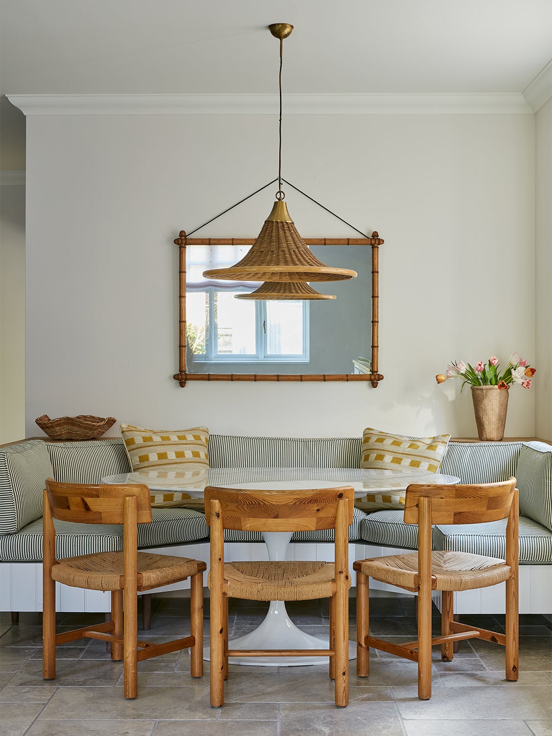
While her grown-up kids have flown the nest, the owner still has her crew of four-legged friends to think about, so Vaughan compromised on premium upholstery fabrics and opted for a mix of hard-wearing, easy-to-vacuum parquet, stone tile, and washable rugs by Weaver Green on the floors (even though the latter wasn’t her first choice). “I had vintage runners in mind—the sort that you can wipe down and naturally disguises stains,” says Vaughan. But the fact that they can just be thrown in the washing machine in case of any accidents and aren’t too costly to replace was too big of a perk.
Throwing Shade
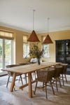
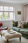
The existing decor was a write-off—think: magnolia walls, beige carpets, and pine woodwork—so it also proved a moment to indulge the sociable homeowner’s predilection for pinks, greens, and yellows. With expanses of walls to fill and a directive to steer clear of too-loud hues like red and orange, Vaughan embraced pockets of color that harmonize with other, more muted shades.
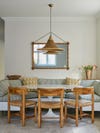
For example, in the long living room, the green millwork is a touch darker than the walls, and the library wall deeper than that. In the dining space, she chose Hay by Farrow & Ball for the paint color’s instant sense of warmth, and rattan chairs and pendant lights to tie in with the scheme.
Dynamic Duo
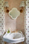
While Vaughan leaned toward neutral tones, the powder room was an opportunity to be more playful. Why limit herself to only wallpaper or just tile? Instead, she combined a tulip print by Ottoline and pink zellige tile from Mosaic Factory, resulting in a sharp contrast of flowy florals and textured squares. The fabric light shades by Alice Palmer evoke a cottagecore feel.
Story Time
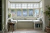
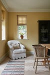
Previously, this bay window was obstructed by a sofa and framed by a set of busy curtains. “It was calling out for coziness, so I created a window seat where you can curl up and read,” explains Vaughan. “It also opens up the area, as there is a set of doors next to it leading out onto the garden.” Two built-in shelves boost its function as a book nook, and relaxed roman blinds help increase the amount of natural light flooding in, making for perfect reading conditions.
Full House
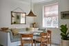
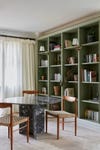
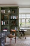
With two dining areas and two sitting areas ticked off, there could have been some head-scratching about what to do with the vacant end of the long sitting room. Cue a game area flanked by frill-edged curtains and a handsome marble table—one of Vaughan’s first finds for the project. “It’s nice to have somewhere different to sit after dinner and enjoy a cocktail or play draughts or cards,” she shares. Deal us in.