We may earn revenue from the products available on this page and participate in affiliate programs.
produced by ANNA KOCHARIAN
Summer is upon us and what better way to bring in a new season than with a revamp for your interior? Big or small, we’re all for a few seasonal changes that can help usher a home into the warmer months. Here, just a few colors we simply cannot get enough of.
inspiration Hints of rose quartz sprinkled in with blue serenity define the mix of warm and cool earthy tones, ideally reserved for a fresh summer palette.
This summer, we’re looking to expand on Pantone’s color duo of the year by filtering in earthy neutrals with soft grays and cool blues.
Dimity, Farrow & Ball
DUSTY ROSES Regardless of whether the color is reserved for a wall paint or an accent piece in the living room, this subdued shade has the ability to set an authoritative element with a space. Especially when it comes in a textured finish.
In the kitchen, the shade is paired with an all-white tile backsplash and bare concrete counters. Warm metallics in copper or gold finishes lend an elevated dimension to the color palette, while textured wooden pieces and natural linens provide a more organic layer to the look.
The dusty shade seamlessly translates into the bedroom, preferably in the form of fine linen bedding, intentionally crinkled to perfection. Pair the color with contrasting shades of a similar tone – stone grays and blues work best.
Rectory Red, Farrow & Ball
We’re taking cues from this stylish seat and going bold with a vibrant shade!
With its cleancut shape and streamlined details, this laquered piece is both elegant and refined.
Vanessa, Ralph Lauren Paint
Pink Ground, Farrow & Ball
Demure, Sherwin-Williams
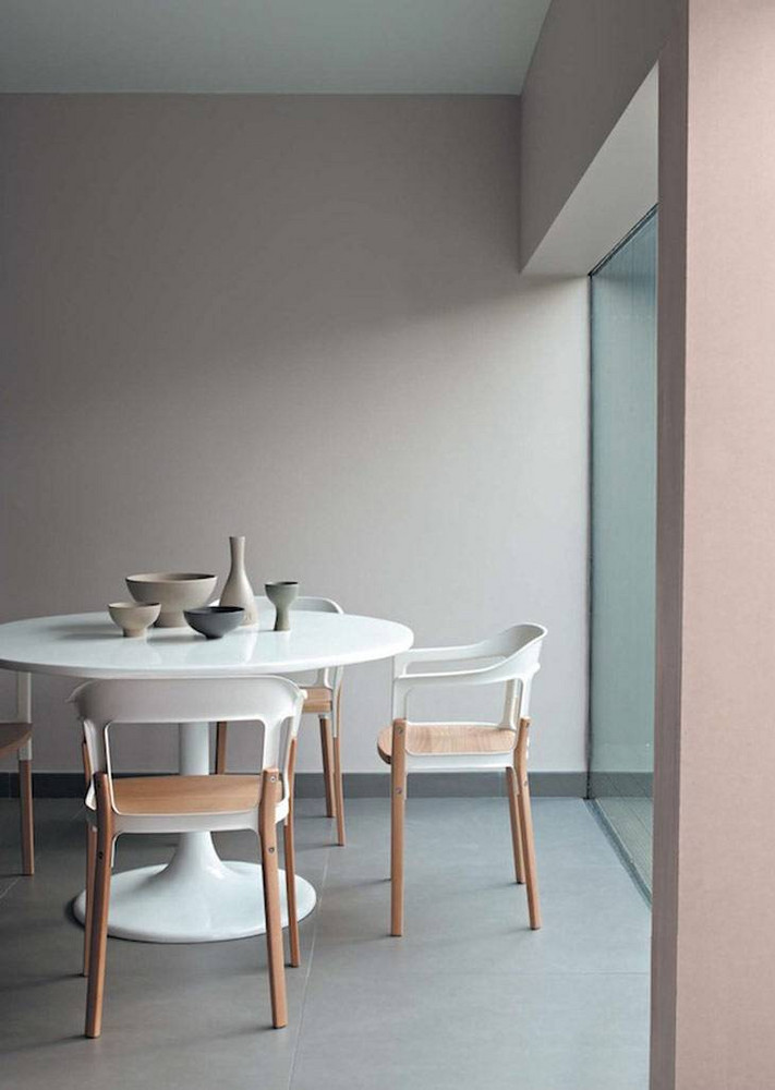
STONE GRAY Regardless of its shade, this timeless color never fails to instill a soothing element within a space. From textiles and accessories to wall paints and furnishings, incorporating grays into a home is easier than one may think.
This blue-tinted gray pairs well with the streamlined contemporary aesthetic of the kitchen cabinetry. Complement the shade with wooden elements and matte black hardware.
In the bedroom, the saturated shade instills a mod backdrop softened by the blush-toned drapes and warm wood furnishings. Matte black furnishings complement the masculine aesthetic, while the intricate crown molding elevate the room.
Complement grays with warm copper accents to accentuate the subtleties of the shade.
This one can double as both a nightstand and a side table!
SKY BLUES For a color as beautifully captivating as this, it’s hard not to go overboard when incorporating it into a space. In truth, it manages to speak volumes when reserved for a more modest display.
In the rustic bedroom, the shade of blue is a natural complement to the wooden textures and whitewashed backdrop, scattered with a vibrant handful of potted greens.
Sweet Bluette, Benjamin Moore
Gustavian Blue, Ralph Lauren Paint
In the bathroom, it imparts the vanity with a defining layer, allowing it to stand out from the whitewashed backdrop. It simultaneously complements the intricately tinted floor tiles as well as the overall aesthetic of the room.
SOFT LILACS Albeit it’s a stone’s throw from rose quartz, this relaxing hue epitomizes modern elegance at its best. Reminiscent of the flower, we’re looking to the color in its natural form for inspiration.
Calluna, Farrow & Ball
Placecard Pink, Ralph Lauren Paint
Bringing the fickle shade into an interior can be intimidating, especially when the space in question skews more towards the contemporary. Opt for a finish with a slightly smoky undertone for a more subtle approach.