The Color Palettes Currently Inspiring Domino Editors
From icy blues and peachy nudes to citron and monstera green.
Published Apr 21, 2017 8:53 AM
We may earn revenue from the products available on this page and participate in affiliate programs.
These days, there’s always a new “it” color trend lurking around the corner. Between Pantone’s Color of the Year and never-ending Millennial Pink moments, it sometimes feels hard to carve out a color palette of your own. At Domino, we’re constantly looking for the next hue to add our homes, wardrobes, and the magazine—the nine palettes here, all perfect for spring inspiration, are currently topping our lists.
Kate Berry, Style Director
“A peachy-nude and yellow have always been my palette, but the tones will change depending on the season or my mood. Evidently, I’m loving the bright yellow and peach in Willem de Kooning’s Door to the River and Jackson Pollock’s Number 27, both at The Whitney. I mean, I’m even living with these colors with my Merci bedding and sofa pillows.”
Anna Kocharian, Digital Editor
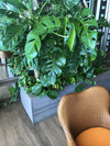
“I’ve got summer on my mind and this shot captures the essence of the season. I love how the textured rattan elevates the palette and complements the sun-kissed aesthetic of the chair.”
Lahaina Alcantara, Digital Photo Editor
“Currently, I am really drawn to color palettes that pair subtle neutrals with bright pops of color like army green and citron as seen in this sculpture by Anthony Caro. I generally dress and surround myself with super neutral, tranquil colors, so adding a bright lip color or throw blanket into the mix to raises the vibration in a joyful way.”
Meghan McNeer, Photo Editor
“I find so much inspiration when I travel by seeing unexpected color combinations in new-to-me places. Most recently, when in Las Vegas to see Magic Mike Live, my friends and I decided to explore the non-strip parts of Las Vegas. Originally, I assumed I would go crazy for the neon signs or the color palette of our hotel, but on this trip I was surprised to draw the most from the parking garage at the Hoover Dam! The terracotta set against the mountains and sky was just such a strong pairing with the addition of the mint stripes on the parking garage pillars. It really sealed the inspiration deal for me with such a strong desert shade color palette.”
Alex Redgrave, Executive Editor
“When I went back home to Nova Scotia in February, everything in the landscape was a variation on slate blue, inky blue, grey-grey—and then this neon orange chain fence at a ferry crossing. It’s that kind of electric bolt of color that I’m craving right now to pull through this last stretch of “spring”… I love how it also also made me notice those grays and blues in a different way.”
Natasha Wolff, Contributing Editor
“I’m super into Sundays‘ all-natural color palette and use of woods, rattan, linen and leather in its decor. This new non-toxic NoMad nail salon is awesome.”
Alyssa Clough, Associate Social Media Editor
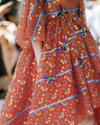
“There are a few fashion labels whose new collections can always shake me out of a color rut. Delpozo is at the top of the list. Their most recent show featured designs in so many good colors. Think reds that aren’t too red, pale and poppy pinks, soft mints and periwinkles, and bright whites against bold shades of orange. Check out their Instagram for more inspiration.”
Kristin Limoges
“This piece by Marco Scozzaro was so inspiring to see in person at the New York Foundation for the Arts. It was collaged with other summer inspiration from his Digital Deli project. It’s snarky and charming and had a subtle neon pink light rimmed behind the edges of the image that made the piece instantly pop.”
Lily Sullivan, Editorial Assistant
“I feel like citron is millennial pink’s 2017 new boo-thing. I’ve started to see them everywhere together—the Maryam Nassir Zadeh fashion show, my new fave restaurant in Soho, De Maria. I’m not prone to like bright colors, but all I want to do is paint my world in that pairing.”
Read more:
8 Paint Color Trends to Try in 2017 Unexpected Color Pairings You Should Really Reconsider How To Organize Your Home By Color
Published on April 21, 2017

