This Designer’s Tiny, Square San Francisco Home Is a Box of Tricks
Complete with tween-approved sliding headboards.
Updated Oct 12, 2018 4:51 PM
We may earn revenue from the products available on this page and participate in affiliate programs.
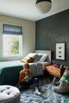
Interior designer Regan Baker and her husband, Jace, weren’t the only ones calling the shots when they decided four years ago to fix up the detached 1960s house in San Francisco they had just bought. Their twins, Amelia and Everett (now 11), also had a say—particularly when designing their own bedrooms, which they ended up personalizing with wallpaper (one horse themed; the other loosely inspired by Star Wars) and built-in desks. “They’re in training,” says Baker, laughing. The backyard was another big focus. The couple added bifolding doors leading out to the patio, so that when friends come over they don’t have to choose between playing inside or out. Around the corner, the side of the house is lined with Astroturf for cartwheels, soccer, and—if Amelia gets her way—a Ninja Warrior course.
While sherbet-hued Victorians are the dream for most home buyers in the area, Baker loved that this house was undeniably boxlike. “I knew it would probably be much easier (and much cheaper) to renovate,” she says of its straightforward, 1,800-square-foot floor plan. She immediately started toying with the facade in AutoCAD, eventually deciding to nix one of the two garages to maximize the entrance and push the top floor out a foot and a half with a cantilever, which made a natural awning. “I wanted to show that you can do a lot with just a square,” she explains.
To avoid losing the home’s mid-century modern charm, Baker created the illusion of additional square footage by extending the thresholds up to the 8-foot-high ceilings and hiding bulky kitchen tools in a Calacatta Oro marble–clad appliance garage, among other clever tricks. Looking back on the nearly year-and-a-half-long renovation, the designer reveals how she (and her two helpers) carved out room to grow.
Keep an Open Mindset
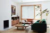
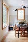
“We kind of all like to be around one another,” Baker jokes of her decision to tear down the two interior walls that once separated the dining area from the living space and raise the ceiling by a foot. Now when she and her husband pop into the kitchen when the children are watching Netflix or Star Wars: The Clone Wars, they can still keep an eye on them. To stay on budget, Baker stuck with the original fireplace (she estimates a new insert would have cost around $6,000, not including the tiling they would have done if she had started fresh). Instead the designer gave the spot a sleek update by bumping out the Sheetrock, now coated in plaster, and painting the opening black.
Repeat Architectural Details
To modernize the once peach-colored exterior, Baker installed cedar louvers on the front windows. The slats aren’t actually operable, but the designer preferred positioning them at an angle so that, from the outside looking in, they appear to be in motion. Inside, as the sunlight changes throughout the day, the boards reflect graphic shadows onto the floors and walls. A similar wood partition at the top of the entryway stairs ties the open-concept living space together.
Welcome Change

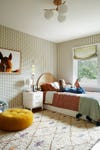
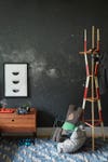
Some things in the twins’ spaces are there for good, like the built-in desk nooks (there’s one in each of their bedrooms), which came in especially handy last spring for homeschooling. Still, their tastes evolve fast, so versatility is crucial. Amelia’s solid ash-wood headboard, for instance, is propped up on felt pads so she can easily slide it out of place when she’s in the mood to redecorate—a frequent occurrence when one of your parents is a pro.
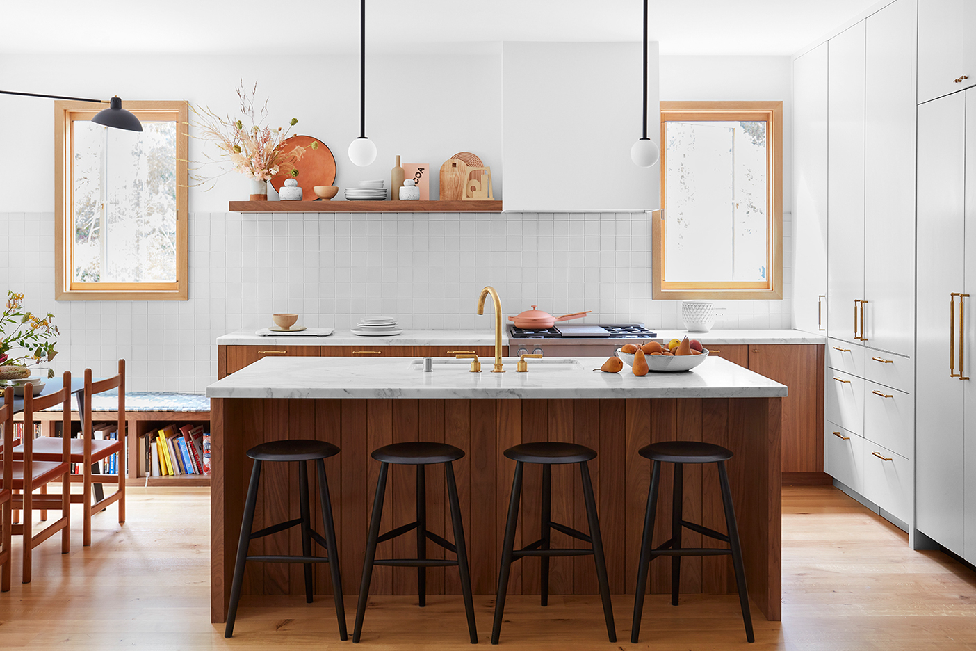
Customize Storage to Be a No-Brainer
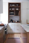
“People always ask me how my kids are so organized,” says Baker. “It’s because they have a place to put everything.” It’s easy to remember where items go in the kitchen, thanks to a decked-out appliance garage with designated cutting board compartments up top and drawers for cereals and snacks below. Just across the room, the family’s record player enjoys a prime spot within one of the nooks of the built-in bench, that way Amelia and Everett can switch out the discs themselves when they please.
Disguise Unsightly Bones

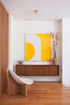
Baker opted for a radiant heating system in the house to keep her allergies at bay. But to avoid adding bulky soffits, she had to come up with clever ways to hide the electrical and plumbing. One of her solutions? Consolidating the wires and pipes within the panels of a custom bar cabinet (now affixed to the wall). Looking at the piece, you’d never know it contained crucial parts of the home.
Fake More Space With Natural Light
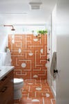

Baker’s choice to put a wall-to-wall transom window in the main bathroom was twofold: The feature floods the formerly dark and dreary space with natural light while offering both privacy and views of the surrounding woods—but more important, it makes the room look wider than it really is. The designer continued the mod pink floor tiles up the back shower wall for this very same reason: the appearance of depth (and to create functional art). “I wanted to make a statement in here that made me smile all the time,” she says.