This Mid-Century Bungalow Doesn’t Have a Single 90-Degree Angle
Curved furniture and little ledges to the rescue.
Updated Oct 10, 2018 5:01 PM

We may earn revenue from the products available on this page and participate in affiliate programs.
When Raili Clasen walked into Dave and Karin Bock’s 1963 home for the very first time, she was hard-pressed to find a right angle. It turned out, there were none. “I was obsessed with the ceiling and nothing else,” she remembers. The designer had tackled mid-century modern houses in the past, but this one was different. Situated in the coveted community of Emerald Bay in Laguna Beach, California, the property was a total teardown—by most neighbors’ standards. Fortunately, the Bocks aren’t the bulldozing type. “I’m happy they kept the bones; they’re good bones,” says Clasen.
Among the rotted framing, mold, and possible dead animals, they discovered evidence of three or four remodels gone wrong. The brown textured flooring on the main level read as “country bumpkin,” while the tiny black and white kitchen skewed traditional. When the designer and homeowners originally began brainstorming solutions, they were focused on cosmetic fixes like sanding the floors—ideas that Clasen now describes as “half-ass.” It wasn’t long before she got this text from Dave: “Screw it; we’re all in.” After pushing pause for nearly six months while an architect came in and addressed the structural issues, Clasen came back on-site. Here, a few key takeaways from transforming the sunny bungalow—protractor in hand.
Study Up
In order to give the house some soul, Clasen had to be book smart. At the top of her reading list: Atlas of Mid-Century Modern Houses, Case Study Houses, Eames, and The Midcentury Modern Landscape. The designer referenced these titles when selecting finishes. “In this day and age, wide oak planks are the preferred flooring, but back then it was three-inch slivers of red oak,” she learned. Along the way, though, she made small tweaks, like bleaching the orangey-red oak wood to give it a Scandinavian-contemporary look. This way, nothing felt too “1950s Palm Springs atomic ranch.”

In the kitchen, they opted for sleek slab door fronts—a more refined version of the era’s once-popular avocado green veneers. The stairway also offered an opportunity to play up history. “Usually we blow it out, add a handrail, and call it a day,” says Clasen. In this case, they closed it off with slats of wood and turned it into a design statement.
Think Outside the (Junction) Box
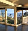
The living room ceiling looked even dreamier after the posts were replaced and the new pieces of wood were shored up and painted with a fresh coat of Benjamin Moore’s Simply White. “You can still see the cracks between the planks,” notes the designer.
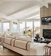
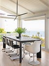
As in love with the structure as everyone was, they quickly realized lighting was going to be a challenge—there was nowhere to hide a junction box. The dining room and the space above the stairs were the two closest sources, so Clasen pulled out all the stops and opted for dramatic, oversize pendants in both places.
Kick Up the Contrast

One of the most challenging parts of the renovation was finding a middle ground between Karin’s and Dave’s different wish lists. (She wanted serene and neutral; he asked for surf vibes and a sense of play.) Eventually, Karin gave in to Dave on the palette. “I’ll do olive,” she announced.
The designer emphasized the green color they landed on for the master bedroom by doing a two-tone wall, half in Simply White and half in Dark Pewter. “I’d be fibbing if I said it was all calculated,” says Clasen of finding the right height for the cutoff. Generally, though, she suggests eyeballing it so it bisects things like the top of the headboard and a piece of art. “It’s an easy way to put character into a space without it being juvenile,” she adds.
Bring the Old in With the New
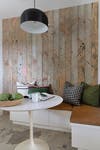
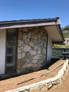
Clasen turned the very bottom floor of the house into a guest apartment of sorts, complete with a small breakfast nook. On the walls? Siding original to the home. It’s a little more rustic than mid-century modern, but the feature works because it’s a nod to the property’s roots. It was a bonus that a couple of the boards boasted spray-painted pink markings from the construction phase. “Looking back, I wish I would have done a whole plank in hot pink, just as a little accent,” she says.
Color Inside the Lines
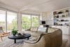
In some spaces, like the downstairs living room, where a vintage Walter Knoll sofa from Amsterdam Modern now sits, embracing curves was the best way to get around all the odd bends and turns. That particular couch is what Clasen calls an aha moment. “We needed something old. We needed olive. We needed low,” she says. In other cases, the problem couldn’t be solved by soft, rounded furniture. Take the guest bedroom: It had so many weird angles that the bed would never have been perpendicular to the original walls.

So Clasen built a back panel behind the headboard to level things out, creating a subtle ledge that’s deep in the center and narrow at the edges. “There were times when I left, thinking, I have to come back and revisit this another day,” she says, laughing. Every time she did, though, the ideas got better.
See more stories like this: Antique Yellow Doors Convinced an L.A. Shop Owner to Escape to the Desert In Alyssa Coscarelli’s New Apartment, the Closet Looks Like a Store This San Francisco Home Expansion Was the Epitome of a Family Affair