We Cracked the Code on Mixing and Matching Patterns
All thanks to this easy formula.
Updated Oct 11, 2018 11:48 AM
We may earn revenue from the products available on this page and participate in affiliate programs.
Even if you’re not a minimalist, pattern play is tricky. Overdo it, and prints can overpower a space; underplay it, and they run the risk of looking out of place. But if your home is missing a hit of bold color, there’s no time like the present to experiment. Go ahead and get creative while cooped up indoors; all it takes are a few ground rules.
Maybe you’re ready to ease into maximalism with a couple of clashing throw pillows on a sofa. Or maybe cabin fever has set in big-time and you’re willing to undergo a larger room reno, complete with new upholstered furniture, wallpaper, and textiles. Either way, these four tips will put you on the right track.
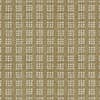
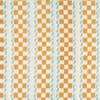
Bring in Texture
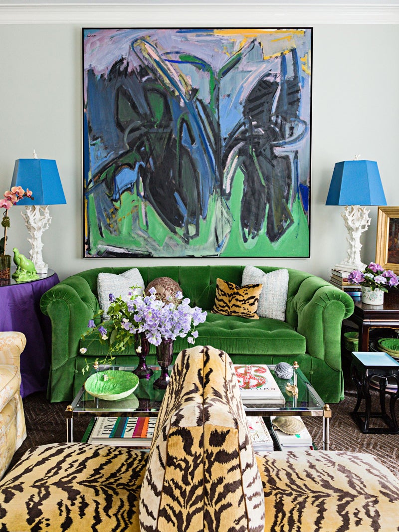
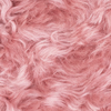
The first key to mastering the mix-and-match look is switching up materials; you don’t want it to appear one-note, after all. Go for contrast. Pair glossy with matte, woolly with smooth, carefully tailored with imperfect silhouettes.
For particularly daring decorators, try a leopard-print velvet with futuristic neoprene to create some interesting drama. Or if you’re just starting out, the general rule of thumb is to keep everything in a similar color family, then ensure that each pattern is a different texture.
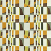
Balance Scale
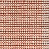
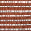
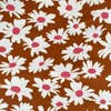
Playing with proportions is all about impact: Put repeat prints on smaller items, like pillows or lampshades, and splash larger motifs across a wall or onto a sofa. And keep in mind that, from a distance, mini patterns will almost read like a neutral.
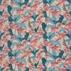
Combine Contemporary and Classic
This goes for pretty much any design project, but when dealing with patterns, it rings especially true. The best way to make a flowery botanical wallpaper or fabric look youthful is to pit it against something wonderfully vibrant and graphic that instantly ages it down. This goes for choosing your individual prints, too. Spice up something traditional, like damask, by opting for it in bright acid tones.
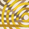
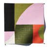
Punch Up the Palette
Not sold on any specific pattern? Start by settling on a color you love and build from there. Using a throughway hue to unite wild abstract shapes with painterly flowers will add structure to even the liveliest of nooks. Make sure you have one base print that balances out the other two with like colors; as a rule, grids, stripes, and polka dots are great for layering in with busier motifs. Go forth and mix it up.
See more ways to experiment with print: A Glider-Turned-3D Quilt Steals the Show in This Nursery We’re Serving Up Spring Pastels the Southern Spanish Way 10 Free-Spirited Painting Designs That Bid Solid Wall Colors Adieu