The Best Uses of Pantone’s COY from the Last Decade
A look back at the inspired spaces featuring the hues that dominated each year.
Published Oct 22, 2018 7:05 PM
We may earn revenue from the products available on this page and participate in affiliate programs.
Greenery 2017
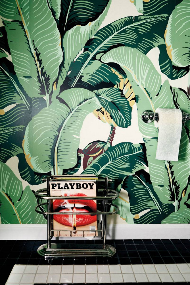
Last year’s shade was all about a fresh start. New beginnings, inspired by a hue ever-so-present at the onset of spring. Among the many ways Greenery was used within interiors, we favored it via a banana leaf-print wallpaper—because, what is more classic than that?

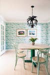
Rose Quartz and Blue Serenity 2016

Marsala 2015
At the height of the era of the wine craze (you know what we’re talking about) it was only fitting that the Color of the Year emulate the bold hue that dominated a generation’s newfound appreciation for the beverage. Marsala’s rich tones took over the fashion world and interiors alike, establishing a daring approach to decorating with the hue. In this cozy nook, a stained leather seat channels the depth of the shade, doubling as a statement that elevates its neutral backdrop.
Radiant Orchid 2014
This dreamy hue fluctuates between a moody lilac and soft purple, opening it up to interpretation when aiming to use it within an interior. This charming bedroom did just that. While the designer chose to hone in on an exclusive palette made of pinks and purples, the pops of Radiant Orchid—found atop the bedding, wall art, and wallpaper—undeniably stood out and stole the show.
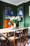
Emerald 2013
We love a good shade of green so needless to say, we were more than enthused for 2013’s COY: Emerald. The bold jewel-tone was utilized in a myriad of decorative endeavors from velvet sofas and sleek dining chairs to concrete flooring and chic wall paint—much like this spot, belonging to designer Luke Edward Hall. And no, it’s not too late to get in on this hue. It’s a classic for interiors, which will surely be around for many years to come.
Tangerine Tango 2012
Tangerine Tango: A vibrant hue that wavered between a saturated red and orange dominated the scene in 2012. When it came to decorating with the shade, the intimidation factor was set pretty high. In this Mexico-based hotel, an artful balance comprised of a whitewashed room, patterned flooring, and a hint of stained wooden accents, redefine the unique hue as an essential decorative detail.
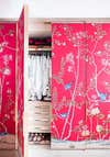
Honeysuckle 2011
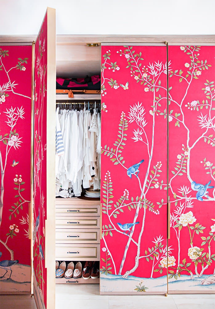
This stunning chinoiserie pattern gave us life. Paired with what is only an ingenious take on 2011’s Color of the Year, the result is nothing short of incredible. File this one under one seriously clever way to upgrade those snoozy closet doors.
Turquoise 2010
Have you ever seen a more daring wallpaper display? Found within actress Megan Ferguson’s light-filled LA abode, this turquoise wallpaper undoubtedly steals the spotlight. Boasting an intricate leaf motif, the vibrant pattern establishes a calming essence throughout the beautifully designed room, which is filled with a handful of accents pieces of a complementary scheme.
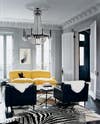
Mimosa 2009
Here’s one way to decorate with the Color of the Year. Leave it to Jenna Lyons to totally school us on the art of styling with a bright yellow sofa. Situated within an almost exclusive palette of timeless grays and bold, black accents, the cheery shade stands out amidst the more deeper tones of the decor.
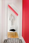
Blue Iris 2008
Can you spot the Color of the Year? Looking behind the bright pinks and delicate pops of red-orange, the delicate COY stands out, doubling in as a gentle contrast against the warmer tones. Channeling the unique spectrum of the hues found within the iris flower, 2008’s color managed to sway between a soft blue and bold purple. Here, we take it in its natural form, with an oversized art print that emulates the same palette.
Chili Pepper 2007
Leave it to artist Donald Robertson to curate a display as colorful as this. At the backdrop, 2007’s hue of the moment—a red so deep and beautifully saturated—establishes the ideal finish for the eclectic assortment of decorative accessories set in front. The ornate nature of the marble fireplace manages to seamlessly downplay the intensity of the shade, earmarking it as a perfect pairing.
Discover more ways to decorate with color:
Pastel Wall Paints Are Back—Here’s What You Should Know Make a Decor Statement With Benjamin Moore’s 2018 Color of the Year Beat the Winter Blues With These Bright Decor Pieces
Learn to love your inbox again—sign up for Domino’s daily email.