Before and After: A Dated Kitchen Gets a Functional Makeover
A smart remodel packs function, style, and historical flair in a small space.
Published May 28, 2017 6:45 AM
We may earn revenue from the products available on this page and participate in affiliate programs.
Although the interior of this 1930 home in Gladstone, Oregon, had retained much of its original charm, the kitchen was downright unpleasant. The too-shallow upper cabinets were barely deep enough for a dinner plate, there wasn’t enough prep space, and the refrigerator was in the next room.
The homeowners tapped Vicki Simon, Portland-based interior designer, for an overhaul. They suggested that she blow out walls to create a new room, but Simon had other ideas. She asked: “How can we respect the architecture first? Can we maintain the integrity of the house design but still get you what you want?”
Her remodel does just that, delivering a functional kitchen that packs a lot of style and historical flair in a smaller footprint. Here’s how she did it.
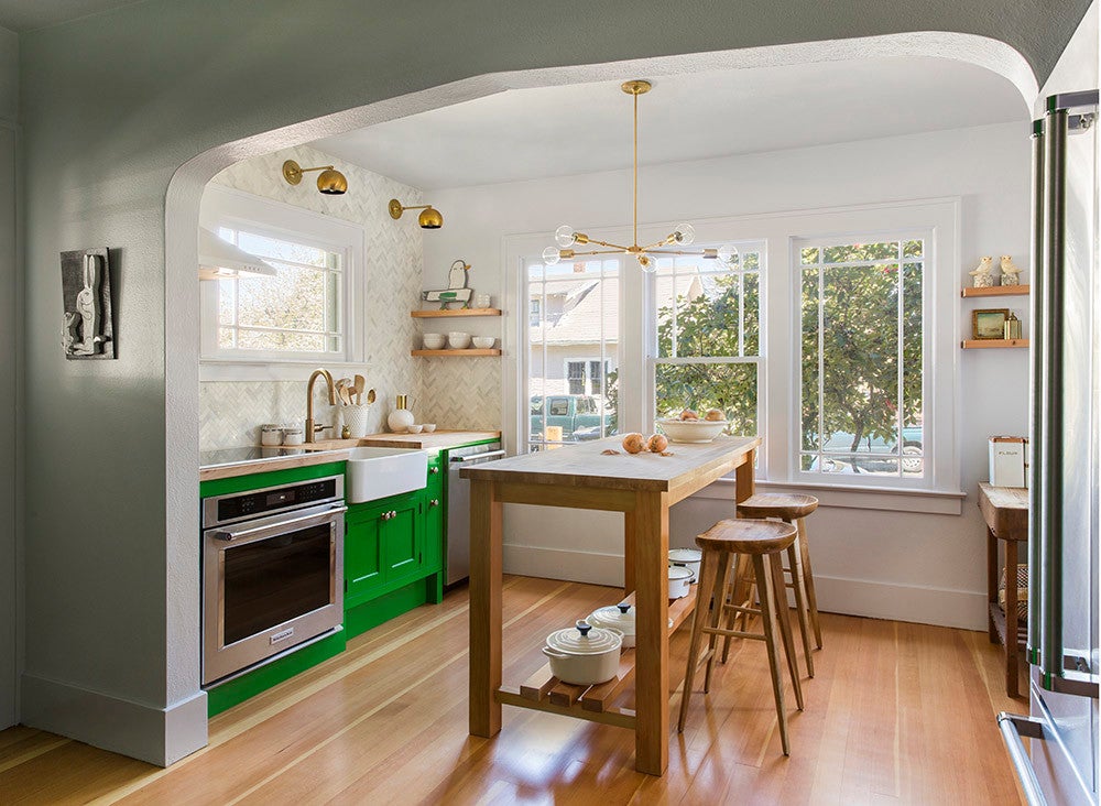
The existing kitchen was dominated by the home’s main dining area. A built-in cabinet was geared towards pretty display rather than adequate storage, which the homeowners needed.
Through an archway, a single run consisted of the sink, a small counter, and the too-shallow upper cupboards. The refrigerator was accessed through a door to the mudroom.
The stove was sequestered in its own niche and needed better ventilation.
Simon started by removing the insufficient storage under the window and relocating the sink and stove there. Next, she exchanged the dining table for a custom work table that acts as both prep space and a gathering spot for meals.
This new arrangement enabled her to keep the home’s historic windows. “We made better use of the windows that were there by having them bring light to functional spaces as opposed to storage space,” she said.
Past the archway, which Simon made sure to leave intact, a bank of floor to ceiling pantry cabinets now offers ample storage. Their exterior details—including inset doors, exposed hinges, and thick baseboard—mirror woodwork elsewhere in the house. The delightful kelly-green hue was requested by the color-loving homeowner.
Simon lined the pantry with a marble counter, wired the rear wall for an outlet, and tucked a coffee station inside. In addition to maximizing function, “It was just a nice way to break up the wall of green cabinetry,” Simon says.
In order to reunite the kitchen triangle, Simon moved the refrigerator to the former stove niche, where it doesn’t distract the eye.
For the materials palette, Simon evoked the house’s history, starting with the original flooring previously obscured beneath linoleum. “The real beauty of this space was uncovering the long hidden lovely fir floors,” she says.
For the counters, she chose maple butcher-block. Brass accents, including the Isaac Sconce from Schoolhouse Electric and the Mother-of-Pearl Knob from Anthropologie, look current thanks to their updated silhouettes. A full-height tile backsplash laid in a herringbone pattern gives the new room a light and bright focal point.
Related reading:
This Renovation Proves That Chic Laundry Rooms Do Exist This Is What It’s Really Like To Remodel A Kitchen A 1920s Kitchen Gets a Bright, Modern Makeover