The “What Color Should We Paint the Nursery?” Dilemma Ends Here
Eleven expert-approved combos to try.
Updated Oct 12, 2018 5:21 PM
We may earn revenue from the products available on this page and participate in affiliate programs.
Most parents gravitate toward calm, comforting neutrals and pastels when painting their nursery: blushing pinks, subtle blues, creamy yellows, and pale grays. We get it—moms and dads are simply looking to create a healthy sleep environment (for both the baby’s and their sake!). However, there are other palettes up to the task—and they don’t have to be so predictable.
Just think of how cozy you were the last time you sat in a dark, moody den. Imagine how at ease you would be in a room filled with warm sunset hues, how inspired in front of a vivid mural. Allover color isn’t your only option either—Backdrop cofounder Natalie Ebel loves when her customers embrace accent shapes and patterns, too. Time to put down the princess pink and baby blue paint buckets and try one of these expert-approved combos instead.
If you want a room full of history…
“Consider a terracotta plaster for the walls, accented with light pink and dark green,” says Jamie Davis, cofounder of Portola Paints & Glazes. “Adding the texture of plaster will warm up the space and give the room a bit of an unexpected twist.”

If you want to inspire creativity…
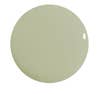
“Pale yellows and greens are commonly associated with nurseries, but why not change up their value and chroma?” suggests Andrea Magno, director of color marketing and development at Benjamin Moore. “By using a deep green on all four walls, or even just an accent wall, a surprisingly calm mood is created. To balance it out, a crisp white and a bold yellow brings some fun and personality.”


If you want a warm, enveloping feeling…
“Don’t be afraid to use a bold, punchy rose all over and pair it with other sunset hues,” says Nicole Gibbons, founder of Clare. “Try painting the walls, ceiling, and trim one color, like the peachy pink in this nursery by Allison Crawford, and throw in some golden yellow and neutral hues.”


If you want a sleeping-under-the-stars vibe…
“Dark blues and pinks are some of our favorites to pair together,” says Ebel. “Surf Camp is a navy with green undertones that has a lot of interesting nuances and really plays with light, while Rose Quartz is a warm blush with gray notes. The rich tones here make for a bold statement that you wouldn’t expect to see in a nursery, where people usually lean toward lighter shades.”

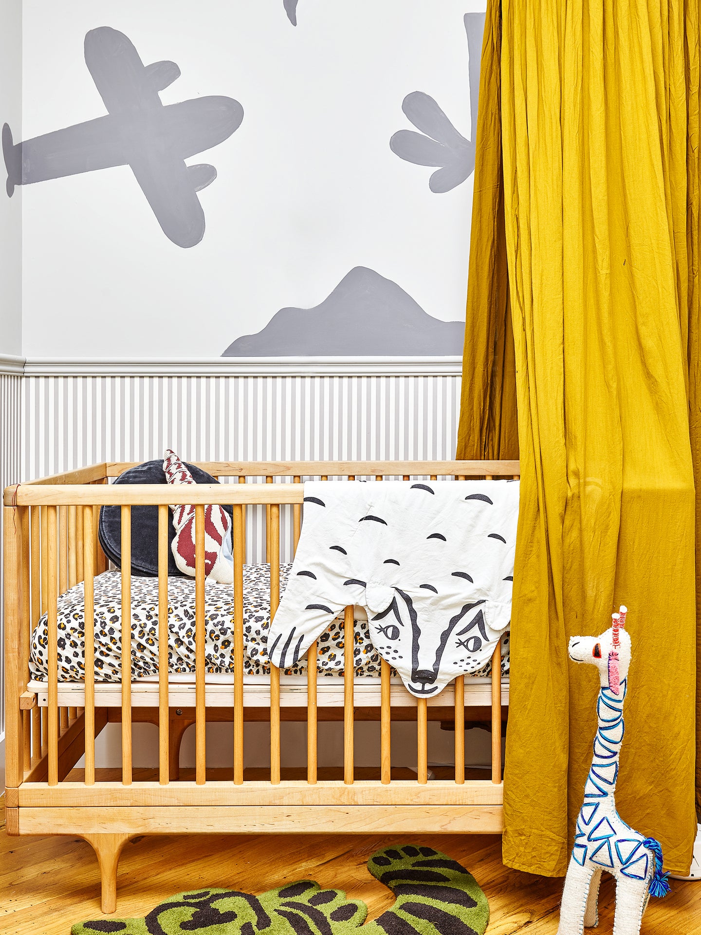
If you want to bring The Jungle Book to life…
“These colors can be played up or down in terms of a bold statement wall,” says Davis. “They represent a unique combination yet are cohesive, providing an overall cool design aesthetic.”

If you want sunny beach days year-round…
“For a more vibrant combo, I love working with tones in the same color family,” says Gibbons. “Try pairing Sublime with a softer blue-green hue like Views for a playful two-toned wall. Mix those cool blue hues with a warm contrasting color like yellow, and you have a whimsical duo that will really make your nursery pop.”

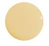
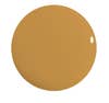
If you want to stare at a sunset all day long…
“Tanlines is a deep, rich yellow, and 36 Hours in Marrakesh is an earthy pink,” says Ebel. “Both colors are exciting without being overpowering. This combination is bold but not overwhelming, which helps balance and complement the inevitable colorful accents you’ll find in a child’s room.”
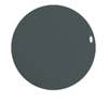
If you’re not afraid of drama…
“When you think about a nursery, the last color you might think of is black or a very dark tone,” says Davis. “However, babies respond to heavy contrast, so using black and white the right way is an interesting choice.”

If you want to re-create cozy fall vibes…
“Rather than using navy blue as an accent in a nursery, consider using it as the main wall color,” suggests Magno. “Then bring in a lighter hue like Silver Cloud, reversing a popular combination for a different take on nursery palettes. To add a burst of bold color, introduce an orange such as Pumpkin Pie. There is plenty of room to grow with these colors.”


If you want a grown-up feel…
“Most people would not opt for such a dark, dramatic color in a nursery, but Current Mood is one of our most popular shades and it looks great in any space,” says Gibbons. “It gives this room an unexpectedly sophisticated vibe, yet the neutrals help to soften it up and keep the space feeling bright and youthful.”
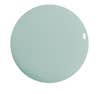
If you want a soothing sanctuary…
“Natural Habitat is a light green with a hint of yellow, and combining it with Supermoon gives a calming feel,” says Ebel. “Not So Delicate is a gray lavender with a touch of pink, one of our most nuanced colors. This earthy combination is both soothing and cheerful, perfect for sleep and play.”
Discover more nursery ideas we love: The 10 Best Unexpected Nurseries on Pinterest Maisonette’s Founders Know How to Design a Great Nursery Christene Barberich’s New Baby’s Nursery Is a Technicolor Dream