Beachy Minimalism Takes Center Stage in This Breezy Sag Harbor Home
Decorating with white 101.
Published Sep 12, 2019 9:09 AM
We may earn revenue from the products available on this page and participate in affiliate programs.

Is it possible to have too many design ideas? Maureen Winter McDermott will tell you yes, but she’ll also tell you that editing is half the fun.
“An old boss of mine once told me, ‘Just because you can do it doesn’t mean you should,’” recalls the designer. At the time, McDermott had just bought a small apartment in Brooklyn with little natural light. She wanted to paint the floors black. “He was basically telling me that just because you have a good idea, it might not be the best idea for that particular project. I think it goes hand in hand with practicing restraint and paring down ideas.”
Her carefully trained eye came in handy on a recent project in her hometown of Sag Harbor, New York. Alongside D&D Harvey Architects and local builder Greg D’Angelo, McDermott set out to deliver covetable waterfront vistas for a family of five that spends as much of their summer on the water as they do indoors.
“There were two recurring themes: organic, beachy materials, and then lots of bling,” the designer says of her client’s inspiration-packed Pinterest boards.
White and gray proved to be a cohesive point of connection for the warm wood tones and shiny metals peppered throughout the home. Any color that the home lacks indoors is promptly accounted for by the views beyond.
“We tried to keep things minimal enough so you still saw the water outside,” says McDermott. “Nothing is too fancy, but it still has a sophistication. You can come off the beach or off the boat and not have to worry about wrecking anything.”

Relaxed glamour takes the lead in the kitchen. For McDermott, the focal point of any well-designed cookhouse is a knockout island. “It’s where everyone congregates and it’s where the stone (or whatever surface material you’re using) can be a star,” she suggests. “It’s also a great opportunity for lighting. It really grounds it.”
McDermott’s big lighting move came in the form of two highly sculptural pendants from GUBI. “They’re airy, but they don’t overpower the space,” adds the designer. Without compromising the home’s airy aesthetic and neutral palette, McDermott spiced up the pale gray cabinetry by swathing part of the room in oversize shiplap.
“The client really likes shiplap, but I didn’t want it to feel cottage-y. Once we put it on the wall going up the stairs, it didn’t feel exciting enough so that’s when I thought we’d go really dark—almost black. We fell in love and just continued it by wrapping it around the wall,” explains McDermott.
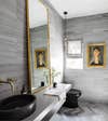
Look closely and you’ll find that the rich, charcoal hue makes more than one appearance. In the powder room, for instance, the smoky stone walls and herringbone floor are broken up by unexpected splashes of brass.
“I wanted things to feel asymmetrical. I wanted there to be layers to it,” shares McDermott. “An entire bathroom of limestone is heavy and severe, so I got a bit playful with it by leaning the mirror instead of hanging it and adding that kitschy portrait and decorative light fixture over the toilet.”

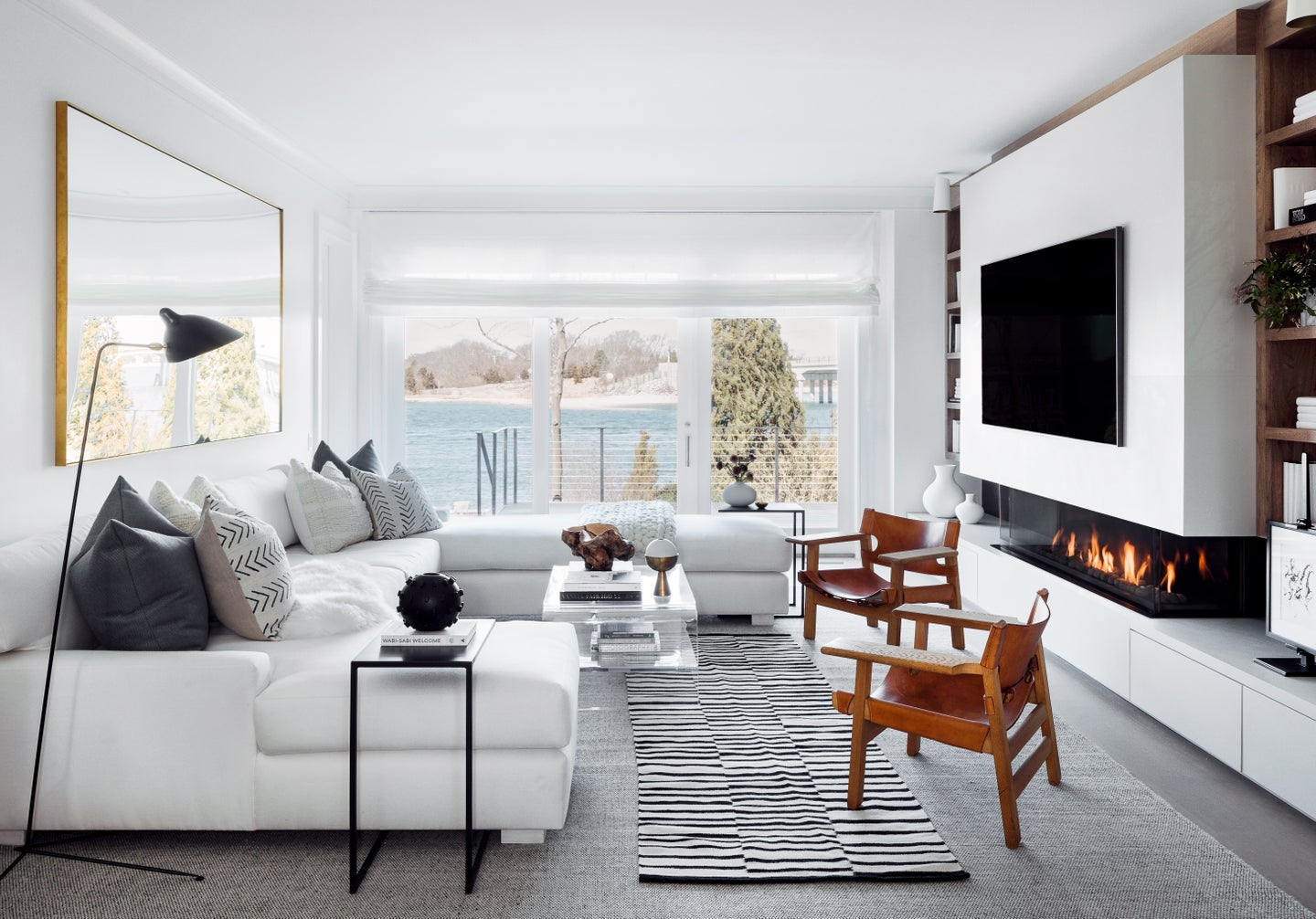
Layering also played a crucial role in the living room, where the graphic addition of a black-and-white rug and C-shaped side tables adds a fresh dimension to the crisp white sectional.
“The number one thing was not to block the view, so I didn’t want any high-back chairs on that water elevation,” says McDermott. “I always use those tables from Room and Board over chaises and ottomans. These wrap around and add some height.”
For the TV wall–cum-fireplace, the designer worked closely with the architects to create a floating effect and incorporated a set of streamlined drawers beneath for sandy shoes and boating essentials.

The cloud-like guest bedroom is primed for sweet slumber. But how does McDermott pull off a neutral scheme without it feeling snoozy? “I think it’s all about texture,” she shares. “For instance, the throw is a different texture than the pillows, and the fur bench is a different texture. You have to break up the monotony.”

Designed to be enjoyed by both kids and kids at heart, custom millwork paid off in the bunk bed guest room. To take the child-approved dwelling one step further, McDermott elevated the space with art, sconces, and private storage cubbies.

Given the home’s serene energy and overall ease, you’d almost never know McDermott and her clients started their journey with enough inspiration to build five very different houses. We’ll take this as a reminder that saving your best ideas for last pays off.

See more home tours:
You’d Never Guess This Serene LA Home Has Stick-On Bathroom Tiles
This Antique Lover’s Home Is a Master Class in Gallery Wall Curation