The Best Living Room Paint Colors Aren’t Just Shades of White
Have your paintbrush ready.
Updated Oct 4, 2021 7:12 AM
We may earn revenue from the products available on this page and participate in affiliate programs.
The kitchen may be the heart of the home, but there’s no question we’re spending more and more time in the living room, the ultimate place to cuddle up with a book, mingle with friends, or sprawl out on the sofa to catch up on our favorite shows. (And if we’re being honest, it’s probably where most of us have been eating our meals these days, too.) If you’re looking to give your space a refresh rather than overhaul your entire decor scheme, consider a can of paint. “Paint has a tremendous amount of impact in any room and really sets the tone for your mood and overall design,” says Nicole Gibbons, founder of Clare. So if you’re searching for a way to cast a cozy or calm glow over your living room, we found five interiors to inspire your next makeover, as well as the best living room paint color ideas from designers who know best.
Our Favorites
- Best green: Benjamin Moore Sea Pine
- Best greige: Clare Penthouse
- Best blue: Farrow & Ball De Nimes
- Best gray: Benjamin Moore Metropolitan
- Best pink: Farrow & Ball Pink Ground
Best Green: Benjamin Moore Sea Pine

“I love Benjamin Moore’s Sea Pine—it’s a soothing yet unexpected color,” says Melanie Millner of The Design Atelier, who recently used it in a salon space. The blue-green color takes on a grayish hue in warm or artificial lighting, which is why Millner stresses that one of the most important things to consider when selecting a paint color is how sunlight reflects in a room. “The amount of sunlight, or the lack thereof, can affect the outcome of a paint color,” she says. “Something that works in one space can look totally different in another.”
Best Greige: Clare Penthouse

In her own living room, Gibbons used Penthouse, a barely there neutral that’s become one of Clare’s best-sellers. Described as an understated greige, it’s an ideal white alternative. “It makes my space feel so calm and grounded, which is so important for a living room,” says Gibbons. “I always recommend it because it looks great in any space, pairs beautifully with any color, and works no matter what the natural light is like in your home.”

Best Blue: Farrow & Ball De Nimes

Named after the French city where denim workwear was invented, this moody teal is at once elegant and down-to-earth. Bespoke Only’s founder and creative director, Melissa Lee, found it perfect for the romantic contrasts in a townhouse on Manhattan’s Upper East Side. “It encapsulated the design thesis in a historic dwelling—manifesting the sophisticated atmosphere and rich detailing that belongs to a limestone,” says Lee, who kept the walls cohesive by painting the trim in the same color. “It’s a favorite trick to quiet down the sometimes overly embellished traditional millwork and complement the cleaner lines in modern interior elements. It also elongates and extends visually with the blurred lines.”
Best Gray: Benjamin Moore Metropolitan

Designer Crystal Sinclair used Metropolitan in a modern living room that needed the color’s cooler undertones but green-yellow cast. “We wanted something that felt regal or stately and modern at the same time—something that worked with all the added detail within the space without being too modern but still giving it an edge,” says Sinclair. Metropolitan was one of Benjamin Moore’s 2019 colors of the year, described as an “understated yet glamorous gray [that] creates a soothing, impactful common ground.”

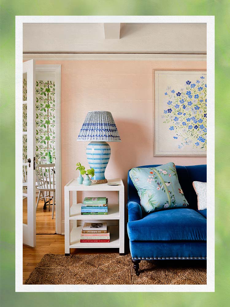
Best Pink: Farrow & Ball Pink Ground

New York–based designer Lilse McKenna has used Farrow & Ball’s Pink Ground as a neutral alternative in a number of living rooms, including this West Village apartment. “It doesn’t read as too pink because it has very little blue in it and offers a nice contrast to a range of colors—navy, red, aqua, teal, and natural textures like seagrass,” she notes. “Perhaps the best perk of a soft pink like Pink Ground, though, is that it reflects a rosy glow on everyone’s skin when they walk into the room, both in natural sunlight and in lamplight in the evening.”

Our Shopping Checklist
Color: When it comes to selecting the best living room paint color, Sinclair’s advice is to listen to the room. “When the room is bright and airy, a lighter color works best,” she explains. It’s also why she’ll opt for a darker color when painting a room that doesn’t get as much natural light—it ups the cozy factor. But it’s just as important to work off of the selected materials in the room—the throw blankets, the furniture—then sample a few options before making your decision.
Indeed, Gibbons cannot stress enough the importance of testing out swatches. “Be sure to view your swatches at different times of day,” she suggests. “The amount of natural light in your space, the direction it’s coming from, and the time of day can impact the way color is perceived. Make sure you love your color both under daylight and in the evening when the sun is down and artificial lights are on in your home.”
Finish: The finish can also change the color’s appearance and determine how it will interact with the light. A flat or matte finish absorbs light, but a lustrous finish like satin reflects it. Because there are so many finish options when it comes to interior paint, Gibbons recommends keeping things simple. At Clare, you choose between just two—eggshell and satin, the former being perfect for walls. “It has a barely there sheen that adds some depth and dimension to the color yet still hides imperfections,” explains Gibbons. She tends to stay away from higher sheens, especially where natural light is hard to come by. When artificial illumination is the main source of brightness, a glossy finish may cause what she calls a halo-like glare.
Ask Domino
Q: What is the best color to paint a living room for resale?
When it comes to appealing to the masses, a neutral is often the safest choice. And according to Zillow’s latest survey on the best interior paint colors for selling your house this year, gray walls compelled potential home buyers to tour a place more than any other hue. Other go-to swatches include light green and white. For the latter, you can’t go wrong with Benjamin Moore’s Chantilly Lace, which is considered to be the perfect blank canvas by many designers.
Q: What colors make a room cozier?
To achieve an inviting living space, choosing the right color is crucial. For Sinclair, nothing beats something a bit darker but still warm, such as a rich greige or cool beige. “Think of the shadows on the wall, the textures that will be in the room, and the flooring—these all help determine which color you should sample,” she advises. Beyond color, Millner also recommends painting everything from the walls to the trim in the same shade and finish. “It feels cozy and cohesive, regardless of the time of day,” she adds.
The Last Word
Keep in mind, the best living room paint color is the one that brings you the most joy. Color is subjective, so trust your gut, but keep some technicalities in mind: The glossier the finish the more durable it is; the hue changes in response to light (especially sun) throughout the day; and the rest of your decor should create contrast to give the paint depth and dimension.