She Loved the Grand Dining Room, He Hated the Cramped Kitchen
A compromise led to their dream space.
Updated Oct 12, 2018 10:50 AM
We may earn revenue from the products available on this page and participate in affiliate programs.
Marisa Yeung knew she had found her dream home the moment she laid eyes on the dining room in her Berkeley, California, century-old house. “It’s this huge room with lots of light,” she says. But for her husband, Wilson, who does most of the cooking, the small kitchen tucked away in the back gave him pause. “He didn’t want to feel like he was stuck in there.”
To find a happy medium, the couple enlisted the help of designer Clara Jung, a principal with Banner Day Interiors. Yeung first found Jung’s work on Pinterest, where a photo of a bathroom she designed was making the rounds. When they finally met, they discovered they were neighbors. “It just felt really right,” Yeung remembers.
As for Jung’s solution to the layout? Tear down the wall between the two rooms and open up both spaces to allow them to flow seamlessly to give the couple the best of both worlds.


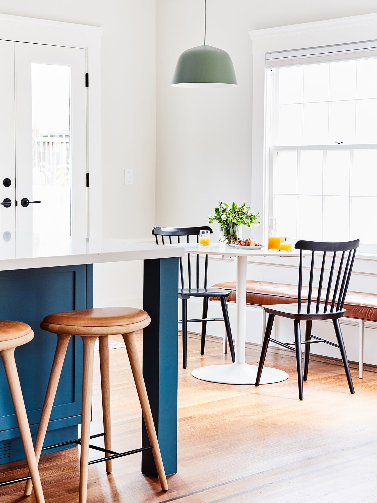
But deciding how to lay out the larger kitchen was tricky: The wall they were originally planning on tearing down was load bearing. Jung, along with a structural engineer she enlisted, had to decide what parts of it needed to remain and which could be safely removed. In the final plan, the room no longer had any right-angle corners, which left little space for upper cabinets, so the designer ultimately opted to use the kitchen’s considerable height to stack cupboards on top of one another. She carved out the additional much-needed storage space in the center island.

Jung opted for custom-made walnut cabinets in the kitchen and pantry to get a sleek, high-end look. The island, however, got a paint job in Farrow & Ball’s Stiffkey Blue. “It’s proportionally large within the scale of the room, so I thought it would be nice to do an accent color,” says Jung. While the walls were kept white to keep the focus on the cabinetry, she added texture by using a herringbone-like pattern from Heath Ceramics in the backsplash.


The tile served a secondary purpose: to contrast with some of the more traditional elements in the space. “We wanted to make sure it didn’t feel stodgy or too stuffy,” Jung says of the design. It also paired well with the white countertops, made from ultra-tough Caesarstone. “We really like the look of marble, but it just wasn’t going to be realistic,” says Yeung, who had a similar quartz benchtop in her last home and loved how low-maintenance it was.

The finished room is airy, bright, and perfect for entertaining. “We’re able to hang out with everybody who is eating at the dining table and be in the kitchen at the same time,” says Yeung. Sometimes, a happy medium turns out to be what everyone needed all along.
See more inspiring renovations: These Are the 17 Best Before-and-After Transformations We’ve Seen My $40K Exterior Remodel Was an Unexpected Lesson in Landscaping We Financed the Renovation of Our Dreamy Desert Inn All by Ourselves