9 Kitchen Cabinet Color Ideas That Outshine Classic White
When risk-taking pays off.
Published Dec 31, 2021 1:00 AM
We may earn revenue from the products available on this page and participate in affiliate programs.
Committing to a cabinet color can feel daunting. Here’s the thing: The kitchen is likely the hub of your home, a hardworking backdrop to (virtual) dinner parties, homework help, and more. Such a front-and-center space needs to look—or, more important, feel—like a true reflection of you. And few design decisions are as personal and impactful as the palette.
Standard white fronts might be a classic choice, but there’s a whole spectrum of possibilities to consider: mellow yellow to emanate warmth, cornflower blue to create a sense of serenity, or zippy mint for an unexpected pop. We rounded up nine kitchen cabinet color ideas to get you inspired, from safe bets to statement shades. Go on, take a risk—it will be worth it.
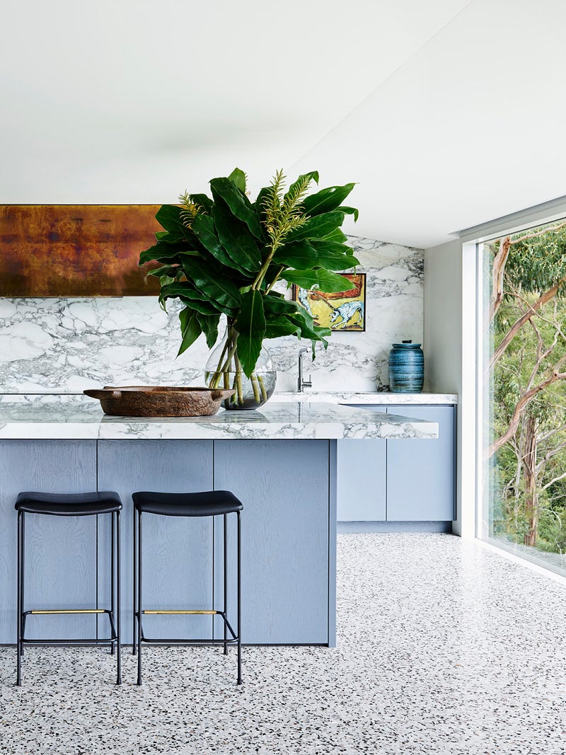
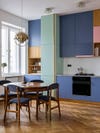
Powder Blue

The first place to look for color inspiration? Outside! Designer David Flack of Melbourne’s Flack Studio turned to nature when choosing the palette for this calming kitchen with sweeping views of the outdoors. A natural complement to surrounding greenery, blue is known to calm and pacify—ideal for those moments when there are too many cooks in the kitchen.
Spruce Green
Color conservatives, this one’s for you: Beatriz Rose of Byrdesign paired lower cupboards in Dunn-Edwards’s Black Spruce with upper cabinets painted the same creamy white as the kitchen walls so that they virtually disappear. The result delivers the richness of a deeper hue without weighing down the space.
Buttercup
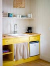
Consider sunny yellow kitchen cabinets to start and end your day on the right foot. Within color psychology, the shade is seen as bright and cheery, evoking a sense of happiness and optimism. Deanna Minich, Ph.D., and Leslie Harrington, Ph.D.—who worked as Benjamin Moore’s color and design director for 16 years—agree that a splash of yellow in the kitchen can contribute to feelings of contentment. (Who wouldn’t welcome more of that?)
Seafoam
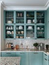
When designing custom cupboards for this London kitchen, Hubert Zandberg opted for Esmeralda by Flamant. “It adds dimension,” he says. “It’s basically one of our favorite colors.” We agree—especially when offset by a speckled terrazzo countertop and backsplash.
Bubblegum
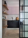
Shiny surfaces do wonders for opening up small spaces, even teeny-tiny galleys. The light-reflecting, high-gloss kitchen cabinets in this Rio de Janeiro apartment make the room feel bigger and brighter. Keeping the sheen-y pink to only the upper cupboards draws the eye up, creating the illusion of a higher ceiling.
Mustard
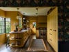
Deep yellows, earthy oranges, and rusty reds warm up a room, which Minich says “enhances personal connection.” What better place to foster a feeling of togetherness than the table where we gather. Carry the hue throughout your walls, open shelving, and range hood to further the effect. (It’s difficult to read the confines of a room when everything is one color, so it seems larger.)
Mint
Singer and artist Lourdes Hernández goes by the stage name Russian Red, but her carefree Los Angeles kitchen is a testament to the versatility of green cabinets. Green signals growth, harmony, and nature, and this pale pistachio hue—Moth’s Wing by Behr—serves up a healthy dose of zenlike calm.
Rust
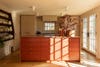
Painted a rich burnt orange, a clean-lined kitchen island makes a stunning statement in this Workstead-designed Hudson Valley, New York, Colonial. Grounded by wood paneling and cabinets in a rustic beige, this easy-to-live-with color functions almost as a neutral itself—commanding attention without stealing the show.
Technicolor
Craving a bolder move? Take a cue from this Polish apartment kitchen designed by In Architekci. Featuring three playful hues, its color-blocked cabinets double as an accent wall. Use a favorite rug, throw pillow, or piece of art as a jumping-off point to choose a palette that works for your space, then configure it to your own setup.
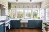
Charcoal
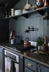
Begone, granite countertops. By painting their cabinets chameleon green-gray (the hue pictured above is Thunderous by Sherwin-Williams), Julia and Chris Marcum allowed the dark, circa-2000 material to blur into the background. “When we laid out the swatches, I think it only took us about 10 minutes to say, ‘That’s the one,’“ notes Julia.
Peach
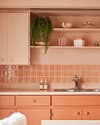
This punchy hue has the power to make even the most dated cabinets feel new again. Exhibit A: the new June Motel. Business partners and now seasoned renovators April Brown and Sarah Sklash took an ultramodern, monochromatic approach in their resident kitchen by coating the countertops and open shelving in a slightly lighter pink shade.
This story was originally published in November 2020. It has since been updated.