The Paint Collection That Convinced Garance Doré to Go Bold in Her L.A. Home
New home, new hues.
Published Oct 14, 2019 3:21 PM
In partnership with
We may earn revenue from the products available on this page and participate in affiliate programs.
For photographer/artist, style icon, and Atelier Doré founder, Garance Doré, finding the right paint colors for her Los Angeles home was no simple feat. In fact, it was an exercise that prompted her to step outside of her comfort zone of black, white, and neutral shades. Thankfully with help from interior designer Sarah Sherman Samuel, our Spring Issue cover star was able to infuse varying palettes of lively hues, from crisp to cozy—that enliven her rooms throughout. Curious to see how the illustrator found her perfect hues? Come along with us for a peek inside…
If you follow me, you’re probably familiar with my illustrations. And you know they’re usually in black and white. That happens to be my style, but it’s also (and mostly) because I think there’s a whole art to working with color. Mixing color is a real skill, and for me it’s one of the most difficult. That’s why people go crazy for the colors in Saint Laurent. Making colors clash, bringing them together, making them communicate, knowing how to let them express themselves – it’s really a whole other world.

When I was thinking about renovating my home, I had California in mind, and the peace I came here to find. To me, a home is a representation of who we are. So, at first, true to my taste, I was envisioning nothing but white and neutral colors. But over time, as I had more experience living with the sun, I began to realize that here in Los Angeles, light is everywhere. Sometimes you feel like protecting yourself from it. And colors can be real allies.


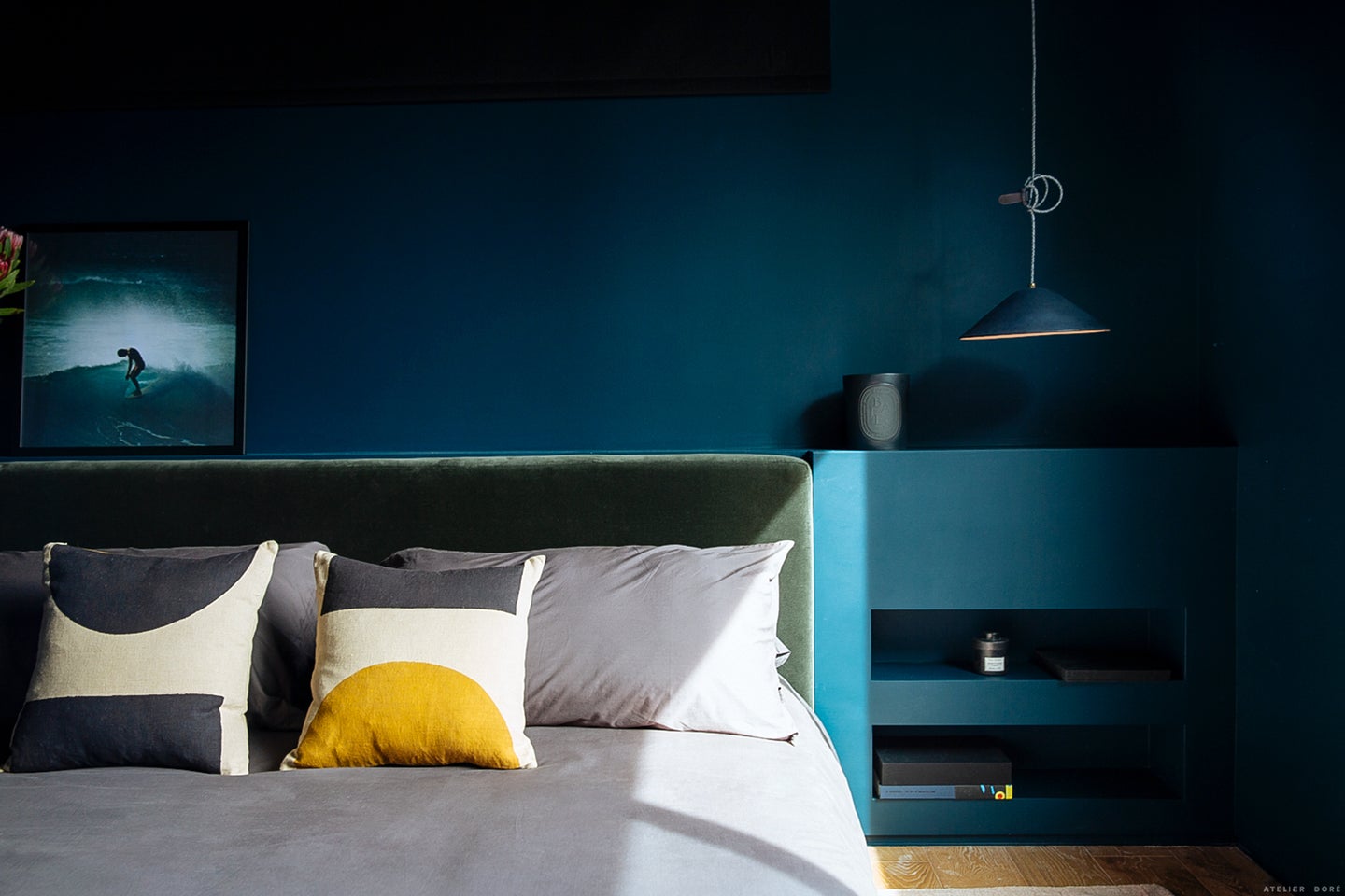
I started to imagine a room in contrast to all that white. I’d decided to really start taking my sleep seriously, and I wanted to create a dark, deep, welcoming space. A room just for me – and if you really want to know all the details — a room that symbolizes our interior worlds. The yin and the yang, the balance between shadow and light. That idea moved me to rethink my desire to make everything white. What other rooms could I bring to life with color?
My studio was the first thing that came to mind. But, that brought up an entirely different question. My studio is located at the southwest corner of the house and has enormous windows… so the light can sometimes be blinding. I wanted to maintain that luminous, bright energy, but I wanted to absorb it and soften it a little… So, what to choose? That’s when I decided to use Color Collection.

When you’re an illustrator, you often use color palettes as a tool for putting colors together, and as I was saying before, color can be intimidating. But, no need to be ashamed. Even the greatest artists use color palettes. Sometimes it’s just a starting point, a place to find inspiration. And sometimes it’s the basis for an entire work of art.


When Sarah and I discovered HGTV HOME by Sherwin-Williams’ Color Collections for 2019, it didn’t take us long to decide which one would work best for us. The “Everyday Balance” palette has just about everything we’d been hoping for. Dark colors alongside soft, soothing colors. Just what I’d been dreaming of.

So, I threw myself wholeheartedly into this new color scheme and honestly, the results blew me away. Not only do the colors work super well together (thank you, Color Collection!), but the ambiance is exactly what I was looking for. Depth and softness. My mantra for 2019, basically!