3 Zesty Color Combos We’re Stealing From an Ultra-Cool Roman Hotel
Italians do it better.
Updated Sep 20, 2018 12:05 PM
We may earn revenue from the products available on this page and participate in affiliate programs.
When Kaja Osinski, co-owner of Rome’s Condominio Monti, first happened upon the property that would become her kaleidoscopic hotel, it was an ’80s baroque mishmash of Roman god statues, imitation stucco, heavy wood furniture, and faux gold.
“The idea was to get rid of the superfluous and, above all, to avoid a fake Roman kitsch effect,” she says. “We are in the oldest district of the city of Rome—from our rooms, you can see the Colosseum—and the contrast between contemporary and ancient has immediately fascinated us.”
With the help of local architects and makers, she created a wonderland where each room has its own eye-catching hue and bold and soft colors are blended into totally unexpected palettes. Here, we asked Sue Wadden, director of color marketing at Sherwin-Williams, to suggest three daring color combos to replicate the happy-go-lucky vibe at home.
Mediterranean Coast

“The rich terra-cotta Cavern Clay is a warm and welcoming color that it instantly puts you at ease,” says Wadden of the paint brand’s color of the year, a shade that’s also prominent in the hotel’s Quadrupla room. “It was extremely popular in the ’70s and has a laid-back vibe. When paired with crisp white, warm wood, and jewel-toned accents, it feels much more contemporary.”
For a combo reminiscent of the vibrant colors on the Mediterranean coast, pair it with an azure hue like that of the throw blanket. “A lapis lazuli blue like Blueblood is anything but subtle. It commands the eye and instantly upgrades a space with a sense of modern luxury.”


Vibrant Coral Reef

“I love the use of a color like Eros Pink as an exuberant, unexpected ceiling accent,” shares Wadden. “Waking up to this mood-boosting shade would be such an energetic way to start the day.” In one of the double rooms, the bright hue is grounded with deep maroon and dark turquoise, and we suggest following suit.
“Turkish Tile is an oceanic aqua that imbues a space with a sense of relaxation,” Wadden says. “In a room with a variety of colors and patterns, this shade captures attention and offers a visual breath of fresh air. Since it is reminiscent of the sea, it plays well with sandy and sunbaked earth tones as well as poppy corals and seafoam greens.”


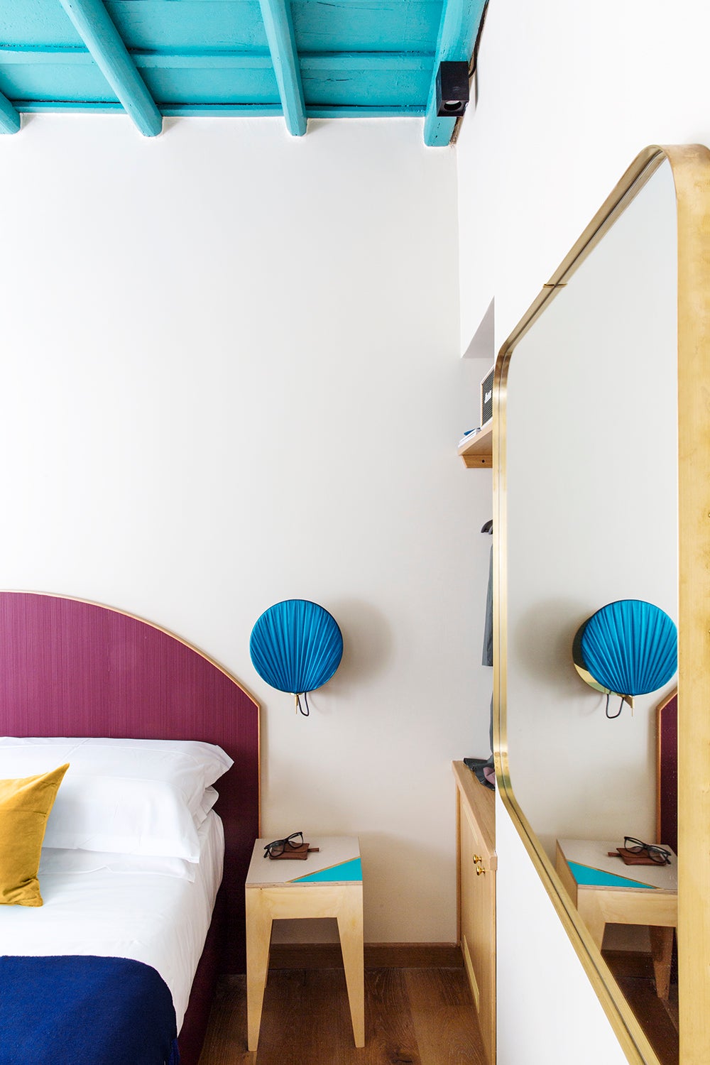
Serene Sea Life

In another double room, seafoam walls are paired with a magenta wall-to-wall headboard, a match made in color heaven. “A bold Juneberry manages to feel fun and deeply luxurious at the same time,” says Wadden. “Its versatility is demonstrated by the wealth of colors it complements, everything from watery blues and dusty pastels to more saturated shades like coral, mustard, and botanical green.”
The walls provide a calming effect against the other bold hues—Waterscape will do the same. “The hazy blue-green shade has a meditative quality to it. Using a bright pastel purple like Juneberry as an unexpected accent keeps the space light and fun.”


Discover more color palettes we love: 7 Paint Color Ideas We Love From New Orleans’s Glamorous New Hotel Get Summer Sunset Vibes With These 6 Paint Colors 3 Colorful Lessons We Learned From L.A.’s Buzziest New Hotel