An Ombré Staircase Is Only the Beginning in This Colorful Ohio Home
When bold design pays off.
Updated Oct 11, 2018 2:30 PM
We may earn revenue from the products available on this page and participate in affiliate programs.
When it came time for my husband, Marc, and I to pull the trigger on purchasing our first home last year, we hesitated a little. The house we were buying, a 100-year-old duplex in Columbus, Ohio’s German Village, had previously been flipped and finished with features that we considered to be “too vanilla.” But we saw the potential to reenergize the space with personality, so we rolled the dice—and I’m glad we did!
To start, we worked to restore many of the original elements. We removed walls, reexposed the brick, and excavated several layers of flooring until we found the original hardwood. We painted everything white to let the bones of the space shine a little brighter. Throughout, our design choices remained focused on mixing: high and low, polished and unfinished, vintage and modern, dark and light.
Looking back, all of my favorite spots in the house are the ones where we took risks with design details that packed a punch. We mashed up more neutral moments with injections of mood-boosting color and pattern, we went bold with our kitchen wallpaper, and we made a splash with our shower tile. After all, when it comes to playing “game of homes,” the winning strategy is always self-expression, and sometimes that means identifying design rules to break along the way.
At the one-year anniversary of moving into our home, what better way to celebrate than to reflect on the journey by sharing some top lessons learned.
Unearth Original Features

The first step for our two fireplaces was to let the original details speak for themselves, which included removing new plaster in order to expose old brick. Once we were able to get back that aged character, the decor needed to follow suit. Our fireplaces might not be functional in the traditional sense, but we made them work for us in a different way: One as a bar and the other as a library for our growing collection of new and vintage records. I consider it “house music” redefined.
We also added personality using art that we leaned against the living room wall. As far as I’m concerned, floor art is the new wall art. I think leaning rather than hanging helps the space feel more effortlessly collected. It also makes it easier to move things around later if you change your mind, which I often do.
Make a Strong First Impression
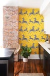
The zebra wall in our kitchen is one of a few accent walls in our home. We positioned this detail strategically to be a burst of energy as you walk in the room, but not to be visible from all angles (so that the total room doesn’t feel too busy). You can see the wallpaper from the front door, so it was really important to do something bold to set an expressive tone. The wallpaper itself pays homage to Margot’s bathroom in The Royal Tenenbaums (one of my favorite Wes Anderson films), but we riffed on the idea with a yellow background instead of red. I’m not sure why anyone ever described the color yellow as mellow; anything yellow brightens my mood, probably because it reminds me of sunshine.
Mix, Don’t Match
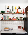
You know the saying “If it ain’t broke, don’t fix it?” Not true here. The kitchen started off with a more traditional black-and-white aesthetic that felt a little too plain, so we converted one wall of cabinets into custom open shelving to spice things up. Open shelves created the opportunity to mix together some key ingredients that help make the kitchen the heart of the home for us: cookbooks (yes, we actually use them), wineglasses (yes, we most definitely use them), and a few fun decorative pieces found, purchased, or passed down from family. When it comes to decorating shelves, my approach is similar to how I order food at a restaurant tapas-style: I’d much rather curate a few tastes from several different flavors than commit to only one course.
Step Up Your Stair Game
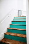
One of the most fun parts of renovating was finding ways to personalize unexpected spaces, including splashing some color into our stairwell. We already loved the well-worn character of the original wood steps, but I couldn’t help feeling as if we needed to add some energy by throwing a little shade. We picked out a few teal hues to paint into an ombré effect, with each step up getting a bit lighter. After a long day, the stairs add a spot of creativity back into our evening ascent.
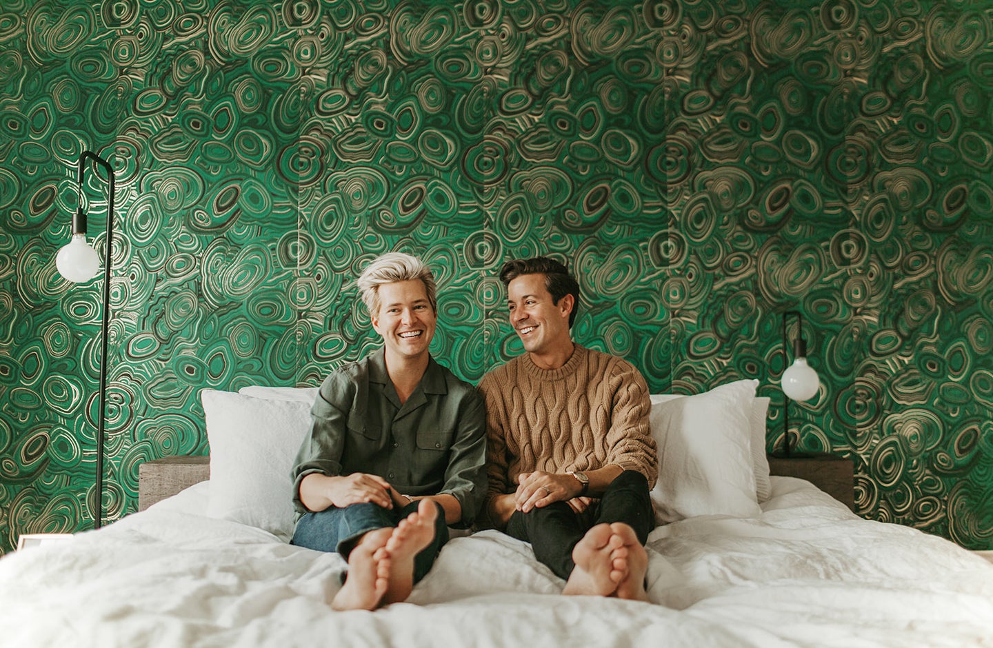
Embrace Both Dark and Light
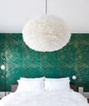
I think it’s important to approach each room by thinking about how the space will be used and how it makes you feel. A bedroom is the last space you see before going to sleep and the first one you see when you wake up. We opted for an accent wall in a deeper green shade in lieu of a headboard, giving some depth and darkness to the room as you turn in at night. In the morning, you wake up to a feather pendant light and fluffy linen bedding that makes you feel like you’ve slept on a cloud.
Study Abroad
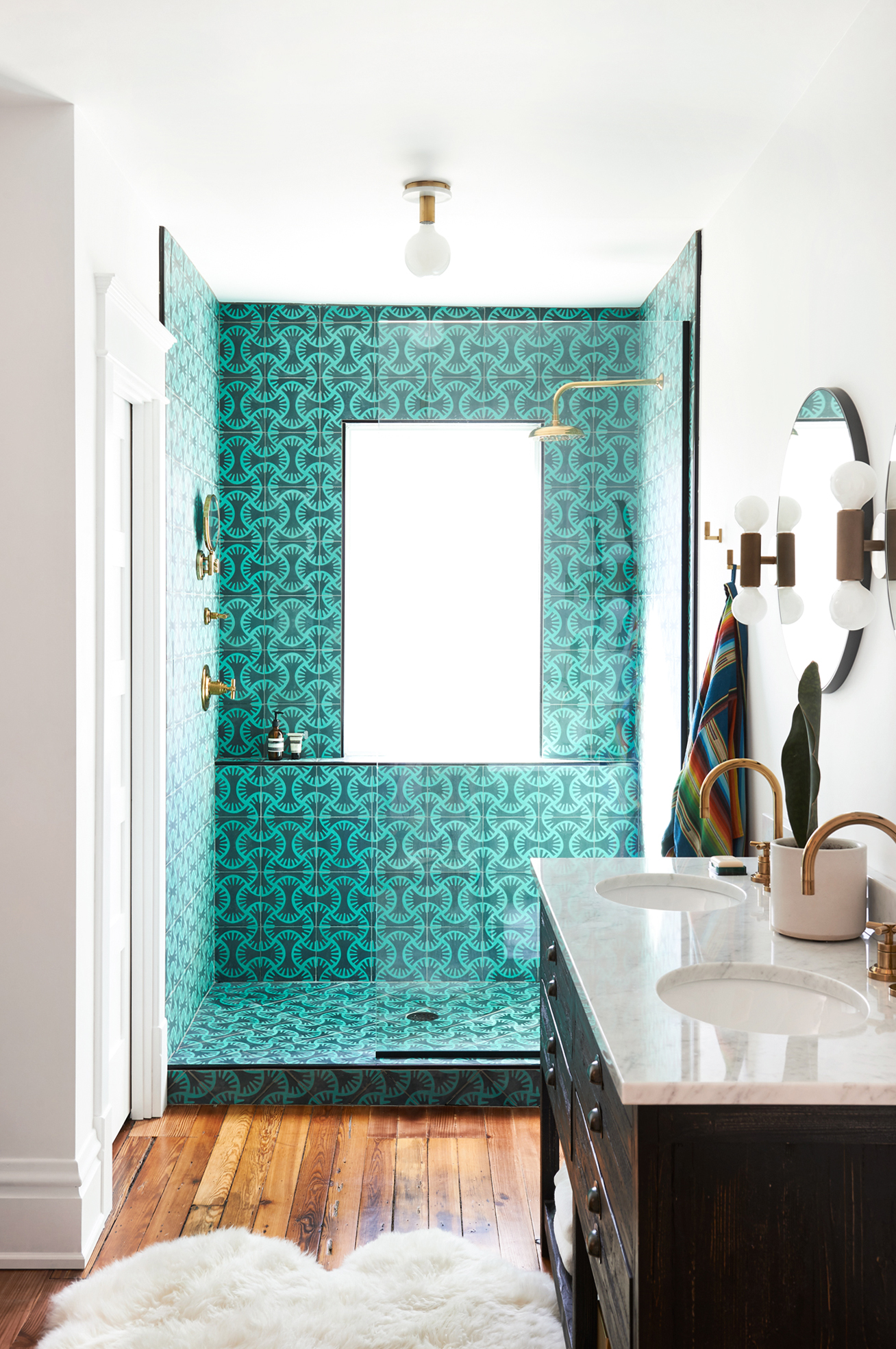
The master shower is my favorite spot in our whole home. We wanted to add brightness to our morning routine with a powerful, energetic design, and we were inspired by patterned tiles from our travels to Marrakech two years ago. Anyone who knows me will tell you that patience is not my strong suit, but I can confidently say that the cement tiles, custom-made in Morocco by Popham Design, proved to me that the right details can be worth the wait. We kept it simple for the rest of the bathroom fixtures and finishes, opting for brass to maintain warmth and round shapes to play off the whimsical tile pattern.
Make It Your Own

A closet is always a great opportunity to make a space your own since your clothes already showcase your personal style. I consider picking out what to wear to be a creative endeavor, whether it’s getting dressed for work, packing for a vacation, or slipping into sweats for the weekend. We treated our master closet as an extended dressing room, organizing clothing and shoes by color for both visual and practical effect.
Find the Right Partner in Crime

I definitely recommend renovating with a significant other at least once in your life. We learned so much about how to build a space together that not only suited our individual preferences but also satisfied our needs as a couple. The kitchen was very important to Marc, as the chef in our relationship, whereas I was very focused on designing an inspiring closet. In the end, our collective design process was a balance of building out the story of each room while finding ways to showcase some of the pieces that reflect our personalities and make us most at home. With the renovation complete, there’s really only one thing left on our house to-do list at this point: enjoy living in it!
Tour more high-personality homes we love: Graphic Wallpaper and Sculptural Chairs: An L.A. Family Home That Wows This Bright and Happy Manhattan Beach Home Has Accent Walls Down Pat Spanish Style Meets Surfer Chic in This Eclectic Home