Tour a Technicolor Home That Radiates Good Vibes
You need to see the wallpaper mural in the bedroom.
Published Jun 29, 2018 4:10 PM
We may earn revenue from the products available on this page and participate in affiliate programs.
The first thing you notice about this Manhattan Beach home is definitely the color.
“The homeowners handed me a piece of multi-colored, geometric wallpaper early on, and it really was the jumping off point for the whole project,” explains Caitlin Murray of Black Lacquer Design, who created the 4,100-square-foot space for a family of four.
In fact, the use of color and pattern is so striking that you probably wouldn’t believe what it looked like before: An entirely blank canvas, courtesy of a new build that came equipped with whitewashed walls and clean lines. Murray worked with the architect and the enthusiastic homeowners to design a space that, in her own words, is “an adventurous marriage of modern minimalism and maximalism.”
“The clients were game for using color in a big way, which isn’t a super common situation, and were really responsive to bold ideas. In fact, they even designed the ombre pattern for the shower tile in the Jack and Jill bath,” says Murray.
Tasked with putting together a home that was modern, colorful, and whimsical while being functional and kid-friendly at the same time, she pulled from the rainbow and incorporated both vibrant and desaturated hues.
Certain spaces are more modern minimalist, such as the gorgeous contemporary kitchen, while others throw all pretense of restraint to the wind, like the bright purple bathroom.
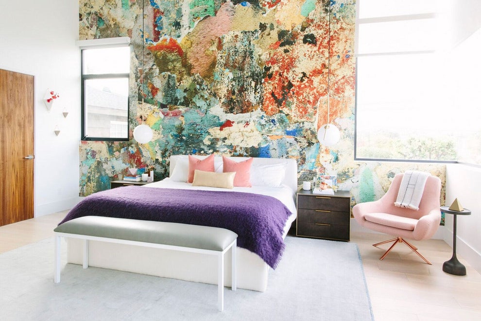
The master bedroom—Murray’s favorite—is a clear standout, thanks to the juxtaposition of the saturated walls with the lighter, pastel-filled space; the custom
wallpaper accentwall behind the bed features an abstract paint design and looks like it belongs in an art museum.
“If you look closely, you’ll notice that all the hues incorporated here are echoed in the guest bathroom wallpaper, which [was] the original inspiration for the house’s color palette,” says Murray of the wallpaper mural. “The wall behind their bed was an ideal blank canvas for something colorful and textural that yielded a high impact, creating instant definition and interest. It’s a mural that I had custom scaled for that wall, so the fact that there’s no repeat makes it look more like a 3D installation than flat paper.”
Read on to discover more insight into how Murray incorporated color in the home; plus, her tips on replicating it yourself. Whether you’re looking to go all out with a similar statement-making wall or want to infuse color in smaller ways, you’ll want to pay attention.
Broadly speaking, can you tell us about your use of color in the home?
Adventurous color choices [were] definitely the theme. I wanted to see a lot of variation in color throughout the home, and I balanced it and made it pop by making softer, more subdued choices around those bursts of color.
Did you stick to a palette or approach each room differently?
While I approached each room as its own opportunity to make bold choices, it was equally important that the home formed a cohesive, conceptual whole. To accomplish this, I used the geometric wallpaper in the downstairs bath to define the color palette.
What are your tips for design rookies looking to dip their toe into a more colorful aesthetic?
If you want to incorporate color by way of paint, try some color on for size in a smaller space first. Once you gain the confidence there, it might be easier to take the plunge. Otherwise, small accessories are a great way to introduce color to your home in a way that minimizes the chance for buyer’s remorse. It sounds old school, but a fail-safe way to choose multiple colors together is to reference the color wheel for complementary hues. Tried and true.
What are your tips for mixing and matching prints?
Number one tip: Never have two prints competing for attention. You always want to have a visual point of focus, so try to introduce one pattern on a larger scale and another on a much smaller scale. It’s also a good general rule to look for prints that have a unifying motif—whether it’s a similar hue, texture, or pattern.
What are your tips for settling on a color palette?
Hunt for one item that you really love, and let that dictate your palette. A wallpaper or great piece of abstract art [is] the perfect catalyst for introducing a color story. That way, you can sort of ride the coattails of someone who has already done the hard work of figuring out which hues work great with each other. I think a lot of times, people know what they like when they see it but have a harder time getting there from scratch.
What are your thoughts as using color as a staple, in larger more investment-worthy pieces, versus using it as a trend with the decor?
I think the most foolproof trick is to simplify your backdrop. Start with white walls and neutrals and introduce pops of color in your decor to that foundation. I know it might sound a little counterintuitive but it produces the most balanced effect overall because a clean, white canvas allows you to add whatever you want. It also allows more freedom later on when you’re looking to refresh a space.
Personally, I love a punchy statement sofa. I got teased by someone on my team once when she pointed out that we have multiple blue velvet sofas in our portfolio. When it comes to investment pieces, I see more clients having regret over making the safe choice (a big gray sectional, for example) than taking the plunge for something alluring that was a bit outside of their comfort zone.
How do you incorporate vibrant hues without making a space feel overwhelming?
Add [them] in either in small doses or in large, limited areas. I love to create little jewel boxes of color, and small spaces present the perfect opportunity to do this. Go all out with patterned wallpaper and bold paint choices in little nooks, powder rooms, and entryways.
Conversely, you can add a ton of personality and depth to a room by immersing a large wall or ceiling in an impactful color or colors. Either way, but not drenching your entire home wall to wall in color, you allow or these moments to really pop in a balanced way.
See more home tours:
Did We Just Find Our Dream Bathroom?
West Coast Vibes Meet Japanese Simplicity in This
Custom KitchenIn 560 Square Feet, the Colorful Home of Small Space Dreams
Learn to love your inbox again—sign up for Domino’s daily email.