Would You Sacrifice a Big Bedroom for a Dream Kitchen? This Couple Did
The first piece of the floor plan puzzle.
Updated Oct 11, 2018 6:26 PM
We may earn revenue from the products available on this page and participate in affiliate programs.
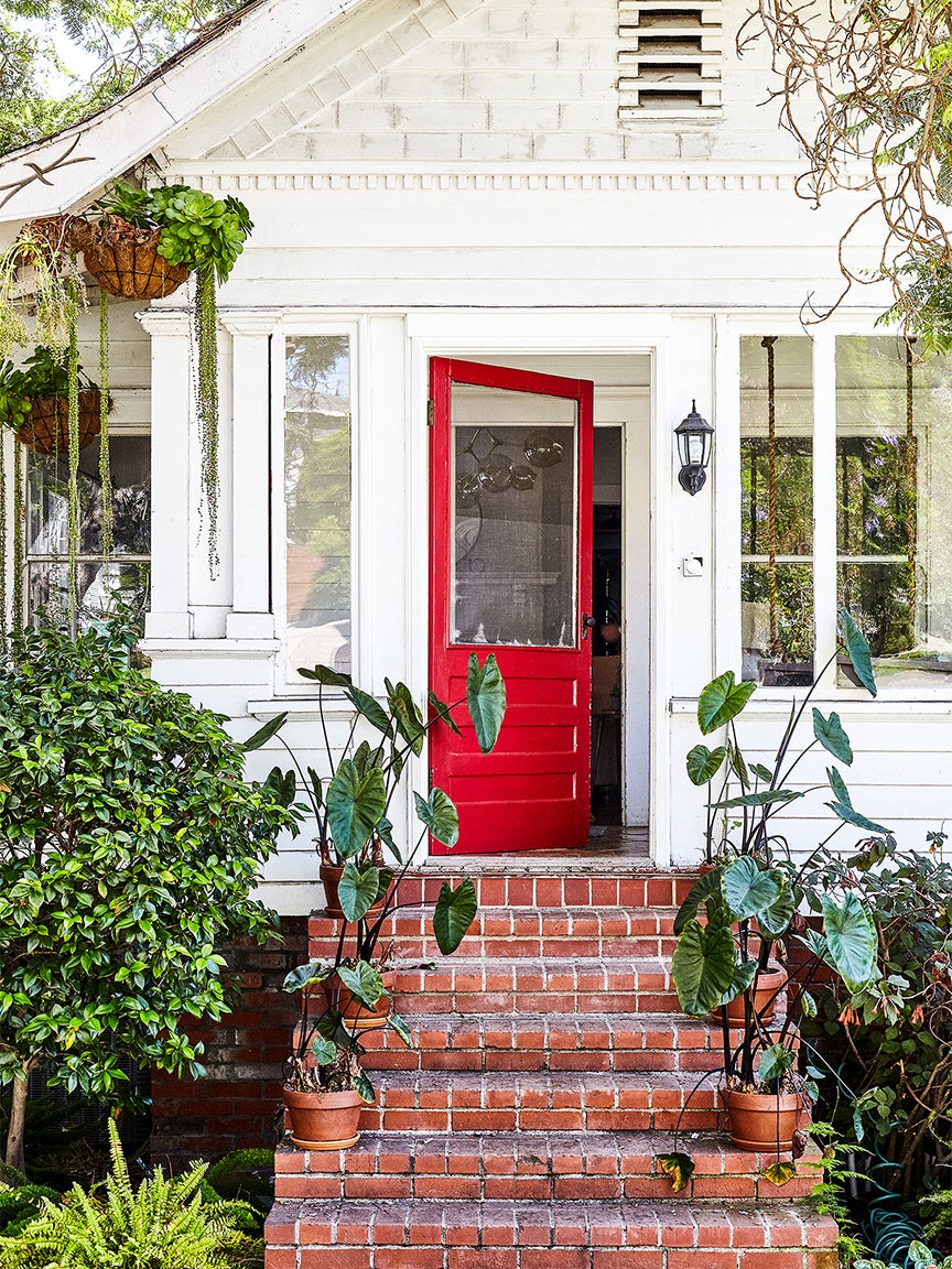
The day Natalie Bruss went into labor with her daughter, Frankie (now 2), a plumber was still working on her 1904 Craftsman’s only bathroom. Eleven months earlier, she and her husband Chris had fallen in love with the house’s cherry red front door and blooming jacaranda tree during a walk around the Santa Monica Historic District where they lived. The interior, as it turned out, wasn’t as picture-perfect as the curb appeal.
To save on costs, they planned to do much of the badly-needed updates themselves, hiring only a consulting architect, Tim Barber (who had experience with heritage buildings), to guide them and relying on their contractor, Dave Campbell, for the work. But the following month, the couple—who were already parents to a then-two-year-old boy named Jack, and two rescue pups, Roxie and Woody—found out they were pregnant again. It was time to call in additional help. With a referral from friends, they brought in Beatriz Rose of Byrdesign to reimagine the worn hardwood floors, non-functioning fireplace, and hole in the roof as a spirited family home.
Renting Out Unused Space
The property was subdivided into three rentals that once catered to early 20th-century fishermen, so Chris and Natalie decided to keep the two downstairs apartments and lease one to a close friend for the time being. “We loved that we were able to move into our forever home now, but have rental income until we were ready to gradually take over the whole house,” says Natalie. The remaining basement studio became a vacation rental and in-law retreat—though since lockdown, they turned it into an office (Chris is the president of Funny or Die and Natalie is the founder of BrussCo, a media venture and brand strategy firm that’s invested in companies like Haus Aperitif and Yumi baby foods).
Reworking the Layout
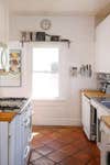
Meanwhile, the third apartment’s upstairs floor plan needed immediate attention: The main bedroom got the best afternoon light, but it was disproportionately large (the result of an earlier renovation) and had the only door that opened up to the backyard. The galley kitchen, on the other hand, felt cramped, and there were no stairs to connect the upper floor to the units below (although Barber suspected the original layout would have included one). “His clue was a built-in bench next to the piano, which would have been part of the staircase,” explains Rose.
The architect demolished a series of deep closets to reintroduce the steps, while Rose moved the kitchen into the main bedroom and turned the former galley into a kids’ space. Another front bedroom became the parents’ retreat, complete with a bathroom with jack-and-jill doors to fake an ensuite feel.
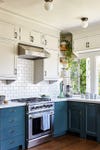
Focusing the Kitchen on the View
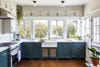
Inset shaker cabinets wrap around the new kitchen in an L-shape, reintroducing Craftsman details to the once-characterless space. “The row of original ribbon windows was counter height so it begged for a sink overlooking the garden,” says the designer of the floorplan. She didn’t want to block the view but needed extra storage. Enter: shallow upper cabinets painted the same color as the walls so that they virtually disappear.
The lower cupboards, however, are covered in Dunn Edwards’ Black Spruce, save for the doors under the sink. (Its perforated brass screen, Barber’s suggestion, helps reduce dampness while lending a rustic touch.) “We decided to forego an island to have space for end-of-day dance parties with the kids,” Natalie adds.
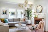
Forgoing a Traditional Dining Space
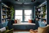
The family didn’t want a formal dining room, so Rose dreamed up an English library instead. “It was an aha moment,” says Natalie, who filled the shelves with art projects, ukuleles, child-size bagpipes, and books for both parents and kids. “We made it a magical all-purpose playspace, study, music room, conversation nook, and overflow dining area.”


But first, Natalie turned to an oil painting by her grandmother for wall color inspiration and pulled over 20 moody green and blue hues. She landed on Farrow & Ball’s Inchyra Blue after collecting votes from friends and relatives. The dark shade anchors the central gathering spot (it’s connected to the kids’ bedroom, laundry, kitchen, stairway, and living area). “We read stories every night on the window seat during golden hour,” says Natalie. “It’s nice to imagine the families that were here before us doing the same things.”

Introducing Domino’s new podcast Design Time, where we explore spaces with meaning. Each week, join editor-in-chief Jessica Romm Perez along with talented creatives and designers from our community to explore how to create a home that tells your story. Listen now and subscribe for new episodes on Thursdays.