This Once-Boring Color Is Getting a Rebrand (and We’re On Board)
Five fresh tips to try it at home.
Updated Oct 12, 2018 1:18 PM
We may earn revenue from the products available on this page and participate in affiliate programs.
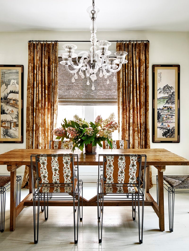
“What’s your favorite color?” is one ice-breaker that never gets old, even though the answer is pretty predictable: blue, green, or, on occasion, yellow. But what about brown? It wasn’t until we met Melissa Colgan, a designer who loves every shade, from chestnut to chocolate, that we started to question its drab reputation.
“Every space needs a bit of brown,” says Colgan, whose Washington D.C. apartment is filled with sepia-toned furnishings and coffee-tinged fabrics. Colgan was methodical about her approach, juxtaposing dark chocolates with ochre, raspberry, and periwinkle—softer pastels that pick up on the patina of antique textiles. “The key to finding the right shade for your space is in the undertones,” she says. Sure, it mightn’t be the 2020 Color of the Year, but we think this unexpected hue deserves a rebrand. Start with these five fresh tips to try it at home.
Pair It with Yves Klein Blue
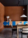
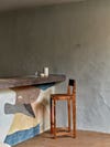
There’s a whole spectrum of browns out there—walnut, mocha, sienna–and each reacts differently to other colors. The best place to start, Colgan suggests, is with the color wheel. “Think opposites. Browns with a bit of orange in them will look best with blues,” says the designer. Exhibit A: The tiled walls in this contemporary dining room. To cool off the copper-bronze undertones, Australian firm Kennedy Nolan incorporated ultramarine shapes in the cabinet.
Brighten It with a Touch of White

White paint serves two purposes in designer and blogger Liz Kamarul’s entryway: It creates the illusion of real archways above the door frames and visually lightens the walls, which are swathed in Behr’s Toasted Bagel. A creamy, oversized tapestry from Kuddrig Home and embellished rug tie the whole thing together in a neat bow.
Amplify Texture with Industrial Materials
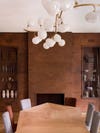
Pierre Yovanovitch is no stranger to paint (his new book is practically a guide on all the creative ways you can use it), but in this Brussels house, the Paris-based designer left the brush at home. The wall and mantel in the dining room look like they’re covered in Venetian plaster, but what you’re actually seeing is patinated steel. A far cry from a rusty bike left out in the rain, the burnished cocoa tones exude the same warmth as a beloved leather sofa.
Practice Restraint
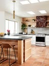
Brown can quickly skew “bad 1970s,” so the duo behind Colossus Mfg used the color sparingly in this Arizona home. The pair chose Cle Tile’s shiny, scorched zellige option for the hood rather than the entire backsplash to create a funky statement pop against the streamlined wood shelves.
Soften Harsh Surfaces
Though technically an earthy color, brown doesn’t always act like other neutrals. “It’s a blend of primary colors (red, yellow, and blue), so it can make white and gray feel less sterile,” says Colgan. Consider a material as grim concrete: This Mediterranean restaurant in Copenhagen is located in the basement of a building, but the designers at Frama gave the cloudy, cold room life by painting the bar in relaxed shapes of sandy-yellows and rich caramels.
Blue has been a front-runner for far too long. Next time you’re asked to play favorites, shock everyone with this sophisticated pick.
See more stories like this: Here’s Why You Should Reconsider Decorating With Beige Your Official Guide to Every 2020 Color of the Year Travertine Deserves a (Second) Chance