Tour a Brooklyn Townhouse That’s Definitely Not Afraid of Color
Plus, tips on how to implement bold hues in your own home.
Published Aug 31, 2017 10:30 PM
We may earn revenue from the products available on this page and participate in affiliate programs.
A gut renovation can be a daunting task—particularly when done for a family with three children. But Tamara Eaton of NYC-based design firm Tamara Eaton Design was definitely up for the challenge.
“There is some architectural molding that was preserved, and some of the windows are historic, but everything else is new new new!” says Eaton. “Townhouse jobs often take years, as you’re still working with those clients for years afterward to keep making changes. It’s the kind of thing that never ends.”
By working hand-in-hand with architects and closely following the clients’ wishes, Eaton completely made over the four-story home. The result is a home that’s fun yet functional, somehow effortlessly blending colors and patterns of all kinds in a manner that looks both intentional and put-together.
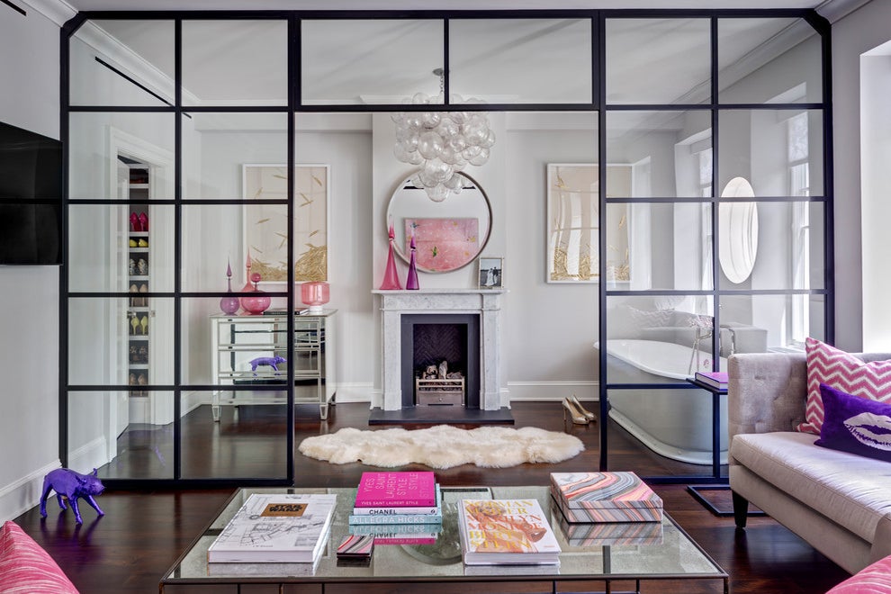
In this image: Horchow Marissa Mirrored Console; Benjamin Moore wall paint in “Collingwood”
We spoke to Eaton to get the backstory on this bright and colorful home.
In this image: Horchow “Swag” Velvet Chaise
Can you tell us about your decor inspiration going into the renovation?
We’re always open to what clients want, and we look a lot to the existing architecture to see how we can respond to that, but a townhouse is designed differently than, say, a Tribeca loft. We looked at the setting of what the space is so we weren’t doing something totally divorced from what the place was.
But that said, we’re certainly not shy of color, and the client was also really into that—she loved pink and purple, which are my favorite colors too—and so making it really playful and colorful and happy was something the family loved. We were building a family home for them, not a museum.
In this image: Oly Studio Muriel Chandelier; Made Goods Emma Mirror
Can you point to specific spots where you really went for it with the color?
The parlor has footstools shaped like elephants—even the parlor shouldn’t be too serious! Adults can have fun too and not feel like they’re sitting in their grandmother’s house. We really wanted to make sure that every space in this house felt like a family space instead of either strictly formal or strictly informal.
If you had to pick a phrase, how would you describe the finished decor?
Colorfully eclectic modern.
In this image: Natural Curiosities Paule Marrot Feathers Print; American Leather Henley Sofa
One thing that really stands out about this home is how it incorporates a lot of punchy colors, patterns, and eclectic accent pieces, but it still looks cohesive and flows well. How did you make that happen?
One thing that’s really important is to set the tone architecturally in a very similar fashion. I love to have a more cohesive base palette, so we keep the trim color pretty much the same, and the walnut floor is present throughout the entire house. We picked a few general paint colors in the same tone throughout the house, which allowed us to have a cohesive voice and still play with color in each room.
In this image: Gray Malin “Two of Hearts” artwork
How about those who want to try decorating with dramatic colors but may not be fully committed—any tips you can share?
It’s not for everybody, but what you can do easily is find small pockets in your house to decorate—so for example, the front entry vestibule of this house is painted black. You never hang out in the front entry vestibule, so you can have a moment of something really dramatic there. Or in the powder room, for example, we did crazy wallpaper because people don’t spend a lot of time in there. It’s really about creating little moments in your house that you don’t have to see every day.
In this image:
serena and lilyPondicherry Headboard in “Shell Pink”; Schumacher Imperial Trellis II Wallpaper
One such moment we love is the free standing bathtub seemingly situated in the middle of a sitting room. Is there a story behind that?
Well, how beautiful is that window? I don’t know anyone who would want to sit in the bathtub and look at the loo, so we put [the tub] outside the bathroom. That’s actually located on the master floor so you can close off that whole space, and it connects to the master bedroom, bathroom, and sitting area. It’s a really nice flow of space.
Looking at more classic elements like the beautiful crown molding and the marble fireplace juxtaposed with a more modern feel through other pieces throughout the home, how did you navigate that balance between old and new?
The architect did the fireplaces, which weren’t overly traditional, and how we reacted to that was incorporating softer pieces that weren’t explicitly modern, but felt a little more tactile. So for example, that big bubble light fixture felt to me a little like bubbles coming out of the bathtub and it didn’t feel modern or traditional, just well-crafted. That balance between the sleeker things, like black steel and glass elements, and the softer bathtub or light fixtures and pops of color works well.
Do you have a favorite part of the finished home?
I have this total crush on the Italian glass-looking bottles; they’re all hand-blown in LA, and you can get custom colors. There’s something that feels so sculptural to them; just really clean and striking with punchy colors. You only need two or three in a room, and they make a big impact.
In this image: Joe Cariati Rouge Genie Bottle Decanter; Joe Cariati Rouge Tear Drop Petite Decanter;
Images by Francis Dzikowski Photography.
See more home tours:
This Designer Built Her Dream Home From ScratchTour a Monochrome LA Home That’s Anything But BoringThis Bohemian Nursery Used to Be a Guestroom