A Cool, Contemporary Nursery that’s Not Afraid of a Little Neon
Peek inside one of the boldest kids’ spaces we’ve ever seen.
Published May 21, 2019 5:37 PM
We may earn revenue from the products available on this page and participate in affiliate programs.
Think about the stereotypical nursery: pastel colors, a couple of carefully strewn teddy bears, maybe an airplane or fairy motif.
Now throw out all those preconceptions, and you might come close to visualizing the nursery Eileen Crossin designed for her son—but even then, as the space is so unique, probably not. Cool, graphic prints line the room; an unexpected color palette featuring a Kelly green as the grounding hue takes center stage; a neon sign with baby Greyson’s name is exponentially cooler than any woven monogram.
“I just wanted something different,” says Crossin. “I was so bored by all the white and the wood…Crate and Kids had this really great green crib. It’s sort of floating in the room so it’s almost like a statement piece! We just didn’t want the standard ‘blue with trucks’ nursery.”
Mission accomplished—the final result couldn’t be further from that cliché. The nursery was the first project Crossin and her husband undertook in renovating their 2,400-square-foot home, a colonial-style house with waterfront views, located about an hour from New York City, overlooking Long Island Sound. It’s where Crossin grew up, and for her, the importance of having a personal connection to a home extends far beyond sharing the same zip code.
In the nursery, personal elements are everywhere: an acrylic gallery frame houses a poem her mother-in-law used to read to Crossin’s husband when he was growing up, and nearby, you’ll find an image of the night sky from when Greyson was born—every one of these bits of the past are expertly juxtaposed amidst the more modern, punchy design elements.
So it’s unsurprising that one of Crossin’s favorite moments in the nursery has personal meaning. The aforementioned green neon sign that says “Greyson” was designed by a friend of theirs who is a professional calligrapher; the couple then sent it to Name Glo to have it made into a fluorescent statement piece. “It means a lot to us because it came from a special place. We’ve used [a replica of the sign] on his birth announcement, we’ve used it on his personalized stationery… we should also probably get a life sometime soon,” she laughs. “But until he has his own signature, he has this.”
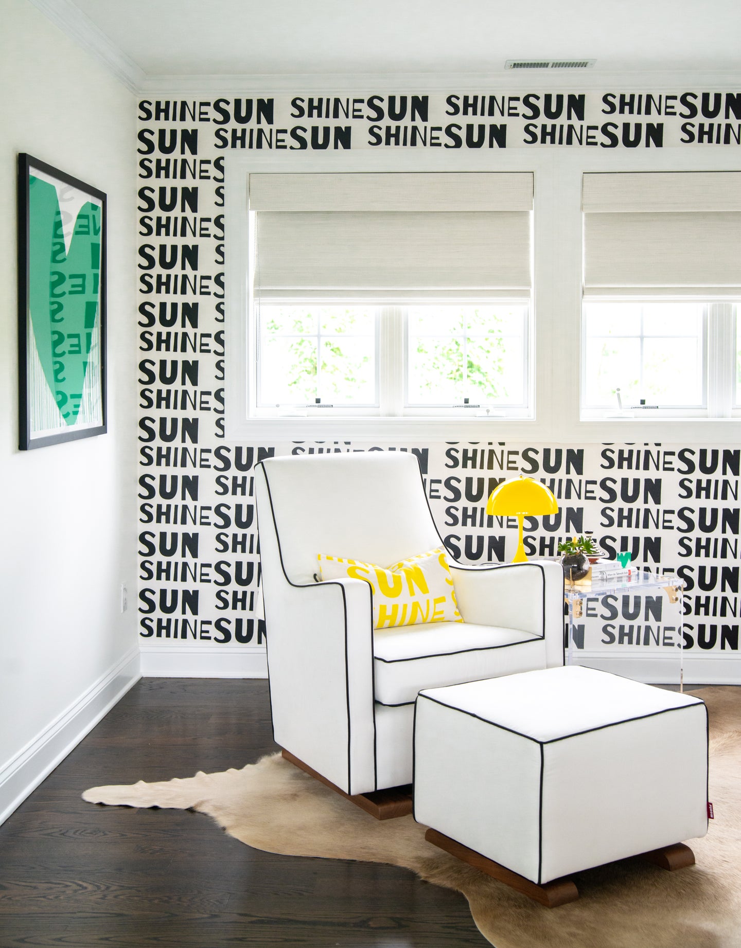
As for the specifics of the renovation, which Crossin describes as a “labor of love,” they were largely cosmetic. The room has seven windows, so aside from the attention-grabbing color scheme (black and white, to play against the vibrant green), maximizing brightness by sticking to a fairly light backdrop was of the utmost importance.
She also looked to one very specific starting point for inspiration: artist Kerri Rosenthal’s work. One of Rosenthal’s pieces featured the phrase “this is so the happy place,” and Crossin knew she immediately wanted to use that as the theme of the nursery. It’s a lively, positive environment—and everything, from the “sunshine” wallpaper to the bright yellow lamp to the palm tree decals exudes that happy vibe.
When prompted on if she was nervous about going this bold and unconventional for a nursery design, Crossin had a definitive answer: “It was the plan from the beginning, but I also err towards the less conventional in pretty much all things I do in life, so it was never an option for me to go the more cliché route. It was always going to be, how do I do this in a way that’s very representative of us and our style?”
Feeling inspired by this unique space? Read on to get some of Crossin’s tips for taking the non-traditional route in nursery design.
Be flexible.
The fluidity of the space was heavily considered every step of the way—for example, if Crossin had another baby, she says she would be happy to put a little girl in this nursery as well. “If we decide to change how the rooms are configured in the house and use this as an office, for example, these are all pieces that I would be happy to spend time looking at,” she says. Go all out with your style, but just be sure to pick pieces that could be flexible and suit a variety of aesthetics and functions wherever possible.
Choose transitional pieces.
While thinking of the fluidity and adaptability of the design, longevity is another crucial component of nursery decor. Crossin pulled together a space that will grow with her baby, keeping the requirements of the upcoming years in mind when choosing specific items and laying out the room. “What I liked about the crib is that it’s a transitional bed and has a toddler rail,” she says, giving an example. “I’ve left space under the windows to be able to put a toy chest or more storage space there, so I can avoid clutter in the room.”
Another great example of this is the armchair. It’s made from a microsuede performance fabric—in other words, it’s built to last. Crossin even had it protected to preempt any spills or mess. The classic design of it ensures its lifespan lasts long after Greyson has outgrown the rest of his nursery furniture.
Enjoy the possibilities.
“Have fun with it! It doesn’t have to be so traditional,” urges Crossin. “There are a lot of opportunities, and a lot of places are designing more modern, contemporary spaces for kids.” She uses tools like Pinterest and retailers like Zara Home as inspiration, pulling from design that may not necessarily be meant for kids’ spaces, but that can inspire a whole room.
Stick to the personal.
As mentioned, Greyson’s nursery may be full of cool pieces pulled from a variety of retailers, but it’s the sentimental stuff that Crossin loves the most. “Find pieces that actually matter to you so that it feels like a personalized space that’s really warm. You’re going to spend a lot of time in it, so you really want to make it feel like a place you want to be,” she says.
See more nursery ideas we love: Stale Nursery Trends it’s Time to Say Goodbye to Eight Nurseries Where Wallpaper Steals the Show A Rainbow Nursery That Pinterest Dreams Are Made Of