The Best Blue Paint Colors, According to Leanne Ford, Emily Henderson, and More
Experts spill all.
Updated Aug 21, 2019 3:35 PM
We may earn revenue from the products available on this page and participate in affiliate programs.
Making the choice to paint your home a certain color is a deeply personal one. It’s true that, with the addition of primer and a bit of patience, it’s hardly an irreversible update, but it’s not just a new dinnerware set either. Painting your space is a big commitment, both in terms of time and budget, so you want to be absolutely sure of a hue before you go all-out with your paint brushes. Blue paint colors continue to be some of the most popular options due to their versatility and the sheer number of shades available, but how do you know if the color is right for you?
There are a few reasons you should consider giving your home a blue refresh. For one, blue paint colors are trending in a big way. If you think you’ve been seeing the color everywhere, you’re not hallucinating. The most obvious example of this has to be the navy-and-brass kitchen trend, which has arguably been one of the most ubiquitous contemporary designs to come out of the last few years. More subtly, you’ll notice the hue popping up in a ton of California-inspired, beachy homes, and given the widespread popularity of that design aesthetic, it’s no wonder the color is making such a comeback.
Of the 2019 Colors of the Year, two were shades of blue, suggesting the paint’s commercial viability. And when we asked paint experts what their best-selling products were, a surprisingly high number of them cited blue paint colors as the most popular. In other words, if you paint your home blue, you’ll be in good company. It’s a foolproof way to get in on a huge design trend without spending a ton of money on new furniture. Try your hand at an accent wall or give your cabinets a refresh if you don’t want to go all-out.
Blue is also incredibly versatile. On one hand, the soft, pale shades of the color are soothing and instantly infuse calm into any space. On the other hand, deep, rich navy tones are an easy way to bring the drama and add an element of luxe elegance to your home. The flexibility this simple shade allows adds to its appeal—almost no other color provides this range and offers this much personalization. You have an entire spectrum to choose from, depending on what mood you want to convey.
This serene shade has also been proven that blue paint colors increase the value of your home; so if you’re looking to sell in the next few months, paint is less of a fun design update and more of a logistical necessity. A 2018 Zillow report found that homes featuring shades like light blue and deep navy actually sold for more. For example, periwinkle or light blue-gray bathrooms sold at a $2,786 premium, while kitchens featuring rich blue cabinets went for an extra $1,547.
Whatever your motivations for giving your home a coat of blue, you can’t go wrong. But since there are so many versatile shades and finishes for the color, we tapped our favorite designers and color experts to share their go-to picks. From classic nautical tones to light pastels, these are the pros’ favorite blue paint colors.
Happy painting!
Light blue paint colors

Kicking things off with an easily digestible shade of blue is designer Megan Hopp. “Constellation is my go-to light blue,” she says of the Benjamin Moore tint. “It’s just bright enough to make a real statement while still so soft that it doesn’t overwhelm a person.” She likes to implement the hue indiscriminately throughout the home, citing its versatility as a near-neutral. “I can use it in every kind of room, and my clients will attest that I most certainly have. I come to it time and time again for how flexible the shade is. Whether the space leans modern or more traditional, this blue fits right in,” she explains.

Joy Cho’s favorite shade of blue paint—Summer Fridayby Clare Paint—is one she advises using in a bedroom or a bathroom. “It’s a medium and muted blue that adds warmth to any space, but it’s also still neutral enough that you can add a ton of other colors into the space without clashing.”

HGTV Home by Sherwin-Williams’ Blissful Blue is the quintessential baby blue. The soft cornflower color pairs well with greens and other blues for a calming, cool-toned space. According to Ashley Banbury, senior color designer for the brand, it helps create a zen-like environment without being dull. She recommends using it in the bedroom or bathroom. “Combine the shade with soft neutrals and natural textures to encourage relaxation,” she advises.

If you’re looking to go bespoke, head to Fine Paints of Europe. The brand doesn’t have an online shop, but you can order via phone or find a retailer in your area. It’s a well-kept designer secret for finding quality paints in unique shades. Joy Moyleris a fan of the brand’s Bermuda Blue tintfrom the Dorothy Draper Signature Collection. “Bermuda Blue delivers consistent color, depth, and saturation. It’s an incredibly calming hue, reminiscent of seaside skies and days full of life, love, and passion,” she says. “I am using it now in the bedroom of a Portofino, Italy, residence. It brings the sky in.”

Leanne Ford’s go-to for a simple, relaxing pale blue? PPG Paints’ Captain’s Walk. “This blue is gentle and has a touch of gray, so it’s very calming,” she says.

Hannah Yeo is Benjamin Moore’s color and design expert, and since her job is to look through the brand’s color palette on a daily basis, we trust her opinion on the best blue implicitly. “Smoke is a pale, sophisticated blue that offers a sense of calm and comfort. Whether it’s in a bedroom or a living room, Smoke brings any room to life without overpowering the space,” she explains of the cool tone. As with most blues, this one’s great for mixing and matching, so if your personal style is ever-evolving, you can switch up your decor to complement your wall color easily.
“I love a classic look by pairing it with a crisp white, maximizing the beauty of its color. But the great thing about this color is that it also pairs well with just about any color including grays, greens, and pinks,” she adds. “What’s more is that Smoke makes a stunning ceiling color. Not only does it lifts up the room like an open sky, but it also gives details and added layers to the room.”
Bold blue paint colors

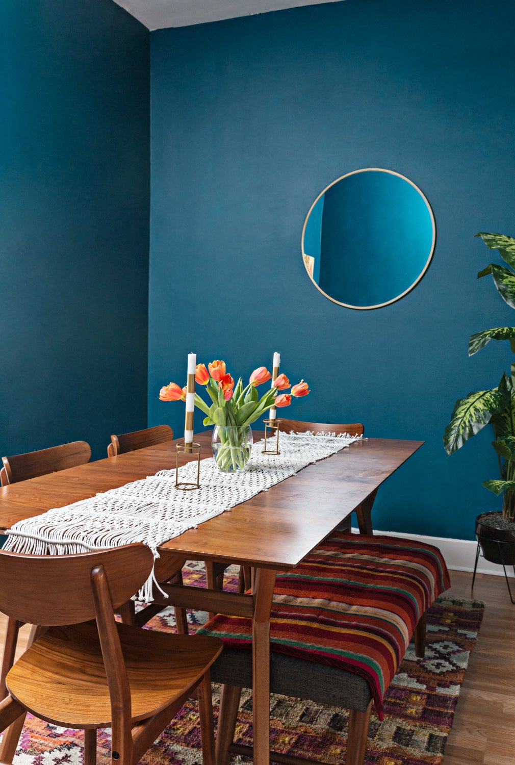
Emily Henderson is a big fan of blue—the self-described “blue person” has tried several shades over the years and has two favorites topping her best-of list. “My old faithful is Farrow & Ball’s Stiffkey Blue,” she says. “It’s just the perfect inky blue. I have used it in a ton of projects, and it never disappoints.” Bring the drama in a dining room or living room with this rich hue.

Henderson’s other recommendation is even bolder: “My new favorite is Sherwin-Williams’ Cyberspace,” she says. It’s so dark that it straddles the line between blue and charcoal, so if you’re looking for a deeper blue that works well as a neutral, try this one. “We used it our Portland Project master bathroom, and it’s truly the best dark navy,” says Henderson, adding that both her favorites are great for adding moodiness and depth to any space in your home.

Ashley Banbury is a fan of HGTV Home by Sherwin-Williams’ Dark Night for a bolder look. It’s a dark teal color that feels both experimental and timeless at once; perfect for adding an elegant edge to any room. One way Banbury recommends using it is in the kitchen, on cabinets that sit under natural stone or warm wood countertops. Alternatively, “use as a backdrop for a gallery wall of your favorite pieces of art or family photos to really make them pop,” she says.

Feeling something a little punchier? HGTV Home by Sherwin-Williams’ Georgian Bayis a saturated blue Banbury also loves. “It can be classic when paired with grays and black or make a statement when combined with pinks and reds,” she says. “Use this shade for a bold contrast or for an interesting monochromatic look.”

“I am currently loving Newburyport Blueby Benjamin Moore,” says Autumn Hachey. “I’m planning to use it on a bookcase in a moody loft space. I think it’s the perfect shade of blue that isn’t too far into the navy scale, making it feel really impactful and timeless (and a bit less nautical).” Take notes from the designer and try the dark gray-blue on a smaller scale. If not a bookcase, use Newburyport Blue to refresh an old piece of furniture and give it an elegant touch.

Yves Klein blue is an iconic shade that can be quite hard to come across in the paint world. Designer Keren Richter found the perfect one from UK-based company Little Greene. “Smalt is a beautiful shade that pops and works well on accent furniture,” says Richter of the vibrant color. “You can’t go wrong pairing it with primary colors or letting it stand on its own against white or black.” We love the idea of going primary, crafting a modern space with Smalt as a base.

Another one of Richter’s favorites is more subdued. “Portola Paint’s Lost Highway is a moody dark blue with green undertones,” says Richter of the muted teal tone. “We love this on kitchen cabinetry or in rich, inviting living rooms and bedrooms.” She recommends pairing it with jewel tones to really drive home a luxe feel or juxtaposing the color with light gray marbles for some contrast. And when in doubt, go contemporary: “Brass hardware and lighting glow against its deep hue,” she says.

“If you are looking for the perfect marine blue, Sherwin-Williams’ Regatta is it,” says designer Anita Yokota. “This is my favorite go-to blue for bold statements such as a front door or in an inviting space like a reading nook. I love how it pops with white furniture and trim.” The punchy hue has a hidden benefit too: Bold wall colors are a low-lift way to make an impact in any room. “You will have to do very minimal styling since the colorful walls will be stealing the show,” points out Yokota. One fresh coat of paint and your room is transformed.

Who says you have to go dark to make a statement? If the rest of your home is a pared-back, neutral environment, add a twist by incorporating a slightly louder color in one room. Amanda Dawbarn is a fan of Farrow & Ball’s Oval Room Blue. “While I primarily decorate with earth tones in my home, I do love it. We used it in our guest bedroom, and it provides a cozy, den-like feeling with a bit of opulence,” she says.
Unique blue paint colors

Artist Lindsay Hollinger’s favorite blue wall paint is derived from her favorite watercolor shade, Verditer Blue by Holbein Artist Materials. She says the closest fit for interiors is Dunn Edwards’ Prim Blue. “It’s a beautiful semi-opaque blue on the edge of lavender that I use often,” she says of the unusual tone. “It’s the color of desert mountains at dusk on the horizon. It would be perfect for an accent wall or a nursery; it’s a versatile and calming color.” Opt for Prim Blue if you have a thing for the pastel trend.

So deep it’s somewhere between purple and gray, Valspar’s Seattle Haze is an interesting balance that’s sure to wow. Sue Kim, color marketing manager for the brand, suggests using it in a space meant for disconnecting and refocusing, like in a bedroom or studio, for example. “Shades of blue are so easy to pair with any decor, but a touch of complex gray inspires a calming effect on busy family life,” says Kim.

Farrow & Ball’s Hague Blue is an inky blue that reads differently depending on the light or time of day—ideal for the indecisive decorator. It also has slight green undertones, which lend an earthy feel to it. Hague Blue is Shavonda Gardner’s current favorite. She’s such a fan that she already has plans for using it in her own space. “I’ll be using it in our master bedroom makeover this spring,” she reveals. “I love it in bedrooms because it adds so much depth and sophistication to these personal spaces. I also really love it used in small spaces. It’s the perfect color for someone not bold enough to go black but who still wants drama.”

“Blue is having a major moment,” says designer Allison Crawford. “And that means a lot coming from a pink lover like myself.” One shade has made her a convert, though. Farrow & Ball’s Light Blue, a light and silvery blue, is perfect for skeptics. Its tone is unique—it almost looks green. “It bridges that happy medium between trendy and neutral,” says Crawford. “It’s something my clients will be happy about on cabinets or walls for years to come.”

Jacquelyn Clark’s go-to blue is another borderline neutral. Not for the faint of heart, Farrow & Ball’s Railings is a soft blue-black. The cool-toned color is recommended for use on front doors to help you welcome guests with a statement-making entrance. Clark loves it for its timeless qualities. “It’s a really rich, deep blue that almost reads as charcoal in certain lighting,” she says. “I love how it instantly adds depth and drama to a space. It works particularly well on millwork and is guaranteed to stand the test of time. I’ve been using it in various projects for a decade now, and it never fails to set my heart aflutter each and every time.”

Ashley Scott’s favorite blue is reminiscent of denim. “Just like your favorite denim pieces, this color really works in almost any scenario. It can be dressed up or dressed down, but it doesn’t ever go out of style,” she says of Farrow & Ball’s De Nimes. For a lighter play on moody hues, opt for this shade and mix with warm and blond wood tones. Scott recommends using it in a room that’s privy to a lot of natural light to keep it feeling bright. As for where you should use this color, “I can’t help but imagine this shade in a nursery, especially in a little girl’s room for a fresh approach,” says Scott. “Mix with wood, whites, metallics, and plenty of texture to create a cozy and comfortable space.”
Classic blue paint colors

Ford swears by PPG Paints’ Federal Blue for a clean yet classic blue. “This rich indigo blue will bring personality and style to any space,” shares the designer, recommending trying it in a dining room to layer in drama and sophistication to your next dinner party. Who needs a complicated tablescape when you have stunning walls? “It’s super traditional,while still feeling fresh,” she continues.

Then there are the blues that are so beloved and timeless that you can’t go wrong. Benjamin Moore’s Hale Navy is one such hue; it’s one of the brand’s best-selling paint colors and it also happens to be Ashley Petrone’s go-to shade of blue. “I love incorporating depth into every space,” explains the blogger. “Whether with a painted piece of furniture or an accent wall, I love how a pop of color can really just bring you in. I painted my island this deep blue, and its cool tones were the perfect contrast to my brass hardware. It made the island a beautiful focal point in my kitchen.” If you’re overwhelmed with choice, stick to the classics.

If you’re looking for a classic, true-blue navy, Dee Murphyrecommends Benjamin Moore’s Old Navy. “I’ve used it in quite a few projects because it is moody without a drastic flip to the dark side,” she says. “It also works with any design aesthetic and makes any artwork really pop.” Use on an accent wall to serve as the backdrop to your gallery wall. If your art is composed of light, neutral tones or more vibrant, punchy colors, the contrast will make quite the statement.

When it comes to blue paint colors, the navies have it. Lindye Galloway is another advocate for darker shades, citing Dunn Edwards’ Novelty Navy as her favorite. “It’s perfectly coastal with just the right amount of subtle pop,” explains the designer. “While it is colorful, its tone acts as a neutral that is a quintessential addition to any room with any style. We recently used this paint color on lower cabinetry to juxtapose natural-toned upper cabinetry, as well as on the wood of a kitchen island to add extra contour to a white space.”

“Salty Dog from Sherwin-Williams is a favorite true blue of mine,” shares Lori Paranjape. “It’s fully blue and has a bit of whimsy added in. Some navy blues are deep and charcoal-y (which I love too), but Salty Dog is more of a vibrant, crisp blue.” A tinge brighter than your average nautical navy, this color will breathe life into your space while keeping it sophisticated.

“Amalfi Navy from Ralph Lauren is one of my all-time favorite classic navy paints,” says designer Shelly Lynch-Sparks. A fan of all classic colors, textures, and materials, Lynch-Sparks loves the hue for its ability to add depth to any space. As for where to use it? “It’s great for underneath the kitchen island, painted kitchen cabinets, or an accent wall in an entry or bedroom.

One color that designer Susana Simonpietri uses time and time again in her clients’ homes? Benjamin Moore’s Bachelor Blue. “It’s the perfect shade of blue—somewhere in between blue jeans and marine and is suitable for a home of any style, whether it’s coastal or urban,” she explains. See it IRL in this Long Island home, where Simonpietri used it on the kitchen island.

Erin Boyle’s favorite navy has a bit of a kick to it. Benjamin Moore’s Abyss is a deep tone that veers toward matte black but still looks undeniably chic. Use it to upcycle old furniture and bring an edge to a space in a manner other than wall color. “A few years ago, I painted our antique headboard and bedroom dressers this color and I’ve never looked back,” says Boyle. “It’s subtle enough to act like a neutral but impactful enough to bring a bit of drama to a small space.”
See more color ideas: 20 of the Best Kitchen Wall Colors: A Definitive Guide The 27 Best Bathroom Colors When All-White Won’t Do Over Living Coral? Here’s Pantone’s Spring 2020 Color Prediction