The Color Combo You’re About to See Everywhere
Something old, something new, and a little blue.
Updated Oct 11, 2018 3:37 PM
We may earn revenue from the products available on this page and participate in affiliate programs.
There is nothing revolutionary about it. Nothing new, unprecedented, or unthought of. And yet, this color combo, being the classic that it is, finds itself at a constant point of reinvention, surprising even the most seasoned of decorators. We’re talking, of course, about blue-green, and the sudden wave of exposure it has experienced as of late.
Now, there is nothing ordinary about the two and the tonal variations of each are what set it apart from the standard. While the green resembles a moody sage, the blue is one that boasts the ever-so-slightest hint of periwinkle. Paired together, the duo inspires an alluring detail that errs on the complementary and still manages to uphold a subtle element of contrast. Ahead, a peek at just a few of the ways we’ll be bringing it home.
On the Walls
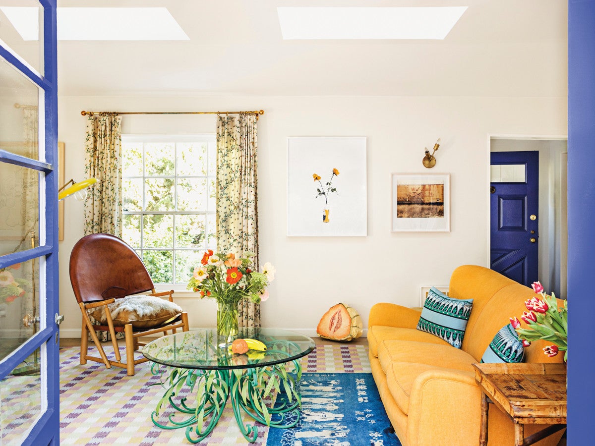
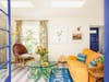
Photographer Annabel Mehran’s LA home is a lesson in living colorfully, and one that showcases the oh-so-trendy combo in a variety of well-thought-out moments. Our favorite comes in the form of her stunning living room, where the blues are reserved for detailing on the walls and the moody sage makes a cameo via the sculptural coffee table.

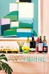
Through the Furnishings
It’s time to rethink your current kitchen table situation. We’re talking: green table, blue chairs—vice versa works just as well, but this scene from Bar Botanique definitely makes a case for the former—and an unexpected pop of yellow to tie the look together. When it comes to the materials, think green marble for the tabletop and a soothing velvet for the seat. The high-low contrast of the upholstery set against the hardness of the table will impart your space with a visually dynamic element that’s hard to match.
On the Table
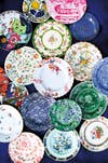
Embrace the pairing by way of your dinnerware, because what easier (read low-commital) approach could you think of? Mixing and matching goes without saying, and patterns are highly encouraged. This intricately-decorated set only serves as a prime example, beautifully offset by a handful of options clad in a lighter color detail with complementary pops of pink and red.
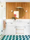
By the Tiles
Who doesn’t love a good geometric tile, especially when it comes in an eye-catching finish? Take this LA home for example, where a vivid pairing of the trendy color combo is found in the flooring of the mod bathroom, complemented by the sleek vanity and warm wood panelings. And while the pairing may not be visible in the most outright, obvious way, it makes a solid case for embracing a trend with subtlety in mind.
With Art
Yet another low-effort approach to emulating the trend—although one that will surely result in maximum impact. Bring in an oversized piece of wall art and let that do all the talking. Reserve the decorative accent for a room that’s void of the superfluous and in dire need of a dynamic statement. Bonus points for setting the art against a colorful backdrop—i.e. paint those walls!
Paint to try: Pitch Blue and Calke Green, Farrow & Ball
Read more:
Editor’s Picks: The Chic New Stone Age The Colors Our Editors Are Loving for Spring The 8 Items That Totally Transformed Our Homes