8 Reasons Why You Should Paint Your Room Yellow
The best uses of the color of the summer.
Published May 29, 2017 6:45 AM

We may earn revenue from the products available on this page and participate in affiliate programs.
Haven’t you heard? Yellow is the color of the summer. So we rounded up a few spots that make the best use of vibrant shade. Take a look!
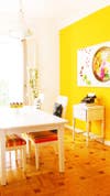
A bright yellow wall paint is best suitable for a light-filled room with a downplayed aesthetic. In this Madrid-based home, a white color block is implemented to break up the intensity of the yellow hue. Whitewashed furnishings further complement the scheme.

A closet-turned-home office definitely counts as a room. Wall-mounted shelving and bright pops of color complete the scene in this happy Austin home of Ray and Laura Uhlir.
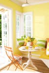
We can’t think of a more cheerful
breakfast nookA mellow shade of yellow idyllically complements this compact setup featuring a cozy booth-style seating and rustic table.
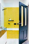
How’s this for a daring design scheme? Yellow subway tiles come side-by-side a classic black and white installation, in this vibrant bath. We’re loving the idea of extending the yellow tile alongside the edge of the tub, resulting in a beautifully cohesive space.
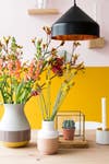
Two of our favorite summer shades come together in a stunning display in this brilliantly colorful dining room. Paired with an array of bold florals and streamlined Scandinavian decor, the finish is surprisingly laid-back and simultaneously fresh.

If you’re still feeling intimidated about incorporating this vibrant hue into your space, try utilizing it in the form of an accent wall. Here, the bright yellow makes for the perfect addition to the little ones’ room, paired with contemporary furnishings and equally bold decor.
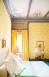
We’ll be forever dreaming of this charming Tuscan bedroom, designed by Dede Pratesi, where a patterned yellow wallpaper emulates the striking landscape of the region. Decorative accents of a primary color scheme complement the mellow shade, while ornate moldings lend an elegant touch.
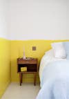
Hotel Henriette’s ode to yellow comes in the form of a subtle color block. Modest furnishings in the Parisian hotel and a true blue textural detail best complement the scheme.
Related reading:
We’re Calling It: Yellow Is the Color of the SummerSeeking Shades of Citron In the Most Unexpected Places14 Bright Accessories to Cheer Up Your Space