The Best Warm White Paint Colors, as Seen in 8 Designers’ Favorite Spaces
From Behr to Benjamin Moore.
Updated Jun 16, 2022 11:28 AM
We may earn revenue from the products available on this page and participate in affiliate programs.
Bold, punchy palettes may be having a moment—see: this art collector’s study swathed in purple, a literary agent’s bright blue library, and the rosy pink kitchen cabinets in one Paris apartment—but sometimes simple white walls is the perfect design statement, especially if you’re trying to show off a work of art or a rainbow-organized book collection inspired by Kevin Sharkey. “I use warm whites rather than cool ones because I am almost always in need of a crisp, clean brightening agent and a true neutral backdrop for the color-filled designs I do,” asserts Boston-based designer Katie Rosenfeld.
Those creamy hues, whether they’re found on a nostalgic Smeg teakettle or papier-mâché vases, never go out of style because they pair well with nearly everything. The reason? Warm whites are cozy and comforting, taking on the same familiar look as age-old materials like linen, bouclé, plaster, and parchment while remaining bright enough to let your decor pop. “Using white to create a bubble for a space allows details such as textiles or artwork to be maximized,” explains designer Alex Boudreau. “And any unflattering flaws the shell might have? They disappear.”
But if you’re looking for another excuse to embrace the absence of color, here’s one: The best warm white paint can give your space a dynamic, organic feel, one of the many reasons this shade has become a go-to for the eight designers we spoke to. Read on for their top picks and why they keep coming back to them.
Our Favorites
- Benjamin Moore Swiss Coffee
- Behr Crisp Linen
- Sherwin-Williams Shoji White
- Benjamin Moore Simply White
- Dunn-Edwards Exclusive Ivory
- Sherwin-Williams Greek Villa
- Benjamin Moore Cloud White
- Farrow & Ball All White
For a Sophisticated Study: Benjamin Moore Swiss Coffee

LRV: 89.93 | Undertones: Yellow, green | Similar colors: Steam, Dune White
Why we chose it: A staple off-white that’s beloved by designers.
“I love Benjamin Moore’s Swiss Coffee because it’s warm and nuanced and sophisticated,” shares Young Huh of Young Huh Interior Design. “With yellow and the tiniest bit of green undertones, it feels so interesting and is one of those colors that changes with different lighting throughout the day.” For Huh, paint is important—it sets the tone of a room, and Swiss Coffee from the Off-White collection is the perfect way to enhance the dynamics of a space. It’s also one of Shea McGee’s favored shades; she has used it in living rooms and kitchens alike.

For Brightening Your Entire Home: Behr Crisp Linen

LRV: 76 | Undertone: Gray | Similar colors: Off White, Silky Bamboo
Why we chose it: This chalky paint color reads white with a bit of patina.
White is arguably designer Leanne Ford’s go-to paint color. Although the options are endless, she has a few favorites she taps time and time again to simplify the selection process, including Behr’s Crisp Linen, which she used to cover the entirety of her Camp California project—inside and out. “I have been obsessed,” gushes Ford. “Truly, I am on my third project in a row using it. It’s warm but still clean, with a fresh hint of vintage.” The color choice completely transformed knotty wood walls and element-worn shingles, even an outdoor porch floor.


For a Window-Filled Living Room: Sherwin-Williams Shoji White

LRV: 74 | Undertone: Brown | Similar colors: Pacer White, Porcelain
Why we chose it: A darker white that’s borderline beige.
“In rooms with ample light flooding in, we love to use Shoji White,” shares Kara Phillips, one half of the design couple behind High Street Homes. “It gives the room a warm, livable feeling while remaining light and bright.” Her tip? Use a semigloss on the trim and eggshell on the walls for just a hint of contrast. The hue pairs perfectly with white oak, a cool marble-look fireplace, and a vintage green cabinet in a Texas build the company recently brought to life.

For Setting the Mood: Benjamin Moore Simply White

LRV: 91.7 | Undertones: Yellow, green | Similar colors: Mountain Peak White, Cloud White
Why we chose it: Make it fresh but moody.
Phillips’s clients are huge fans of Simply White. “This color is clean and crisp without feeling cold and provides a great palette for other colors and textures to shine. We use it in semigloss on trim and eggshell on the walls,” she says. It’s also designer Kate Lester’s current favorite. “It is the perfect white color, with warm undertones that keep it from coming across as too sterile,” offers Lester. “You need a white that will change with the lighting of the room, so when you have ambient lighting that is increasingly moody, it takes on that lighting style rather than staying stark white.” That versatility gives Lester the freedom to use it everywhere, including kitchens and bedrooms.

For Displaying Your Tchotchkes: Dunn-Edwards Exclusive Ivory

LRV: 74 | Undertone: Greige | Similar colors: Bone White, Instant Classic
Why we chose it: A little goes a long way with this shade.
Covering an entire room in the same shade and finish of white paint? Almost never. Take a cue from designer Lindye Galloway, founder and chief creative officer of the Lindye Galloway Studio and Shop, who recently made a big impact with a tiny touch. “Exclusive Ivory is an off-white hue that works in a number of rooms. We decided to include this shade on millwork within the great room of a recent project which turned out fantastic,” she shares. “We choose a velvet sheen to complement the cabinet handles and accessories. This is a great neutral shade that’s not too white and not too beige that I love.”

For Creating an Escape: Sherwin-Williams Greek Villa

LRV: 84 | Undertone: Yellow | Similar colors: Alabaster, Westhighland White
Why we chose it: An under-the-radar off-white ideal for traditional spaces.
Perhaps not as well known as other white paint colors out there, Greek Villa is Rosenfeld’s pick for almost every project. (In fact, you can see the mellow effect it has on this Massachusetts home’s walls, shiplap ceiling, cabinetry, and trim.) “It is not too warm, doesn’t throw off any undertones, and is crisp and clean without being stark white,” Rosenfeld adds. Though we love seeing it in this transitional take on a modern-day English cottage, it’s hard not to be reminded of a Nancy Meyers–designed movie set.

For Softening Your Space: Benjamin Moore Cloud White

LRV: 92 | Undertone: Yellow | Similar colors: Steam, Simply White
Why we chose it: White walls instantly feel light and airy.
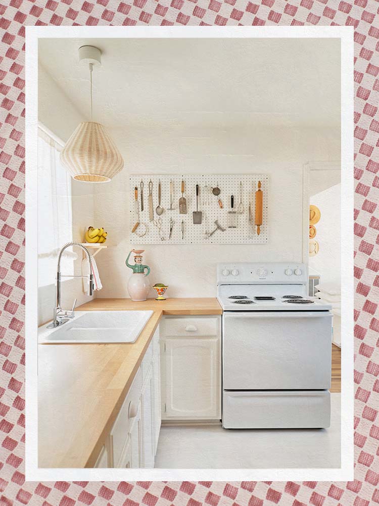
To stay on budget in this project, Boudreau freshened up the space using one paint color—in this case, Cloud White—across multiple elements, including the trim, walls, ceiling, and cabinets, rather than replacing the existing millwork. “I like to use flat on the walls and ceiling, with a satin on the trim,” notes Boudreau. Satin is a touch less shiny than semigloss or gloss, for example, which she prefers for shades of white paint, though the color itself is the definition of lightweight and luminous. Another cost-saving trick? An electric range in the same shade blends better in an all-white kitchen.


For Minimal Intensity: Farrow & Ball All White

LRV: 87.35 | Undertone: Yellow | Similar colors: Wimborne White, White Tie
Why we chose it: A widely appealing pure-ish white.
Kim Armstrong, owner and principal designer of Kim Armstrong Interior Design, loves All White—it’s pigmented enough to bring depth and richness to a room. “This white glows just enough to feel warm, but it doesn’t have any weird undertones,” she explains. The only pure white on our list (all the other suggestions are more of an off-white), this is definitely the least warm-looking but pairs well with pretty much anything. The brand, however, specifically recommends Skimming Stone and Strong White.

We Also Like
- According to designer Amber Lewis in her book Made for Living, Farrow & Ball’s Wevet is the “prettiest, warmest white,” making it the best neutral distinguishable only by its slight gray undertones. “It can go a little beige and yellow if paired with a brighter white trim,” shares Lewis. “Try painting the trim the same color as the walls for a tonal and serene look.”
How We Chose These Products
We asked eight designers to share their favorite warm white paint colors. They told us what they loved and how they used each shade (whether it was application, placement, or finish) and the ways light—ambient and natural—can impact how warm these hues come off.
Our Shopping Checklist
Light and Mood
“In the science of color, white is the presence of all colors,” explains Armstrong. “So when you use white in areas that might not get flooded with the most natural light, they feel much brighter, because the little light that does come into the space is reflected and not absorbed into the walls. This light reflection makes a room much brighter than it would be if you painted it a darker color.” All of this directly impacts the ambience.
“Harsh, white light is normally not favored over warm overhead lighting,” adds Galloway. “To continue the calm and inviting feeling, I suggest going with warm light overhead and within reading nooks in the form of a floor or table lamp. If you have the same sense of lighting throughout, this will help make the paint more symmetric throughout the whole space.”
Pigmentation
Pigmented paint seems to have a myriad of meanings: Sometimes designers reference it in relation to the depth of a color, but it’s actually a crucial ingredient used to make color (kind of like food coloring) when combined with a binder. It may seem as though white wouldn’t have any pigments at all, but it’s still a necessary part of the process.
Undertones
According to Ford, understanding undertones doesn’t have to be tricky. If you want your room to feel straight out of the Victorian era, favor creamier yellow undertones; if you’re trying to make a space feel ahead of its time, stick with something starker, like gray. Undertone is a greater indication of color depth and dimension than pigmentation—white, of course, is the main color you see, but more subtle shades peek through. For warm white, these colors are primarily yellow, red, and brown, and sometimes gray or green.
Ask Domino
Q: What does LRV mean, anyway, and is it important to the selection process?
LRV, or light reflectance value, is a measurement of how much a color reflects light. The higher the number, the more light it reflects; the lower the number, the more light it absorbs. “We find that we are drawn to colors with a lower LRV when we have ample natural light, but confirming the livability of the color throughout the day with paint samples is a must,” advises Phillips, noting that less available light can make a color feel dark and oppressive. “Always apply paint samples to your walls before making a decision. The color will change throughout the day based on the amount of natural light that floods into the room.”
Q: Should I paint my ceiling and walls the same color white and same finish?
Designers often create contrast between the walls and ceilings when painting everything the same shade of white—the trick is to go with a slightly glossy or matte finish to inject a sense of subtlety and distinction. Lester’s fail-proof approach: flat for ceiling, semigloss for trim and baseboards, and walls in eggshell. “I love the way different shades of white or neutral colors, in general, look together in a room,” notes Galloway. “To bring dimension and character into a space, highlight different elements in the room, such as millwork, in a different color so you continue the calming and luxury feel with a little pizzazz.”
Q: Do I need a primer for my warm white paint color?
It isn’t always necessary to add primer to the job, especially if you’re starting from scratch or using a formula that promises high coverage. But if you’re covering up a darker wall, it can save you an extra bucket of paint and help your chosen color read more accurately.
Q: Can I re-create a plastered look—for a fraction of the cost—with paint?
Of course! Whether that’s going with a specialized finish like limewash or clay—or giving Phillips’s DIY hack a try—all you need is a towel. Try applying the paint with a regular hand towel instead of a brush or roller. “It creates subtle imperfections in the wall texture—it’s a cost-effective way to get the plaster look,” she explains.
The Last Word
For an interior that’s as calming as it is comforting, you can’t go wrong with the best warm white paint colors. Take advantage of ample natural light or create the perfect cozy nook with one of these eight designer-approved shades for a neutral vibe that’s equally the embodiment of a warm and fuzzy feeling.