New York’s Coolest Hotel Designer Is Begging You to Go Bold With Paint
You only live once.
Updated Oct 11, 2018 3:30 PM
We may earn revenue from the products available on this page and participate in affiliate programs.
The most popular interior paint colors often fall within a predictable color wheel of neutrals. Conventional wisdom and ongoing trends support these rather safe choices since they make it easy to add in colors through other aspects. But if you’re willing to live dangerously, Brian Smith, a founding partner at Studio Tack, thinks that this bold shade should be on your radar: red.
“Of all the colors, red is the most profound,” he says. “It’s a color of contradictions, arousing our deepest most passionate emotions: from love and lust to anger and aggression. That’s why it’s such a wonderful color to use in design because it appeals to a broad range of feelings. It can make spaces feel classic and timeless or moody and glamorous.”
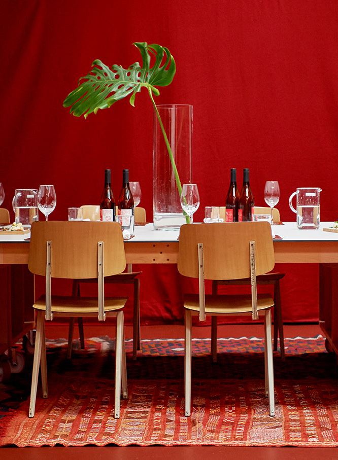
As a design and development group based in New York City, Studio Tack has created award-winning hotels throughout the world, inciting wanderlust in those who want to kick back in a stylish getaway. Smith and his team used Benjamin Moore’s Cottage Red inside the library at Sound View in Greenport, New York, for “a sense of sophistication,” he says, and opted for RAL’s Red Brown for the bar at Casa Bonay in Barcelona to evoke “an immersive space.”
In Smith’s view, red isn’t a color to shy away from. If you plan on using it, he says, then go all in. “Don’t relegate red to an accent wall. It works best when it’s allowed to saturate a room,” Smith continues. “This might sound counterintuitive, but a bold color like red actually becomes less jarring the more you use it.”
Now that Smith has spoken so highly of this color, you might feel inspired to try it in your own home. To make sure that confidence lasts, we asked him for tips on what to know about red paint before going shopping, how to style it for every room in your home, and the best red paint colors to try when you’re ready to take the plunge.
What to Know About Finishes

“A general rule of thumb we follow at Studio Tack is to use a matte finish for reds on walls and ceilings and a high-gloss finish for reds on millwork, furniture, and floors,” Smith says. “If you’re painting a room red, then use a low sheen and a matte finish to bring out the depth of color.”
Smith notes that matte finishes absorb more pigment, making a red shade appear denser when it’s applied throughout a room. His team usually chooses Farrow & Ball’s Estate Emulsion finish for this effect because it has a low sheen that complements many different lighting options.
A high-gloss finish, on the other hand, adds drama to smaller applications. When Smith and his team are looking to make millwork stand out, they often turn to Fine Paints of Europe and Hollandlac Brilliant 98. “It’s highly resilient and, as the name suggests, it’s quite brilliant,” he says.
Overall, the most important thing to remember about choosing a red paint color, and paints in general, is that higher-quality choices are worth the extra money. “While more expensive, these paints look and feel more luxurious because they are made with quality pigments and additives that help the paint adhere better to different surfaces,” Smith adds. “Premium paints like Farrow & Ball are thicker, spread easier, and usually require fewer coats.”
How to Use Red Throughout Your Home
In the Kitchen: “For cabinets, use a high-gloss finish,” Smith says. “Not only is it bold and beautiful, but it’s more resilient and easier to clean.”
In the Living Room: “Living rooms are a great place to use high gloss and matte paint finishes together,” Smith notes. “Pick the same color for the walls and the trim, but use a matte finish on the walls and a high-gloss finish on the moldings. An enamel finish will naturally produce a deeper tone of color, creating a monochromatic difference between the two surfaces. But if you’re not ready to coat your living room in red, try using it as a wainscot that’s either painted directly on the wall or on the wood paneling.”
In the Bedroom: “Don’t forget the ceiling,” Smith adds. “You’ll be looking up a lot.”
In the Bathroom: “Bathrooms are a great place to use red on accessory pieces or built-ins,” Smith says. “Try using red on a small wooden hutch or on the shelves. If you use it on the walls, don’t forget the base of the tub, which is an often overlooked surface that can help tie the space together.”
The Best Red Paint Colors
If you’re feeling moody…
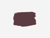
“This shade is more aubergine than true red,” Smith says. “It’s like red’s more contemplative sister.”
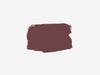
If you believe in classics…

“This is a deep, crimson-like red with rust undertones that’s part of Benjamin Moore’s Historical Collection, which is a series of colors inspired by America’s historic landmarks,” Smith continues. “It’s a time-tested classic.”
If you’re a maximalist at heart…
“This is a new color for Farrow & Ball, and it’s inspired by paints from the Baroque era,” Smith says. “It’s an ebullient red that reminds me of scarlet peonies.”
If you love a good red lip…

“A classic lipstick red that’s great for accent pieces,” Smith says. “Try it on your front door to give your home some striking curb appeal.”
Discover more red interiors we love: Red, White, and Blue Take a Sophisticated Turn in This Chicago Home 9 Red Sofas That Flip the Script on Tradition Here’s Why You Should Accessorize With Red