The Best Green Paint Colors From Benjamin Moore That Aren’t on Your Radar
How one designer works with these unconventional hues.
Updated Jun 16, 2022 9:21 AM
We may earn revenue from the products available on this page and participate in affiliate programs.
Early on in the pandemic, designer Andrea Fisk—one half of the duo behind Shapeless Studio, a firm based in New York—took to playing with oil paints as a way of understanding color more deeply. “Color is a really interesting and complex phenomenon,” she says, and picking out the right paint swatch for a home adds a whole other layer of intricacy. Different light qualities, materials, and furnishings in a room all come into play, which makes figuring out the best green paint colors, for example, difficult.
Unanimously dubbed 2022’s color of the year, green comes in all shades and undertones. “Green is a color that mediates between the warm and cool colors on the wheel, which means there is a lot of variation in how it makes us feel, from warm, springy yellow-greens to deeper, moodier turquoises and teals,” says Fisk. “I think greens can feel healthy, optimistic, comforting, and creative.”
For our own deep dive into green paint colors, we asked Fisk to walk us through some of her favorites. Read on for her four no-fail picks for a light and bright living room or a dark and cozy bedroom—all of them, it turns out, by Benjamin Moore.
Our Favorites
- Best warm green: Benjamin Moore Nantucket Gray
- Best cool green: Benjamin Moore Sea Haze
- Best blue-green: Benjamin Moore Narragansett Green
- Best gray-green: Benjamin Moore Gray Owl
Best Warm Green: Benjamin Moore Nantucket Gray
Surface recommendation: Walls bathed in natural light | LRV: 39.49 | Similar colors: Urban Nature, Cheyenne Green
What we like:
- Neutralizing color choice
- Complements wood details
Worth noting:
- Strong yellow undertones
Why we chose it: A warm, neutral green that plays well with other palettes.
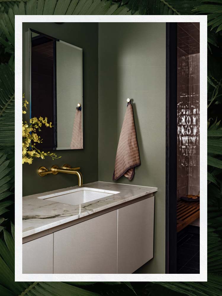
For the entrance to an apartment with a mid-century modern color palette, Fisk needed a green that could work well from multiple vantage points, and this sophisticated hue did just the trick. “This space is the main connection between the front door, the roof terrace, and the rest of the apartment, so it’s a really well-used area,” she says. Long story short, it had to play well with all the other colors in the home, which is quiet but earthy. “The floor tile is basalt, which is a natural volcanic stone, and the millwork is Douglas fir, which is a pretty warm wood that leans toward yellow-orange,” adds Fisk. “We thought Nantucket Gray was a nice counterpoint to the Douglas fir, really neutralizing and quieting the space while still having an impact.”
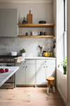
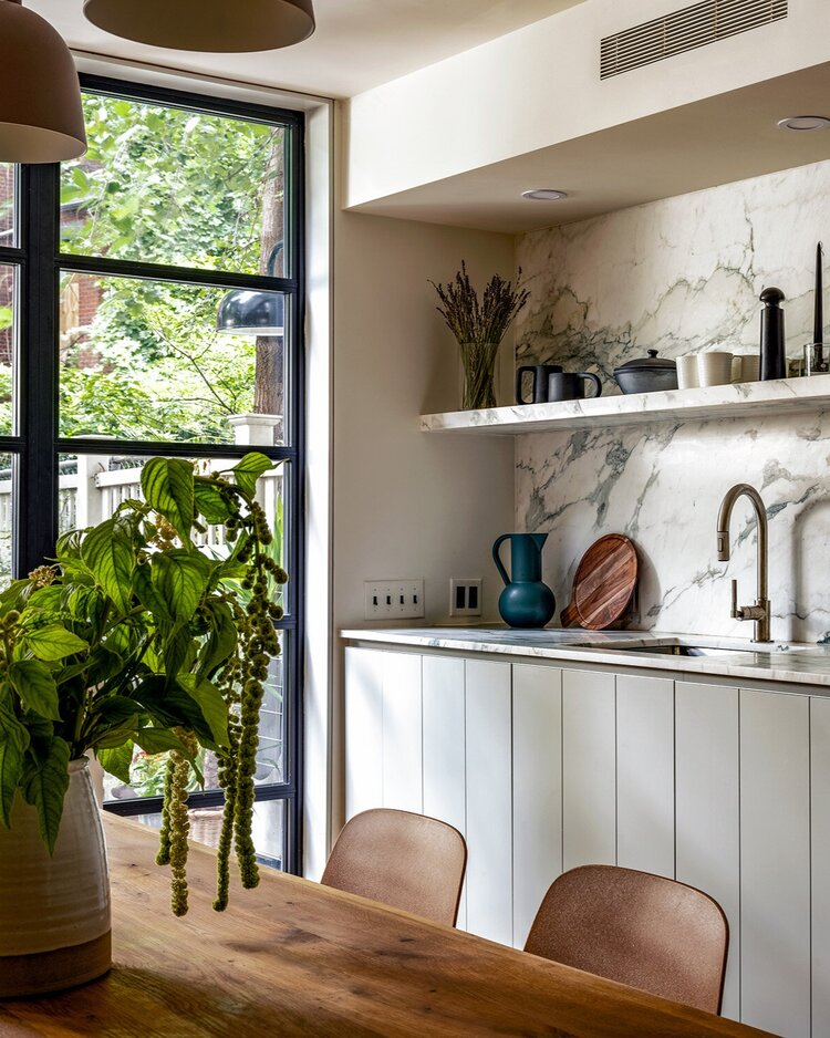
Best Cool Green: Benjamin Moore Sea Haze
Surface recommendation: Sleek cabinet fronts | LRV: 45.83 | Similar colors: Fieldstone, Horizon Gray
What we like:
- Mid-tone neutral with a likeness to blue-gray
- Complements wood details
Worth noting:
- Superlight
Why we chose it: Dip your toe into the green kitchen cabinet trend with this muted choice.
On the parlor floor of a brownstone in Brooklyn, Shapeless Studio searched for a color similar to that of the original mossy-green marble mantel above a fireplace. “We wanted to carry that tone through to the kitchen, to tie the whole floor together,” recalls Fisk. “Plus the light gray wall color that we chose, Silver Satin, has cool undertones that skew toward green, so we thought going slightly more gray and green for the cabinetry would be nice.” Enter Sea Haze: Cool-toned, neutral, and soft, it offers an easy entry point for those looking to try out a green palette.
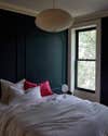
Best Blue-Green: Benjamin Moore Narragansett Green
Surface recommendation: A moody bedroom | LRV: 7.37 | Similar colors: Amazon Green, Olympus Green
What we like:
- Saturated, jewel-like tone
- Adds a hint of elegance
Worth noting:
- Strong blue undertones
Why we chose it: If you need to make a statement, consider this rich, bold option.
This color is—dare we say it?—decadent. “Narragansett Green is a really fascinating color, and we have used it several times in different projects and lighting conditions,” says Fisk. “It is quite dark, and it’s about halfway between blue and green, skewing one way or the other based on the lighting. In this room, we wanted something quite moody to complement the enormous tree outside the window. Aside from the wall color, there are a lot of warm furnishings and linens that balance the depth of the room.”
Best Gray-Green: Benjamin Moore Gray Owl

Surface recommendation: Shiplap kitchen cabinets | LRV: 65.77 | Similar colors: Oystershell, Ice Cap
What we like:
- Natural, stonelike appearance
- Fresh and modern
Worth noting:
- Can easily change appearance depending on nearby decor and lighting
Why we chose it: A super-pared-back green for even the most color shy.
This is a shade that Fisk says Shapeless Studio uses time and again—though the color shifts depending on the light and surroundings. Here, in a bright space that connects directly to a backyard, the designers wanted to employ a light but natural hue to let the main attraction—the garden—shine. With other green elements, including the turquoise marble counters and backsplash, the paint takes on a lovely pale green look.
Runners-up
- For a green that’s full-bodied but not too dark, Fisk turns to Porch Swing: “We have used it in a bedroom and found it was a lovely complement to a lot of different artwork options.”
- Raccoon Hollow basically skews brown, but Fisk suggests it still fits in the green family, though it’s a bit warmer in tone than most. “I used this color in combination with a gray floor tile and a lot of wood paneling, and it looked great,” she shares. “It’s also a fantastic color for exterior applications, especially in wooded areas.”
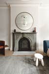
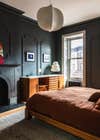
- In the paneled bedroom, below, the design duo went with Kitty Gray, a color that can shift from gray to blue to green. “Our intent here was to match the base tone of a historic slate mantel in the room to make everything feel unified,” says Fisk. “The furniture was very warm wood, so the room still feels balanced and cozy.”
How We Chose These Products
Fisk considers herself a paint connoisseur, always taking the selection process one step further, and when it comes to selecting the best green paint colors, Shapeless Studio thinks outside the box. “There are two main elements to color: the value (the relative lightness and darkness, a scale from black to white) and the chroma (the purity or intensity of color, a scale from gray to vibrant color),” notes Fisk. “With greens in particular, we tend to gravitate toward shades that are less saturated (meaning the chroma, not the value).”
Our Shopping Checklist
LRV
LRV stands for a paint color’s light reflectance value, a rating that quantifies the percentage of light that is reflected from the paint’s surface. Fisk simply refers to this as a paint’s value. “If you were to take a black and white photograph of the space, this would determine how the surface will register on the black-white spectrum,” she explains. “However, it doesn’t tell you which color wavelengths are reflected, so a gray-green and a saturated green that both have a rating of 35 will appear wildly different, and they won’t work in the same circumstances.” It’s helpful for shoppers to reference as a general guide, however: In general, the lower the LRV, the darker the paint color will appear on the wall; the higher the LRV, the more the paint will reflect light, which the eye often perceives as a brighter, lighter hue.
Vibrancy
What’s even more difficult to quantify but just as important, argues Fisk, is a color’s intensity, saturation, or chroma, which ranges on a scale from muted gray to vibrant color. “A green color might be neutralized by mixing in its complementary color, red, or its vibrance could be strengthened with yellow or blue,” she says. “We really just need to rely on our eyes and to perceive how different color combinations work together.”
Application and Tools
Now it’s time to get working. Before painting a surface in any shade of green, a first layer of primer is highly recommended (especially if the original wall is a deeper, darker tone) though not always necessary, especially if you go with a self-priming paint formula. But how to decide whether to pick up a brush or a paint roller? The latter does a better job when you want quick coverage on plain walls, but for delicate details like trim and millwork, a brush is best.
Ask Domino
Q: Why is Benjamin Moore a great brand for green paint colors?
Benjamin Moore isn’t the only brand that Fisk works with, but it is the one that Shapeless Studio uses the most for a variety of reasons. “They have a ton of different bases that are appropriate for all different substrates and situations, with varying levels of sheen,” says Fisk. “It’s fantastic to have that flexibility. Second, they have an enormous collection of colors—more than 3,500 shades in their current collections. When we are searching for a shade in a tricky room, we often test several variations of almost identical shades, and it’s surprising how often there is a clear winner.”
Q: How do I choose the right shade of green paint?
Selecting the right shade of paint—whether green or any other color—can be an overwhelming decision when there are so many options. Take a page out of Shapeless Studio’s book. The designers always start by considering the materials in a space that can’t be swapped out. “[We’ll ask:] Is there an existing wood floor? What tiles are used in the space? Is there a reflection from a bright red building across the street?” says Fisk. “Paint color is often the thing that can unify all these elements when chosen carefully. Your paint color should look pleasing next to each of these elements.”
Next? Sample, sample, sample. Place or paint a swatch on the wall to see how it looks. Fisk advises checking it throughout the day to note how the natural light changes with all the artificial lights turned off, then on at night. Her tip? Investigate every corner. How does the light look—not only in the brightest part of the room but also in the most shadowy.
Q: Is green a popular paint color for 2022?
“Color trends tend to come in cycles, and since shades of pink have dominated for the past few years, I think people are ready to neutralize all the pink with its complementary color, which happens to be green,” notes Fisk. Unsurprisingly, major paint brands each listed a green color as their pick of the year, and we’re seeing the trend everywhere, from kitchen cabinets to nurseries. “Green is the color of growth,” says Fisk. “I think, especially after the past two years, this is an element that really resonates with people.”
The Last Word
Overall, if you ask Fisk, the best green paint colors are less saturated and more versatile. “Since there is so much green in nature, I think the eye is really sensitive to slight differences, and a little really goes a long way,” she says.