Benjamin Moore’s 2019 Color of the Year Was Not What We Expected
You'll be seeing this everywhere next year.
Updated Jun 20, 2019 2:58 PM
We may earn revenue from the products available on this page and participate in affiliate programs.
As far as trendsetters go, Benjamin Moore has safely established themselves amongst the best of them. Last year, the paint company highlighted Caliente as their 2018 Color of the Year—an aptly titled shade of saturated red, which permeated both the realm of fashion and interiors.
For that reason alone, we found ourselves waiting with baited breath for the brand’s 2019 COTY announcement, one which was sure to surpass its predecessor in both popularity and novelty. Coming off the heels of their competitor’s recently unveiled picks—Sherwin-Williams’ Cavern Clay and Behr’s Blueprint, to name a few—we had a feeling that Ben Moore’s selection would be one that erred towards a contrasting spectrum. And we weren’t wrong.
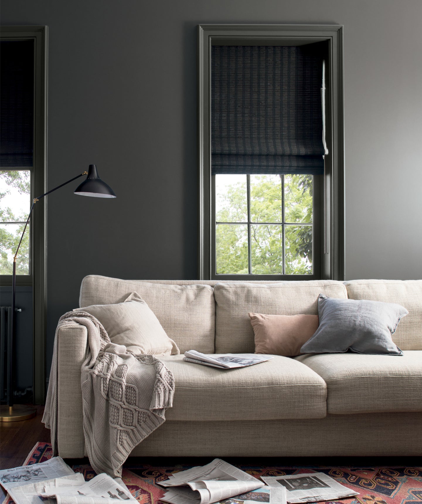
This year’s COTY announcement was met with quite the surprise and it could not be a more versatile pick. Dubbed Metropolitan AF – 690, the tone is described as a “stylish gray with cool undertones,” according to the paint company.
The alluring shade of gray is calming in nature and rich with a timeless sense of elegance. Its ability to be paired with a liberal slew of both complementary and contrasting tones is a defining element of the gray and a prime reason for its candidacy for 2019’s COTY.
Coincidentally enough, Metropolitan was, in a way, a reaction to the brand’s selection from the year prior, a retreat that would provide a sense of quietude and balance. “One of the things that really resonated with me through all this research was the need to find a common ground, and how this color really exemplifies that,” notes Andrea Magno, Benjamin Moore’s color and design expert.
But don’t be fooled, the hue is anything but ordinary or mundane. Its ability to interact with natural light results in an influential reaction cultivated by the emergence of the color’s cool undertones. “It’s a much more complex sort of gray,” adds Magno, “it’s really looking to the characteristics of the color and how it can be enhanced by natural light.”
The inspiration for Metropolitan was found by an equally alluring source, one that perfectly encapsulates the tonal properties of the hue. Magno likens the process of selecting the COTY to a sort of archeological dig, which entails a year-long course of exploration through the multi-faceted verticals of design. Paris, she says, was an undeniable influence but its true source was located not too far off.
Benjamin Moore’s director of strategic design intelligence, Ellen O’Neill, found inspiration by way of her travels in England and Scotland, where she was struck by the veiled quality of the sea, highlighting the effect of mist on stone, recalls Magno. The softness of the color coupled with the scene helped form the neutrally-charged palette from which Metropolitan was born.
Looking to bring the hue home? Metropolitan comes with a corresponding palette of 15 complementary shades, which cater to the central color’s versatile properties, resulting in a multi-dimensional finish that can work to just about any decorative aesthetic.
See more colors hitting it big for 2019: Pantone Just Released its 2019 Color Trend PredictionsSherwin-Williams’ 2019 Color of the Year Is a Desert DreamBehr’s 2019 Color of the Year Is Exactly What We Needed