Make a Decor Statement With Benjamin Moore’s 2018 Color of the Year
According to the paint company, this is the hue we’ll be seeing everywhere next year.
Published Sep 28, 2018 8:01 PM
We may earn revenue from the products available on this page and participate in affiliate programs.
As hard as it might be to believe, 2017 is almost over—and this year has definitely had its fair share of tough moments. While that might inspire some to infuse their homes with softer, more tranquil shades, Benjamin Moore is going in a different direction entirely: The paint company just announced their Color of the Year for 2018, and it’s seriously striking.
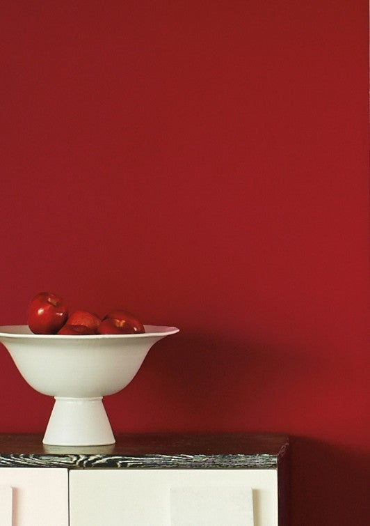
Named “Caliente AF”—well, technically, the color’s full title is Caliente AF-290, but the shorter version sounds more fun—the bold red hue is just that. It’s energizing and statement-making, meant to encourage confidence and strength.
“My first color cue of this year was a sea of pink to rose to red on the heads of more than a million women at the Women’s March in Washington, DC,” says Ellen O’Neill, Benjamin Moore’s Director of Strategic Design Intelligence. “It was a color coating that spread over the entire mall. Color was appearing culturally, but we needed to test drive it to see if it would work in a residential room, not just a commercial space.”
The color was unveiled at an October 10 event in New York City’s Guggenheim Museum, where everything from the roses to the cushions were tinted in the trendy hue. O’Neill cites famously red interior spaces—such as Diana Vreeland’s apartment and the Gucci Store in Manhattan—to prove that red can make equally as powerful a statement in home decor. Go big and paint your walls in the deep red shade, or instantly elevate your space by adding small touches of the color.
Paint your front door red for something as close to a welcoming red carpet as it gets—aside from an actual red carpet—or give your kitchen cabinets a fresh look with a coat of red paint. The versatile shade also works with virtually every color scheme, so you can pair Caliente with neutrals to have the red be the focal point, or you could try color blocking with other similarly bold shades.
Benjamin Moore also unveiled their Color Trends report for the upcoming year, in the form of a 23-shade palette that includes both warm and cool tones. From a blush pink that looks suspiciously reminiscent of millennial pink (we called it—that trend isn’t going anywhere anytime soon) to a pretty golden mustard hue that works perfectly for fall, there’s a color for every design aesthetic in the carefully curated collection.
And of course, each works well with the color of the year.
“If you’re a color-confident person and want to mix reds and pinks, there are suggestions within the palette,” says O’Neill of using the palette in conjunction with Caliente. “But if you’re not ‘red-ready,’ there are a number of grays and neutral tones that will envelop the red gesture.”
See more color trends to know:
These Are The Colors You’ll Be Painting Your Home In 2018 The Italian Design Team Inspiring Our Fall Color Palette The Colors That Will Soon Be Trending, According To NYFW