inspiring tile, wallpaper, and hues of blue
Published Feb 21, 2016 10:00 AM
We may earn revenue from the products available on this page and participate in affiliate programs.
Meet Shea and Syd McGee, the power designing couple who are bringing domino a monthly dose of creative inspiration–and energy. Read on.
About a year ago, we started working with the cutest newlywed couple who had just purchased a fixer upper in one of Salt Lake’s most charming neighborhoods. The 1950s Cape Cod style home had been updated a few times throughout the years, but was in need of a major overhaul.
With the help of Tiek Built Homes, we moved the kitchen to a new location, closed doorways, opened ceilings, and created a mudroom out of the breezeway next to the garage. The structural changes improved the overall flow and made the home feel much larger without changing the square footage.
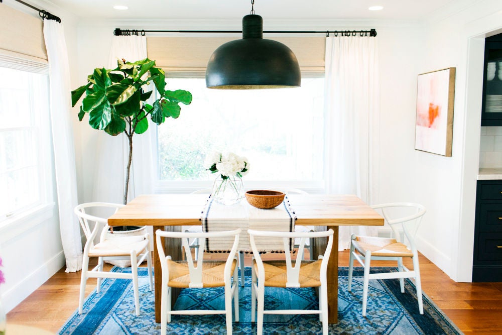
Our goal was to create a mashup of coastal-boho-preppy styles…that’s a thing, right? We mixed white walls, navy accents and stripes, with
vintage rugsleather and natural wood tones. The result is bright, eclectic and filled with lots of good vibes.
before
WHAT WAS YOUR FAVORITE PART OF THE HOME?
My favorite part of the home is the family room – the room gets so much natural light and those buffalo check chairs are the stuff my dreams are made of. I never like to stick to just one style in a room, so we used
white paintas a clean backdrop to take a risk and mix lots of prints, textures and materials together. The result is a happy blend of styles that works together seamlessly.
WHAT WAS THE MOST CHALLENGING ASPECT OF THE MAKEOVER?
The most challenging aspect of the makeover was figuring out how to make the most of the entryway space. Originally, it felt very cavelike. With the help of the builder, Steve Tiek, we opened the ceiling and added paneling to draw the eye upward. We did not have room for a lot of furniture, but still wanted the space to feel cozy. We achieved this by using items with character and history – antlers from the family ranch, gifted artwork and a cute little maidenhair fern. The star of the entryway is the striped runner that adds lots of interest without taking up any extra space!
before
before
before
The master bathroom is a study in balance and compromise!Our clients each had very different ideas of what the bathroom should be: he liked more traditional design and she leaned more modern. We started with timeless Carrara marble tile and countertops because they look great with everything and then paired them with a streamlined vanity and fixtures. Yes, a steel shower is unconventional, but the shape of the window panes are totally classic!
In a home filled with mostly white walls, we knew the powder bathroom should be daring and bold. When our client pinned this Eskayel wallpaper we knew it was just what this space needed! We didn’t want cabinetry to distract from the awesome wallpaper, so we designed a floating marble sink. The warmth of the gold faucet was the perfect finishing touch to all the cool tones in the space.
SEE MORE FROM
studio mcgeeHERE!