An Outdated ’90s Kitchen Gets a Major, Modern Makeover
How one couple's starter home turned into their dream space.
Published Sep 28, 2018 6:40 PM
We may earn revenue from the products available on this page and participate in affiliate programs.
For the young couple coming into their very first home, having ample space for entertaining was top on their list of priorities. And since working within the confines of an outdated, ‘90s-inspired kitchen had no spot on said list of priorities, a little change up was in order. Enter Alice Cheng, of Shialice Spatial Design, who was tasked with ushering the bland kitchen into the 21st century. “They were far more fun and vibrant than the standard ‘90s granite and white appliances, so we got to work retooling the space to match their needs and personality,” notes Cheng of the reno.
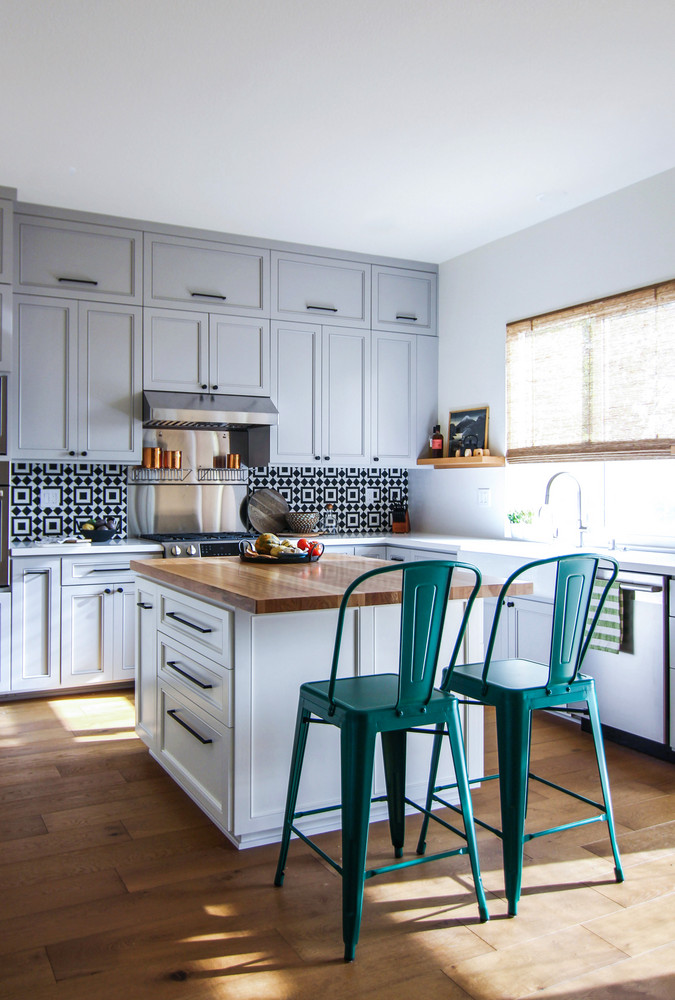
Having moved to be closer to family, the couple’s main goal was to carve out enough space that would allow them to entertain large groups at once. A luxury that was impeded by the massive island set dead-center in the room. The outdated black granite counters, laminate floors, barely-white cabinets, and “yellowing Swiss Coffee” walls certainly weren’t helping either.
“There was a large window above the sink that ate up most of the wall (read: no storage). The space felt a little dingy and there were a lot of pockets of wasted space,” recalls Cheng of the original layout. As a result, her team was faced with a blank slate of sorts, having the opportunity to take decorative charge with major revamps in place.
Aside from the need for additional seating and space to entertain, the couple’s key requests also entailed the need for ample storage and establishing a wider walkway between the kitchen island and wall cabinets. In addition to their formal dining room, the couple was also insistent on the inclusion of a breakfast seating area, large enough for six.
Armed with the knowledge that the couple would be spending the majority of their time in the kitchen area, Cheng and her team strived to fill the space with high-quality materials that would be durable enough to withstand the test of time and yet maintain a comfortable and current feel.
When it came time for the actual reno, a handful of functional requirements were integrated into their design decisions. By extending the cabinets up to the 10’ ceilings, they were able to implement much more storage space. “Let’s face it: few people can reach up there without a ladder, but it greatly cleans up the sight lines and makes the room feel bigger and more grand,” notes Cheng of the upgrade. And while day-to-day storage isn’t ideal up there, it’s a great place for infrequently needed things like holiday decorations, and stocked items.”
While the island was resized and repositioned to make way for an easier flow throughout the room, the floors were also replaced by beachy-esque oak planks to soften up the existing aesthetic. Soft white walls, freshly painted, imparted a bright and open feel, balanced out by the cabinets boasting a light grey finish with a subtle blue undertone. “To keep all the cool-toned cabinetry and white walls from feeling too cool, we added a gorgeous hickory butcher block top on the island and leather saddle chairs from Rejuvenation to add warmth,” says Cheng.
“You know, when people want to renovate, I remind them that things like tile, flooring (anything built-in) have permanence and, therefore, to not go too trendy unless it’s something they genuinely love and/or can more easily swap out,” notes Cheng of her decision to implement such a graphic tile for the backsplash.
“At that point, we were already going with a pretty blueish grey for the shaker cabinets and a hickory butcher block top for the island and had low maintenance quartz on the counters—all that jived well with the clients, but I wanted to give a nod to their (particularly the wife’s) super vibrant personality and the fun inviting atmosphere she envisioned.”
Custom birch shelves were added to house the couple’s collection of cookbooks and art, balancing out the taller cabinets and making the wall behind the sink feel significantly less disconnected.
Feeling the need to avoid an overly serious space, she opted for the geometric pattern from Cle Tile, to provide a higher contrast as well as a focal point that would draw the eye in. “We used it only on the short wall behind the range, broke it up with a stainless steel splash behind the range, and ran the white quartz for counters up the other wall as a splash. Really, if they tire of it in a few years, it’s a minor change, all things considered. My hunch, though, is that the tile is there to stay,” says Cheng.
Read on for more home tours that inspire:
How a Young Couple Infused Their Colorful Personalities into a Neutral LA Home This Eclectic Loft Is the Epitome of Brooklyn Cool This Tiny California Cottage Is Charming and Functional
Learn to love your inbox again—sign up for Domino’s daily email.