6 Pattern Rules You Need to Start Following
An expert dishes on all you need to know about mixing and matching prints.
Published Aug 1, 2018 5:07 PM
We may earn revenue from the products available on this page and participate in affiliate programs.
Mixing and matching patterns, although a widespread decor trend, can often be highly intimidating when you’re doing it for yourself. Whether you’re a minimalist or a maximalist, know that there’s a way you can mix color and pattern to create a cohesive look that won’t overwhelm your space. Don’t believe us? Well, maybe these rooms ahead will help. Orchestrated by Carly Pokornowski Moeller of Unpatterned, a Chicago-based interior design firm, these following rooms emphasize a mix of different patterns in all sorts of creative ways, from using tile and minimalist design to going all out with fabrics and wallpaper.
“Mistakes to avoid when mixing patterns would be obsessing over matching or symmetry. Things don’t have to be a perfect match,” the pattern expert tells Domino. “In fact, it’s better and a bit more intentional sometimes if they aren’t—but make sure that they’re complementary.”
Another huge tip? Don’t be afraid to mix metals and styles/eras. “It’s one of the best ways to make a room feel timeless and put together thoughtfully, rather than taken out of a catalog,” says Moeller. “And lastly (this is something I’ve been guilty of personally, too), when possible, try to invest money in long-term things upfront to avoid doing something twice. The biggest offenders here are window treatments (which are a great opportunity for pattern mixing) and lighting. They are often big-ticket items, but can really make or break the overall look and feel of a space.”
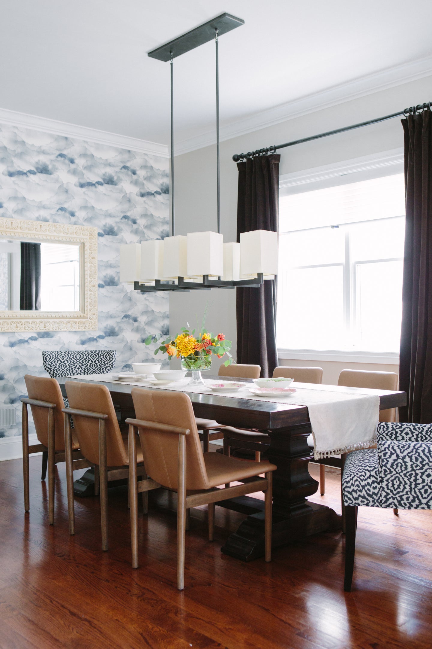
Ahead, check out rooms from the dreamy homes Moeller has designed throughout the years, along with her favorite lessons from each. Trust us: You’ll be playing with patterns before you know it.
Use an unexpected mix of hues, while still sticking to the same color family.
There’s a lot going on in this little
breakfast nookFrom the wallpaper to the seats to the vase, a mix of pattern adds a sunny look to the space. The wallpaper was chosen by the client as a way to bring in some greenery, the chairs were picked because they had touches of blue and white in them as well—enough for both contrast and cohesion. Painted white windows and modern lighting complete the look.
“Geometric prints seemed to compete with the organic, yet structured wallpaper. We landed on the botanical because it had the blue and the green in it without being a perfect match, and it also had turquoise to add a different color,” says Moeller of her design choices. “The scales were different enough, and there was enough white in the bench, the trim, and the furniture that it all worked well together.”
Mix scale for a pop.
More colors come alive in this living area, with the pink chairs and shelving being the only remnants of the client’s original home. As everything else chosen had to play off these original elements, Moeller decided to really have some fun with it.
“We played on repeating the pink in the wallpaper, but I also wanted to add some unexpected companions,” she says. And while blue and pink might seem like the obvious choice, some surprise elements were added via the teal hue in the dresser and the mixed carpeting.
“One of the best ways to mix prints or add in unexpected colors is to repeat common threads throughout the room,” says Moeller. “Here, the grounding is the whites and the solid pieces—the chairs and the buffet are solid. The trim, the table, and the drapery ground are white, and the walls are almost white, while the gold in the wallpaper is repeated in the draperies and furniture accents. The green of the buffet is repeated on some throw pillows. The wallpaper is fairly large scale, the print on the chairs is medium, and the draperies are small-scale print. It’s the combo for this variety and repetition at once that makes it all sing together.”
Small spaces allow for big risks.
Moeller admits that the smaller a room is, the more likely it is that you can take a big risk in the space. In this case, the powder room was the perfect backdrop for a mix of patterns in a pale hue, in order to not overwhelm the space completely.
”We knew we wanted to pull in some geometric repeating and large scale print to make an impact in a small space,” says Moeller. She also made sure to add in some extra brass elements for contrast. “Mixing metals is a good way to help things feel timeless, customized, and not overly matchy,” she explains. “The geometric bone inlay mirror works against the wallpaper because they have a common color, plus the mirror has contrasting brass and gray. We then repeated the brass in the art hanging on the opposite wall.”
Pick an accent piece.
While this airy living room certainly has its fair share of colors, you’ll notice that they’re all subdued in terms of prints. The pink patterned armchair is the only real statement-maker in the space, but that’s more than enough when paired with all the colors around the area, including fresh artwork, playful accessories, and unexpected trinkets.
A fun fact? This is actually Moeller’s own home, where she spent several months picking the very perfect fabric for that statement chair, which actually belonged to her grandmother. “I finally reupholstered it after years of waiting, because it took me a while to find the perfect fabric,” says Moeller. “But I am obsessed with houndstooth and knew I wanted something colorful. Classic houndstooth would have been too traditional or stuffy on this chair in this space.”
As the room had a fairly open floor plan, care was made to repeat colors so that everything looked cohesive, be it in the accessories or small touches in the paintings or other fabrics. And unlike the wallpapered homes she designs, here, the walls were kept neutral—”I am a bit of a collector of colorful things, and in this small space, the almost white walls really let the art, accessories, and fun prints shine!” explains Moeller.
Don’t be afraid to use non-traditional tile.
While yes, plain white tile is a classic for a reason, Moeller insists that using some different, colored options can be a fun way to add a pop of color to a space, even if the rest of the home lies more on the subdued side. When it came to this home bar, the rest of the space was a little more subdued—grey cabinetry and quartz white countertops were chosen to really let that impressive alcohol collection pop. By picking another pale hue (that wasn’t white!), Moeller let some color shine through without having it look too out of place.
“I think it’s important that wet bars, dry bars, butler’s pantries, etc. don’t look like they’re trying to be a kitchen, especially when they are not adjacent to one,” says Moeller. “They are their own space with a different function—and in this case, a very fun one!”
Use shades of white as a grounding base.
While it might look like this room is simply a mix of bold patterns and colors, closer inspection shows a base of white ties everything together. “The rug pattern, the trim, the lampshade, the tray—they all consist of white, which serves as a basis for mixing in other patterns and colors,” says Moeller. As the clients already had the rug, draperies, and sofa, Moeller knew she needed something heavy and unexpected for the pop of color—and what better than pink velvet? It didn’t look over-the-top precisely because of those grounding hues serving to keep the classic look intact. “Introducing a wood side table brought in a natural element, and the brass and glass helped lighten up the texture and provide some needed variety,” adds Moeller.
See more design advice:
How to Fake a Mudroom If You Don’t Have One
10 Ways to Decorate With Our Newest Favorite Color
12 Things We Learned From Joanna Gaines
Learn to love your inbox again—sign up for Domino’s daily email.