Patchwork Stripes and Jungle Florals—These Are the 7 Big Tile Trends
Number three doesn’t even look like stone.
Kate McGregor is Domino’s associate design editor. She started in August of 2021, and covers everything related to the home, from design inspiration to IKEA hacks. Before Domino, she was the market assistant at ELLE Decor where she focused on curating product for the print magazine’s market pages.
McGregor started in journalism as the beauty intern at Harper’s Bazaar Magazine in 2017. Since then, she’s shifted into the interiors industry, loving the glimpse into people’s lives homes can offer. Starting in the market department of ELLE DECOR, working across both print and digital, McGregor worked on everything from SEO content to photoshoot production. Wanting to tell more stories about people and the inspiration behind pieces, she joined Domino in August of 2021. Now she primarily writes home tours, collection news, and DIY how-to’s.
McGregor attended Belmont University and graduated with a B.S. in Entertainment Industry Studies and a minor in Marketing.
Texture is more important than color.
Number three doesn’t even look like stone.
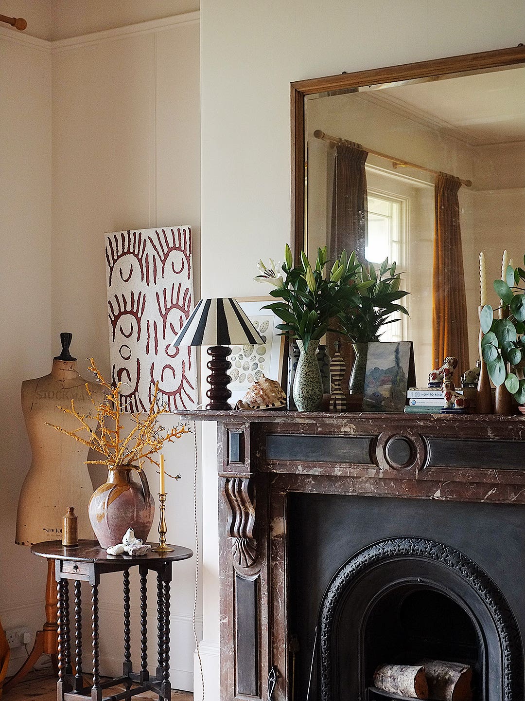
Cue the strategic color usage and carousel horse.
All in only 650 square feet.
Seven designers share how they’d use the trendy hue.
It works everywhere—indoors and out.
The designer loved it so much, she decided to take it home.
Plus, options for any work style.
Here are three tips for taking a leap of faith.
Designers spill their secret sources.